Query Time: 1.17 ms Query memory: 0.023 MB Memory before query: 4.173 MB Rows returned: 0
SELECT `data`

  FROM `l6r3h_session`

  WHERE `session_id` = X'6138393366653066613335366435653830393033393538393139393134663630'
| id | select_type | table | partitions | type | possible_keys | key | key_len | ref | rows | filtered | Extra |
|---|
| 1 | SIMPLE | l6r3h_session | NULL | const | PRIMARY | PRIMARY | 194 | const | 1 | 100.00 | NULL |
| Status | Duration |
|---|
| starting | 0.06 ms |
| checking permissions | 0.01 ms |
| Opening tables | 0.10 ms |
| init | 0.02 ms |
| System lock | 0.01 ms |
| optimizing | 0.01 ms |
| statistics | 0.05 ms |
| executing | 0.01 ms |
| end | 0.01 ms |
| query end | 0.01 ms |
| closing tables | 0.01 ms |
| freeing items | 0.03 ms |
| cleaning up | 0.01 ms |
| # | Caller | File and line number |
|---|
| 16 | JDatabaseDriverMysqli->execute() | JROOT/libraries/joomla/database/driver.php:1740 |
| 15 | JDatabaseDriver->loadResult() | JROOT/libraries/joomla/session/storage/database.php:45 |
| 14 | JSessionStorageDatabase->read() | Same as call in the line below. |
| 13 | session_start() | JROOT/libraries/joomla/session/handler/native.php:260 |
| 12 | JSessionHandlerNative->doSessionStart() | JROOT/libraries/joomla/session/handler/native.php:50 |
| 11 | JSessionHandlerNative->start() | JROOT/libraries/joomla/session/handler/joomla.php:88 |
| 10 | JSessionHandlerJoomla->start() | JROOT/libraries/src/Session/Session.php:661 |
| 9 | Joomla\CMS\Session\Session->_start() | JROOT/libraries/src/Session/Session.php:621 |
| 8 | Joomla\CMS\Session\Session->start() | JROOT/libraries/src/Session/Session.php:499 |
| 7 | Joomla\CMS\Session\Session->get() | JROOT/libraries/src/Session/Session.php:456 |
| 6 | Joomla\CMS\Session\Session->isNew() | JROOT/libraries/src/Application/CMSApplication.php:826 |
| 5 | Joomla\CMS\Application\CMSApplication->loadSession() | JROOT/libraries/src/Application/CMSApplication.php:136 |
| 4 | Joomla\CMS\Application\CMSApplication->__construct() | JROOT/libraries/src/Application/SiteApplication.php:66 |
| 3 | Joomla\CMS\Application\SiteApplication->__construct() | JROOT/libraries/src/Application/CMSApplication.php:386 |
| 2 | Joomla\CMS\Application\CMSApplication::getInstance() | JROOT/libraries/src/Factory.php:140 |
| 1 | Joomla\CMS\Factory::getApplication() | JROOT/index.php:46 |
Query Time: 1.01 ms After last query: 0.99 ms Query memory: 0.020 MB Memory before query: 4.268 MB Rows returned: 0
SELECT `session_id`

  FROM `l6r3h_session`

  WHERE `session_id` = X'6138393366653066613335366435653830393033393538393139393134663630'
  LIMIT 1
| id | select_type | table | partitions | type | possible_keys | key | key_len | ref | rows | filtered | Extra |
|---|
| 1 | SIMPLE | l6r3h_session | NULL | const | PRIMARY | PRIMARY | 194 | const | 1 | 100.00 | Using index |
| Status | Duration |
|---|
| starting | 0.05 ms |
| checking permissions | 0.01 ms |
| Opening tables | 0.03 ms |
| init | 0.02 ms |
| System lock | 0.01 ms |
| optimizing | 0.01 ms |
| statistics | 0.03 ms |
| executing | 0.01 ms |
| end | 0.01 ms |
| query end | 0.01 ms |
| closing tables | 0.01 ms |
| freeing items | 0.03 ms |
| cleaning up | 0.01 ms |
| # | Caller | File and line number |
|---|
| 9 | JDatabaseDriverMysqli->execute() | JROOT/libraries/joomla/database/driver.php:1740 |
| 8 | JDatabaseDriver->loadResult() | JROOT/libraries/src/Session/MetadataManager.php:74 |
| 7 | Joomla\CMS\Session\MetadataManager->createRecordIfNonExisting() | JROOT/libraries/src/Application/CMSApplication.php:154 |
| 6 | Joomla\CMS\Application\CMSApplication->checkSession() | JROOT/libraries/src/Application/CMSApplication.php:828 |
| 5 | Joomla\CMS\Application\CMSApplication->loadSession() | JROOT/libraries/src/Application/CMSApplication.php:136 |
| 4 | Joomla\CMS\Application\CMSApplication->__construct() | JROOT/libraries/src/Application/SiteApplication.php:66 |
| 3 | Joomla\CMS\Application\SiteApplication->__construct() | JROOT/libraries/src/Application/CMSApplication.php:386 |
| 2 | Joomla\CMS\Application\CMSApplication::getInstance() | JROOT/libraries/src/Factory.php:140 |
| 1 | Joomla\CMS\Factory::getApplication() | JROOT/index.php:46 |
Query Time: 4.77 ms After last query: 0.06 ms Query memory: 0.004 MB Memory before query: 4.273 MB
INSERT INTO `l6r3h_session`
(`session_id`,`guest`,`time`,`userid`,`username`,`client_id`)
  VALUES
(X'6138393366653066613335366435653830393033393538393139393134663630', 1, 1713997342, 0, '', 0)
EXPLAIN not possible on query: INSERT INTO `l6r3h_session`
(`session_id`,`guest`,`time`,`userid`,`username`,`client_id`) VALUES
(X'6138393366653066613335366435653830393033393538393139393134663630', 1, 1713997342, 0, '', 0)
| Status | Duration |
|---|
| starting | 0.06 ms |
| checking permissions | 0.01 ms |
| Opening tables | 0.01 ms |
| init | 0.02 ms |
| System lock | 0.01 ms |
| update | 0.19 ms |
| end | 0.01 ms |
| query end | 3.51 ms |
| closing tables | 0.02 ms |
| freeing items | 0.02 ms |
| cleaning up | 0.01 ms |
| # | Caller | File and line number |
|---|
| 8 | JDatabaseDriverMysqli->execute() | JROOT/libraries/src/Session/MetadataManager.php:116 |
| 7 | Joomla\CMS\Session\MetadataManager->createRecordIfNonExisting() | JROOT/libraries/src/Application/CMSApplication.php:154 |
| 6 | Joomla\CMS\Application\CMSApplication->checkSession() | JROOT/libraries/src/Application/CMSApplication.php:828 |
| 5 | Joomla\CMS\Application\CMSApplication->loadSession() | JROOT/libraries/src/Application/CMSApplication.php:136 |
| 4 | Joomla\CMS\Application\CMSApplication->__construct() | JROOT/libraries/src/Application/SiteApplication.php:66 |
| 3 | Joomla\CMS\Application\SiteApplication->__construct() | JROOT/libraries/src/Application/CMSApplication.php:386 |
| 2 | Joomla\CMS\Application\CMSApplication::getInstance() | JROOT/libraries/src/Factory.php:140 |
| 1 | Joomla\CMS\Factory::getApplication() | JROOT/index.php:46 |
Query Time: 3.15 ms After last query: 1.89 ms Query memory: 0.081 MB Memory before query: 4.523 MB Rows returned: 56
SELECT `extension_id` AS `id`,`element` AS `option`,`params`,`enabled`

  FROM `l6r3h_extensions`

  WHERE `type` = 'component'
  AND `state` = 0
  AND `enabled` = 1
| id | select_type | table | partitions | type | possible_keys | key | key_len | ref | rows | filtered | Extra |
|---|
| 1 | SIMPLE | l6r3h_extensions | NULL | ref | extension | extension | 82 | const | 56 | 1.00 | Using where |
| Status | Duration |
|---|
| starting | 0.05 ms |
| checking permissions | 0.01 ms |
| Opening tables | 0.07 ms |
| init | 0.04 ms |
| System lock | 0.01 ms |
| optimizing | 0.01 ms |
| statistics | 0.05 ms |
| preparing | 0.01 ms |
| executing | 0.00 ms |
| Sending data | 0.33 ms |
| end | 0.01 ms |
| query end | 0.01 ms |
| closing tables | 0.01 ms |
| freeing items | 0.02 ms |
| cleaning up | 0.01 ms |
| # | Caller | File and line number |
|---|
| 12 | JDatabaseDriverMysqli->execute() | JROOT/libraries/joomla/database/driver.php:1701 |
| 11 | JDatabaseDriver->loadObjectList() | JROOT/libraries/src/Component/ComponentHelper.php:445 |
| 10 | Joomla\CMS\Component\ComponentHelper::Joomla\CMS\Component\{closure}() | Same as call in the line below. |
| 9 | call_user_func_array() | JROOT/libraries/src/Cache/Controller/CallbackController.php:173 |
| 8 | Joomla\CMS\Cache\Controller\CallbackController->get() | JROOT/libraries/src/Component/ComponentHelper.php:453 |
| 7 | Joomla\CMS\Component\ComponentHelper::load() | JROOT/libraries/src/Component/ComponentHelper.php:519 |
| 6 | Joomla\CMS\Component\ComponentHelper::getComponents() | JROOT/libraries/src/Component/ComponentHelper.php:44 |
| 5 | Joomla\CMS\Component\ComponentHelper::getComponent() | JROOT/libraries/src/Component/ComponentHelper.php:103 |
| 4 | Joomla\CMS\Component\ComponentHelper::getParams() | JROOT/libraries/src/Application/SiteApplication.php:594 |
| 3 | Joomla\CMS\Application\SiteApplication->initialiseApp() | JROOT/libraries/src/Application/SiteApplication.php:212 |
| 2 | Joomla\CMS\Application\SiteApplication->doExecute() | JROOT/libraries/src/Application/CMSApplication.php:225 |
| 1 | Joomla\CMS\Application\CMSApplication->execute() | JROOT/index.php:49 |
Query Time: 1.12 ms After last query: 2.12 ms Query memory: 0.021 MB Memory before query: 4.769 MB Rows returned: 6
SELECT id, rules

  FROM `l6r3h_viewlevels`
| id | select_type | table | partitions | type | possible_keys | key | key_len | ref | rows | filtered | Extra |
|---|
| 1 | SIMPLE | l6r3h_viewlevels | NULL | ALL | NULL | NO INDEX KEY COULD BE USED | NULL | NULL | 6 | 100.00 | NULL |
| Status | Duration |
|---|
| starting | 0.04 ms |
| checking permissions | 0.01 ms |
| Opening tables | 0.07 ms |
| init | 0.01 ms |
| System lock | 0.01 ms |
| optimizing | 0.00 ms |
| statistics | 0.01 ms |
| preparing | 0.01 ms |
| executing | 0.00 ms |
| Sending data | 0.08 ms |
| end | 0.01 ms |
| query end | 0.01 ms |
| closing tables | 0.01 ms |
| freeing items | 0.03 ms |
| cleaning up | 0.01 ms |
| # | Caller | File and line number |
|---|
| 10 | JDatabaseDriverMysqli->execute() | JROOT/libraries/joomla/database/driver.php:1506 |
| 9 | JDatabaseDriver->loadAssocList() | JROOT/libraries/src/Access/Access.php:1063 |
| 8 | Joomla\CMS\Access\Access::getAuthorisedViewLevels() | JROOT/libraries/src/User/User.php:458 |
| 7 | Joomla\CMS\User\User->getAuthorisedViewLevels() | JROOT/libraries/src/Plugin/PluginHelper.php:318 |
| 6 | Joomla\CMS\Plugin\PluginHelper::load() | JROOT/libraries/src/Plugin/PluginHelper.php:87 |
| 5 | Joomla\CMS\Plugin\PluginHelper::getPlugin() | JROOT/libraries/src/Plugin/PluginHelper.php:129 |
| 4 | Joomla\CMS\Plugin\PluginHelper::isEnabled() | JROOT/libraries/src/Application/SiteApplication.php:604 |
| 3 | Joomla\CMS\Application\SiteApplication->initialiseApp() | JROOT/libraries/src/Application/SiteApplication.php:212 |
| 2 | Joomla\CMS\Application\SiteApplication->doExecute() | JROOT/libraries/src/Application/CMSApplication.php:225 |
| 1 | Joomla\CMS\Application\CMSApplication->execute() | JROOT/index.php:49 |
Query Time: 1.16 ms After last query: 0.08 ms Query memory: 0.021 MB Memory before query: 4.781 MB Rows returned: 2
SELECT b.id

  FROM l6r3h_usergroups AS a

  LEFT JOIN l6r3h_usergroups AS b
  ON b.lft <= a.lft
  AND b.rgt >= a.rgt

  WHERE a.id = 11
| id | select_type | table | partitions | type | possible_keys | key | key_len | ref | rows | filtered | Extra |
|---|
| 1 | SIMPLE | a | NULL | const | PRIMARY | PRIMARY | 4 | const | 1 | 100.00 | NULL |
| 1 | SIMPLE | b | NULL | range | idx_usergroup_nested_set_lookup | idx_usergroup_nested_set_lookup | 4 | NULL | 2 | 100.00 | Using where; Using index |
| Status | Duration |
|---|
| starting | 0.05 ms |
| checking permissions | 0.01 ms |
| checking permissions | 0.00 ms |
| Opening tables | 0.10 ms |
| init | 0.02 ms |
| System lock | 0.01 ms |
| optimizing | 0.01 ms |
| statistics | 0.06 ms |
| preparing | 0.02 ms |
| executing | 0.00 ms |
| Sending data | 0.03 ms |
| end | 0.01 ms |
| query end | 0.01 ms |
| closing tables | 0.01 ms |
| freeing items | 0.03 ms |
| cleaning up | 0.01 ms |
| # | Caller | File and line number |
|---|
| 11 | JDatabaseDriverMysqli->execute() | JROOT/libraries/joomla/database/driver.php:1550 |
| 10 | JDatabaseDriver->loadColumn() | JROOT/libraries/src/Access/Access.php:980 |
| 9 | Joomla\CMS\Access\Access::getGroupsByUser() | JROOT/libraries/src/Access/Access.php:1095 |
| 8 | Joomla\CMS\Access\Access::getAuthorisedViewLevels() | JROOT/libraries/src/User/User.php:458 |
| 7 | Joomla\CMS\User\User->getAuthorisedViewLevels() | JROOT/libraries/src/Plugin/PluginHelper.php:318 |
| 6 | Joomla\CMS\Plugin\PluginHelper::load() | JROOT/libraries/src/Plugin/PluginHelper.php:87 |
| 5 | Joomla\CMS\Plugin\PluginHelper::getPlugin() | JROOT/libraries/src/Plugin/PluginHelper.php:129 |
| 4 | Joomla\CMS\Plugin\PluginHelper::isEnabled() | JROOT/libraries/src/Application/SiteApplication.php:604 |
| 3 | Joomla\CMS\Application\SiteApplication->initialiseApp() | JROOT/libraries/src/Application/SiteApplication.php:212 |
| 2 | Joomla\CMS\Application\SiteApplication->doExecute() | JROOT/libraries/src/Application/CMSApplication.php:225 |
| 1 | Joomla\CMS\Application\CMSApplication->execute() | JROOT/index.php:49 |
Query Time: 2.62 ms After last query: 0.62 ms Query memory: 0.051 MB Memory before query: 4.850 MB Rows returned: 173
SELECT `folder` AS `type`,`element` AS `name`,`params` AS `params`,`extension_id` AS `id`

  FROM l6r3h_extensions

  WHERE enabled = 1
  AND type = 'plugin'
  AND state IN (0,1)
  AND access IN (1,1,6)

  ORDER BY ordering
| id | select_type | table | partitions | type | possible_keys | key | key_len | ref | rows | filtered | Extra |
|---|
| 1 | SIMPLE | l6r3h_extensions | NULL | ref | extension | extension | 82 | const | 249 | 0.60 | Using index condition; Using where; Using filesort |
| Status | Duration |
|---|
| starting | 0.08 ms |
| checking permissions | 0.01 ms |
| Opening tables | 0.01 ms |
| init | 0.02 ms |
| System lock | 0.02 ms |
| optimizing | 0.01 ms |
| statistics | 0.05 ms |
| preparing | 0.02 ms |
| Sorting result | 0.01 ms |
| executing | 0.00 ms |
| Sending data | 0.01 ms |
| Creating sort index | 1.18 ms |
| end | 0.01 ms |
| query end | 0.01 ms |
| closing tables | 0.01 ms |
| freeing items | 0.04 ms |
| cleaning up | 0.01 ms |
| # | Caller | File and line number |
|---|
| 11 | JDatabaseDriverMysqli->execute() | JROOT/libraries/joomla/database/driver.php:1701 |
| 10 | JDatabaseDriver->loadObjectList() | JROOT/libraries/src/Plugin/PluginHelper.php:351 |
| 9 | Joomla\CMS\Plugin\PluginHelper::Joomla\CMS\Plugin\{closure}() | Same as call in the line below. |
| 8 | call_user_func_array() | JROOT/libraries/src/Cache/Controller/CallbackController.php:173 |
| 7 | Joomla\CMS\Cache\Controller\CallbackController->get() | JROOT/libraries/src/Plugin/PluginHelper.php:356 |
| 6 | Joomla\CMS\Plugin\PluginHelper::load() | JROOT/libraries/src/Plugin/PluginHelper.php:87 |
| 5 | Joomla\CMS\Plugin\PluginHelper::getPlugin() | JROOT/libraries/src/Plugin/PluginHelper.php:129 |
| 4 | Joomla\CMS\Plugin\PluginHelper::isEnabled() | JROOT/libraries/src/Application/SiteApplication.php:604 |
| 3 | Joomla\CMS\Application\SiteApplication->initialiseApp() | JROOT/libraries/src/Application/SiteApplication.php:212 |
| 2 | Joomla\CMS\Application\SiteApplication->doExecute() | JROOT/libraries/src/Application/CMSApplication.php:225 |
| 1 | Joomla\CMS\Application\CMSApplication->execute() | JROOT/index.php:49 |
Query Time: 2.04 ms After last query: 37.96 ms Query memory: 0.101 MB Memory before query: 10.090 MB Rows returned: 73
SELECT m.id, m.menutype, m.title, m.alias, m.note, m.path AS route, m.link, m.type, m.level, m.language,`m`.`browserNav`, m.access, m.params, m.home, m.img, m.template_style_id, m.component_id, m.parent_id,e.element as component

  FROM l6r3h_menu AS m

  LEFT JOIN l6r3h_extensions AS e
  ON m.component_id = e.extension_id

  WHERE m.published = 1
  AND m.parent_id > 0
  AND m.client_id = 0

  ORDER BY m.lft
| id | select_type | table | partitions | type | possible_keys | key | key_len | ref | rows | filtered | Extra |
|---|
| 1 | SIMPLE | m | NULL | ref | idx_client_id_parent_id_alias_language | idx_client_id_parent_id_alias_language | 1 | const | 125 | 3.33 | Using index condition; Using where; Using filesort |
| 1 | SIMPLE | e | NULL | eq_ref | PRIMARY | PRIMARY | 4 | db597855425.m.component_id | 1 | 100.00 | Using where |
| Status | Duration |
|---|
| starting | 0.08 ms |
| checking permissions | 0.01 ms |
| checking permissions | 0.00 ms |
| Opening tables | 0.09 ms |
| init | 0.03 ms |
| System lock | 0.01 ms |
| optimizing | 0.01 ms |
| statistics | 0.05 ms |
| preparing | 0.02 ms |
| Sorting result | 0.01 ms |
| executing | 0.00 ms |
| Sending data | 0.01 ms |
| Creating sort index | 0.76 ms |
| end | 0.01 ms |
| query end | 0.01 ms |
| closing tables | 0.01 ms |
| freeing items | 0.02 ms |
| cleaning up | 0.01 ms |
| # | Caller | File and line number |
|---|
| 31 | JDatabaseDriverMysqli->execute() | JROOT/libraries/joomla/database/driver.php:1701 |
| 30 | JDatabaseDriver->loadObjectList() | JROOT/libraries/src/Menu/SiteMenu.php:93 |
| 29 | Joomla\CMS\Menu\SiteMenu->Joomla\CMS\Menu\{closure}() | Same as call in the line below. |
| 28 | call_user_func_array() | JROOT/libraries/src/Cache/Controller/CallbackController.php:173 |
| 27 | Joomla\CMS\Cache\Controller\CallbackController->get() | JROOT/libraries/src/Menu/SiteMenu.php:101 |
| 26 | Joomla\CMS\Menu\SiteMenu->load() | JROOT/libraries/src/Menu/AbstractMenu.php:78 |
| 25 | Joomla\CMS\Menu\AbstractMenu->__construct() | JROOT/libraries/src/Menu/SiteMenu.php:62 |
| 24 | Joomla\CMS\Menu\SiteMenu->__construct() | JROOT/libraries/src/Menu/AbstractMenu.php:142 |
| 23 | Joomla\CMS\Menu\AbstractMenu::getInstance() | JROOT/libraries/src/Application/CMSApplication.php:417 |
| 22 | Joomla\CMS\Application\CMSApplication->getMenu() | JROOT/libraries/src/Application/SiteApplication.php:275 |
| 21 | Joomla\CMS\Application\SiteApplication->getMenu() | JROOT/libraries/src/Router/SiteRouter.php:65 |
| 20 | Joomla\CMS\Router\SiteRouter->__construct() | JROOT/libraries/src/Router/Router.php:189 |
| 19 | Joomla\CMS\Router\Router::getInstance() | JROOT/libraries/src/Application/CMSApplication.php:533 |
| 18 | Joomla\CMS\Application\CMSApplication::getRouter() | JROOT/libraries/src/Application/SiteApplication.php:403 |
| 17 | Joomla\CMS\Application\SiteApplication::getRouter() | JROOT/administrator/components/com_sh404sef/vendor/weeblr/wblib/v2/packages/platform/joomla/platform.php:80 |
| 16 | Weeblr\Wblib\V_SH4_4352\Platform\JoomlaPlatform->boot() | JROOT/administrator/components/com_sh404sef/vendor/weeblr/wblib/v2/packages/factory.php:396 |
| 15 | Weeblr\Wblib\V_SH4_4352\Factory->buildPlatform() | JROOT/administrator/components/com_sh404sef/vendor/weeblr/wblib/v2/packages/factory.php:281 |
| 14 | Weeblr\Wblib\V_SH4_4352\Factory->buildObject() | JROOT/administrator/components/com_sh404sef/vendor/weeblr/wblib/v2/packages/factory.php:228 |
| 13 | Weeblr\Wblib\V_SH4_4352\Factory->getObject() | JROOT/administrator/components/com_sh404sef/vendor/weeblr/wblib/v2/packages/factory.php:116 |
| 12 | Weeblr\Wblib\V_SH4_4352\Factory->getThe() | JROOT/administrator/components/com_sh404sef/vendor/weeblr/wblib/v2/packages/system/hook.php:169 |
| 11 | Weeblr\Wblib\V_SH4_4352\System\Hook->execute() | JROOT/administrator/components/com_sh404sef/vendor/weeblr/wblib/v2/packages/system/hook.php:151 |
| 10 | Weeblr\Wblib\V_SH4_4352\System\Hook->filter() | JROOT/administrator/components/com_sh404sef/vendor/weeblr/wblib/v2/wblib.php:136 |
| 9 | Weeblr\Wblib\V_SH4_4352\Wblib->boot() | JROOT/plugins/system/sh404sef/bootstrap.php:43 |
| 8 | include_once JROOT/plugins/system/sh404sef/bootstrap.php | JROOT/plugins/system/sh404sef/sh404sef.php:35 |
| 7 | plgSystemSh404sef->__construct() | JROOT/libraries/src/Plugin/PluginHelper.php:280 |
| 6 | Joomla\CMS\Plugin\PluginHelper::import() | JROOT/libraries/src/Plugin/PluginHelper.php:182 |
| 5 | Joomla\CMS\Plugin\PluginHelper::importPlugin() | JROOT/libraries/src/Application/CMSApplication.php:667 |
| 4 | Joomla\CMS\Application\CMSApplication->initialiseApp() | JROOT/libraries/src/Application/SiteApplication.php:686 |
| 3 | Joomla\CMS\Application\SiteApplication->initialiseApp() | JROOT/libraries/src/Application/SiteApplication.php:212 |
| 2 | Joomla\CMS\Application\SiteApplication->doExecute() | JROOT/libraries/src/Application/CMSApplication.php:225 |
| 1 | Joomla\CMS\Application\CMSApplication->execute() | JROOT/index.php:49 |
Query Time: 1.30 ms After last query: 20.39 ms Query memory: 0.022 MB Memory before query: 13.301 MB Rows returned: 1
SELECT *

  FROM l6r3h_languages

  ORDER BY ordering ASC
| id | select_type | table | partitions | type | possible_keys | key | key_len | ref | rows | filtered | Extra |
|---|
| 1 | SIMPLE | l6r3h_languages | NULL | ALL | NULL | NO INDEX KEY COULD BE USED | NULL | NULL | 1 | 100.00 | Using filesort |
| Status | Duration |
|---|
| starting | 0.06 ms |
| checking permissions | 0.01 ms |
| Opening tables | 0.10 ms |
| init | 0.02 ms |
| System lock | 0.01 ms |
| optimizing | 0.01 ms |
| statistics | 0.02 ms |
| preparing | 0.01 ms |
| Sorting result | 0.01 ms |
| executing | 0.01 ms |
| Sending data | 0.02 ms |
| Creating sort index | 0.08 ms |
| end | 0.01 ms |
| query end | 0.01 ms |
| closing tables | 0.01 ms |
| freeing items | 0.04 ms |
| cleaning up | 0.01 ms |
| # | Caller | File and line number |
|---|
| 14 | JDatabaseDriverMysqli->execute() | JROOT/libraries/joomla/database/driver.php:1701 |
| 13 | JDatabaseDriver->loadObjectList() | JROOT/administrator/components/com_sh404sef/helpers/language.php:219 |
| 12 | Sh404sefHelperLanguage::getAllContentLanguages() | JROOT/administrator/components/com_sh404sef/helpers/language.php:171 |
| 11 | Sh404sefHelperLanguage::getUrlCodeFromTag() | JROOT/administrator/components/com_sh404sef/classes/pageinfo.php:85 |
| 10 | Sh404sefClassPageinfo->setCurrentLanguage() | JROOT/administrator/components/com_sh404sef/classes/pageinfo.php:101 |
| 9 | Sh404sefClassPageinfo->init() | JROOT/plugins/system/sh404sef/sh404sef.php:103 |
| 8 | plgSystemSh404sef->onAfterInitialise() | JROOT/libraries/joomla/event/event.php:70 |
| 7 | JEvent->update() | JROOT/libraries/joomla/event/dispatcher.php:160 |
| 6 | JEventDispatcher->trigger() | JROOT/libraries/src/Application/BaseApplication.php:108 |
| 5 | Joomla\CMS\Application\BaseApplication->triggerEvent() | JROOT/libraries/src/Application/CMSApplication.php:668 |
| 4 | Joomla\CMS\Application\CMSApplication->initialiseApp() | JROOT/libraries/src/Application/SiteApplication.php:686 |
| 3 | Joomla\CMS\Application\SiteApplication->initialiseApp() | JROOT/libraries/src/Application/SiteApplication.php:212 |
| 2 | Joomla\CMS\Application\SiteApplication->doExecute() | JROOT/libraries/src/Application/CMSApplication.php:225 |
| 1 | Joomla\CMS\Application\CMSApplication->execute() | JROOT/index.php:49 |
Query Time: 1.54 ms After last query: 6.10 ms Query memory: 0.062 MB Memory before query: 14.100 MB Rows returned: 1
SELECT `params`
  FROM l6r3h_extensions
  WHERE `element`='com_sh404sef'
  AND `type`='component';
| id | select_type | table | partitions | type | possible_keys | key | key_len | ref | rows | filtered | Extra |
|---|
| 1 | SIMPLE | l6r3h_extensions | NULL | ref | element_clientid,element_folder_clientid,extension | element_clientid | 402 | const | 1 | 10.00 | Using where |
| Status | Duration |
|---|
| starting | 0.09 ms |
| checking permissions | 0.02 ms |
| Opening tables | 0.03 ms |
| init | 0.03 ms |
| System lock | 0.01 ms |
| optimizing | 0.02 ms |
| statistics | 0.18 ms |
| preparing | 0.02 ms |
| executing | 0.01 ms |
| Sending data | 0.14 ms |
| end | 0.02 ms |
| query end | 0.01 ms |
| closing tables | 0.01 ms |
| freeing items | 0.04 ms |
| cleaning up | 0.02 ms |
| # | Caller | File and line number |
|---|
| 16 | JDatabaseDriverMysqli->execute() | JROOT/libraries/joomla/database/driver.php:1740 |
| 15 | JDatabaseDriver->loadResult() | JROOT/plugins/system/shlib/shl_packages/db/classes/class.php:687 |
| 14 | ShlDbClass->loadResult() | JROOT/plugins/system/shlib/shl_packages/db/classes/class.php:377 |
| 13 | ShlDbClass->shlLoadResult() | JROOT/plugins/system/shlib/shl_packages/db/helpers/helper.php:483 |
| 12 | ShlDbHelper::selectResult() | JROOT/administrator/components/com_sh404sef/helpers/general.php:160 |
| 11 | Sh404sefHelperGeneral::getComponentParams() | JROOT/administrator/components/com_sh404sef/classes/config.php:671 |
| 10 | Sh404sefClassConfig->__construct() | JROOT/administrator/components/com_sh404sef/sh404seffactory.php:121 |
| 9 | Sh404sefFactory::getConfig() | JROOT/plugins/system/sh404sef/sh404sef.php:126 |
| 8 | plgSystemSh404sef->onAfterInitialise() | JROOT/libraries/joomla/event/event.php:70 |
| 7 | JEvent->update() | JROOT/libraries/joomla/event/dispatcher.php:160 |
| 6 | JEventDispatcher->trigger() | JROOT/libraries/src/Application/BaseApplication.php:108 |
| 5 | Joomla\CMS\Application\BaseApplication->triggerEvent() | JROOT/libraries/src/Application/CMSApplication.php:668 |
| 4 | Joomla\CMS\Application\CMSApplication->initialiseApp() | JROOT/libraries/src/Application/SiteApplication.php:686 |
| 3 | Joomla\CMS\Application\SiteApplication->initialiseApp() | JROOT/libraries/src/Application/SiteApplication.php:212 |
| 2 | Joomla\CMS\Application\SiteApplication->doExecute() | JROOT/libraries/src/Application/CMSApplication.php:225 |
| 1 | Joomla\CMS\Application\CMSApplication->execute() | JROOT/index.php:49 |
Query Time: 2.08 ms After last query: 21.48 ms Query memory: 0.023 MB Memory before query: 16.978 MB Rows returned: 2
SHOW FULL COLUMNS
  FROM `l6r3h_komento_configs`
EXPLAIN not possible on query: SHOW FULL COLUMNS FROM `l6r3h_komento_configs`
| Status | Duration |
|---|
| starting | 0.07 ms |
| checking permissions | 0.01 ms |
| checking permissions | 0.01 ms |
| Opening tables | 0.46 ms |
| init | 0.03 ms |
| System lock | 0.01 ms |
| optimizing | 0.01 ms |
| statistics | 0.02 ms |
| preparing | 0.01 ms |
| executing | 0.02 ms |
| Opening tables | 0.11 ms |
| checking permissions | 0.05 ms |
| checking permissions | 0.03 ms |
| Sending data | 0.06 ms |
| end | 0.01 ms |
| query end | 0.01 ms |
| closing tables | 0.01 ms |
| removing tmp table | 0.17 ms |
| closing tables | 0.01 ms |
| freeing items | 0.06 ms |
| cleaning up | 0.03 ms |
| # | Caller | File and line number |
|---|
| 15 | JDatabaseDriverMysqli->execute() | JROOT/libraries/joomla/database/driver.php:1701 |
| 14 | JDatabaseDriver->loadObjectList() | JROOT/libraries/joomla/database/driver/mysqli.php:448 |
| 13 | JDatabaseDriverMysqli->getTableColumns() | JROOT/libraries/src/Table/Table.php:261 |
| 12 | Joomla\CMS\Table\Table->getFields() | JROOT/libraries/src/Table/Table.php:585 |
| 11 | Joomla\CMS\Table\Table->reset() | JROOT/libraries/src/Table/Table.php:724 |
| 10 | Joomla\CMS\Table\Table->load() | JROOT/administrator/components/com_komento/includes/komento.php:399 |
| 9 | KT::config() | JROOT/components/com_komento/bootstrap.php:52 |
| 8 | require_once JROOT/components/com_komento/bootstrap.php | JROOT/components/com_komento/router.php:14 |
| 7 | require_once JROOT/components/com_komento/router.php | JROOT/libraries/src/Router/SiteRouter.php:779 |
| 6 | Joomla\CMS\Router\SiteRouter->getComponentRouter() | JROOT/libraries/src/Router/SiteRouter.php:131 |
| 5 | Joomla\CMS\Router\SiteRouter->parse() | JROOT/libraries/src/Application/CMSApplication.php:1142 |
| 4 | Joomla\CMS\Application\CMSApplication->route() | JROOT/libraries/src/Application/SiteApplication.php:796 |
| 3 | Joomla\CMS\Application\SiteApplication->route() | JROOT/libraries/src/Application/SiteApplication.php:218 |
| 2 | Joomla\CMS\Application\SiteApplication->doExecute() | JROOT/libraries/src/Application/CMSApplication.php:225 |
| 1 | Joomla\CMS\Application\CMSApplication->execute() | JROOT/index.php:49 |
Query Time: 1.44 ms After last query: 0.10 ms Query memory: 0.022 MB Memory before query: 16.991 MB Rows returned: 1
SELECT *

  FROM l6r3h_komento_configs

  WHERE `name` = 'config'
| id | select_type | table | partitions | type | possible_keys | key | key_len | ref | rows | filtered | Extra |
|---|
| 1 | SIMPLE | l6r3h_komento_configs | NULL | ALL | NULL | NO INDEX KEY COULD BE USED | NULL | NULL | 3 | 33.33 | Using where |
| Status | Duration |
|---|
| starting | 0.07 ms |
| checking permissions | 0.01 ms |
| Opening tables | 0.02 ms |
| init | 0.03 ms |
| System lock | 0.01 ms |
| optimizing | 0.06 ms |
| statistics | 0.02 ms |
| preparing | 0.02 ms |
| executing | 0.01 ms |
| Sending data | 0.11 ms |
| end | 0.01 ms |
| query end | 0.02 ms |
| closing tables | 0.01 ms |
| freeing items | 0.90 ms |
| cleaning up | 0.01 ms |
| # | Caller | File and line number |
|---|
| 12 | JDatabaseDriverMysqli->execute() | JROOT/libraries/joomla/database/driver.php:1465 |
| 11 | JDatabaseDriver->loadAssoc() | JROOT/libraries/src/Table/Table.php:747 |
| 10 | Joomla\CMS\Table\Table->load() | JROOT/administrator/components/com_komento/includes/komento.php:399 |
| 9 | KT::config() | JROOT/components/com_komento/bootstrap.php:52 |
| 8 | require_once JROOT/components/com_komento/bootstrap.php | JROOT/components/com_komento/router.php:14 |
| 7 | require_once JROOT/components/com_komento/router.php | JROOT/libraries/src/Router/SiteRouter.php:779 |
| 6 | Joomla\CMS\Router\SiteRouter->getComponentRouter() | JROOT/libraries/src/Router/SiteRouter.php:131 |
| 5 | Joomla\CMS\Router\SiteRouter->parse() | JROOT/libraries/src/Application/CMSApplication.php:1142 |
| 4 | Joomla\CMS\Application\CMSApplication->route() | JROOT/libraries/src/Application/SiteApplication.php:796 |
| 3 | Joomla\CMS\Application\SiteApplication->route() | JROOT/libraries/src/Application/SiteApplication.php:218 |
| 2 | Joomla\CMS\Application\SiteApplication->doExecute() | JROOT/libraries/src/Application/CMSApplication.php:225 |
| 1 | Joomla\CMS\Application\CMSApplication->execute() | JROOT/index.php:49 |
Query Time: 1.47 ms After last query: 5.36 ms Query memory: 0.024 MB Memory before query: 17.539 MB Rows returned: 0
SELECT *
  FROM `l6r3h_sh404sef_aliases`
  WHERE `state` = 1
  and (`alias` = 'Extension-Documentation/kbase/frontend-usage/')
  order by `ordering` asc
| id | select_type | table | partitions | type | possible_keys | key | key_len | ref | rows | filtered | Extra |
|---|
| 1 | SIMPLE | l6r3h_sh404sef_aliases | NULL | ref | state,alias | alias | 573 | const | 1 | 100.00 | Using where; Using filesort |
| Status | Duration |
|---|
| starting | 0.04 ms |
| checking permissions | 0.00 ms |
| Opening tables | 0.44 ms |
| init | 0.02 ms |
| System lock | 0.01 ms |
| optimizing | 0.01 ms |
| statistics | 0.06 ms |
| preparing | 0.01 ms |
| Sorting result | 0.00 ms |
| executing | 0.00 ms |
| Sending data | 0.01 ms |
| Creating sort index | 0.03 ms |
| end | 0.00 ms |
| query end | 0.01 ms |
| closing tables | 0.01 ms |
| freeing items | 0.03 ms |
| cleaning up | 0.01 ms |
| # | Caller | File and line number |
|---|
| 18 | JDatabaseDriverMysqli->execute() | JROOT/libraries/joomla/database/driver.php:1662 |
| 17 | JDatabaseDriver->loadObject() | JROOT/plugins/system/shlib/shl_packages/db/classes/class.php:628 |
| 16 | ShlDbClass->loadObject() | JROOT/administrator/components/com_sh404sef/models/redirector.php:222 |
| 15 | Sh404sefModelRedirector->findHardcodedMatchedRules() | JROOT/administrator/components/com_sh404sef/models/redirector.php:116 |
| 14 | Sh404sefModelRedirector->loadMatchRules() | JROOT/administrator/components/com_sh404sef/models/redirector.php:87 |
| 13 | Sh404sefModelRedirector->__construct() | JROOT/administrator/components/com_sh404sef/sh404seffactory.php:205 |
| 12 | Sh404sefFactory::getRedirector() | JROOT/administrator/components/com_sh404sef/classes/router.php:706 |
| 11 | Sh404sefClassRouterInternal->_checkAliases() | JROOT/administrator/components/com_sh404sef/classes/router.php:295 |
| 10 | Sh404sefClassRouterInternal->preprocessParseRule() | Same as call in the line below. |
| 9 | call_user_func_array() | JROOT/libraries/src/Router/Router.php:596 |
| 8 | Joomla\CMS\Router\Router->processParseRules() | JROOT/libraries/src/Router/SiteRouter.php:597 |
| 7 | Joomla\CMS\Router\SiteRouter->processParseRules() | JROOT/libraries/src/Router/Router.php:212 |
| 6 | Joomla\CMS\Router\Router->parse() | JROOT/libraries/src/Router/SiteRouter.php:139 |
| 5 | Joomla\CMS\Router\SiteRouter->parse() | JROOT/libraries/src/Application/CMSApplication.php:1142 |
| 4 | Joomla\CMS\Application\CMSApplication->route() | JROOT/libraries/src/Application/SiteApplication.php:796 |
| 3 | Joomla\CMS\Application\SiteApplication->route() | JROOT/libraries/src/Application/SiteApplication.php:218 |
| 2 | Joomla\CMS\Application\SiteApplication->doExecute() | JROOT/libraries/src/Application/CMSApplication.php:225 |
| 1 | Joomla\CMS\Application\CMSApplication->execute() | JROOT/index.php:49 |
Query Time: 1.44 ms After last query: 0.26 ms Query memory: 0.025 MB Memory before query: 17.565 MB Rows returned: 0
SELECT *
  FROM l6r3h_sh404sef_aliases
  WHERE state = 1
  and (type = 1 or type = 2);
| id | select_type | table | partitions | type | possible_keys | key | key_len | ref | rows | filtered | Extra |
|---|
| 1 | SIMPLE | l6r3h_sh404sef_aliases | NULL | range | type,state | type | 1 | NULL | 2 | 100.00 | Using index condition; Using where |
| Status | Duration |
|---|
| starting | 0.03 ms |
| checking permissions | 0.00 ms |
| Opening tables | 0.01 ms |
| init | 0.01 ms |
| System lock | 0.01 ms |
| optimizing | 0.01 ms |
| statistics | 0.44 ms |
| preparing | 0.02 ms |
| executing | 0.00 ms |
| Sending data | 0.02 ms |
| end | 0.00 ms |
| query end | 0.01 ms |
| closing tables | 0.00 ms |
| freeing items | 0.04 ms |
| cleaning up | 0.01 ms |
| # | Caller | File and line number |
|---|
| 20 | JDatabaseDriverMysqli->execute() | JROOT/libraries/joomla/database/driver.php:1701 |
| 19 | JDatabaseDriver->loadObjectList() | JROOT/plugins/system/shlib/shl_packages/db/classes/class.php:661 |
| 18 | ShlDbClass->loadObjectList() | JROOT/plugins/system/shlib/shl_packages/db/classes/class.php:455 |
| 17 | ShlDbClass->shlLoadObjectList() | JROOT/plugins/system/shlib/shl_packages/db/helpers/helper.php:686 |
| 16 | ShlDbHelper::selectObjectList() | JROOT/administrator/components/com_sh404sef/models/redirector.php:287 |
| 15 | Sh404sefModelRedirector->findWildcardMatchedRules() | JROOT/administrator/components/com_sh404sef/models/redirector.php:117 |
| 14 | Sh404sefModelRedirector->loadMatchRules() | JROOT/administrator/components/com_sh404sef/models/redirector.php:87 |
| 13 | Sh404sefModelRedirector->__construct() | JROOT/administrator/components/com_sh404sef/sh404seffactory.php:205 |
| 12 | Sh404sefFactory::getRedirector() | JROOT/administrator/components/com_sh404sef/classes/router.php:706 |
| 11 | Sh404sefClassRouterInternal->_checkAliases() | JROOT/administrator/components/com_sh404sef/classes/router.php:295 |
| 10 | Sh404sefClassRouterInternal->preprocessParseRule() | Same as call in the line below. |
| 9 | call_user_func_array() | JROOT/libraries/src/Router/Router.php:596 |
| 8 | Joomla\CMS\Router\Router->processParseRules() | JROOT/libraries/src/Router/SiteRouter.php:597 |
| 7 | Joomla\CMS\Router\SiteRouter->processParseRules() | JROOT/libraries/src/Router/Router.php:212 |
| 6 | Joomla\CMS\Router\Router->parse() | JROOT/libraries/src/Router/SiteRouter.php:139 |
| 5 | Joomla\CMS\Router\SiteRouter->parse() | JROOT/libraries/src/Application/CMSApplication.php:1142 |
| 4 | Joomla\CMS\Application\CMSApplication->route() | JROOT/libraries/src/Application/SiteApplication.php:796 |
| 3 | Joomla\CMS\Application\SiteApplication->route() | JROOT/libraries/src/Application/SiteApplication.php:218 |
| 2 | Joomla\CMS\Application\SiteApplication->doExecute() | JROOT/libraries/src/Application/CMSApplication.php:225 |
| 1 | Joomla\CMS\Application\CMSApplication->execute() | JROOT/index.php:49 |
Query Time: 0.97 ms After last query: 0.07 ms Query memory: 0.023 MB Memory before query: 17.574 MB Rows returned: 0
SELECT *
  FROM l6r3h_sh404sef_pageids
  WHERE `pageid`='Extension-Documentation/kbase/frontend-usage';
| id | select_type | table | partitions | type | possible_keys | key | key_len | ref | rows | filtered | Extra |
|---|
| 1 | SIMPLE | l6r3h_sh404sef_pageids | NULL | ref | alias | alias | 767 | const | 1 | 100.00 | NULL |
| Status | Duration |
|---|
| starting | 0.03 ms |
| checking permissions | 0.00 ms |
| Opening tables | 0.06 ms |
| init | 0.01 ms |
| System lock | 0.01 ms |
| optimizing | 0.01 ms |
| statistics | 0.03 ms |
| preparing | 0.01 ms |
| executing | 0.00 ms |
| Sending data | 0.02 ms |
| end | 0.00 ms |
| query end | 0.00 ms |
| closing tables | 0.00 ms |
| freeing items | 0.04 ms |
| cleaning up | 0.01 ms |
| # | Caller | File and line number |
|---|
| 16 | JDatabaseDriverMysqli->execute() | JROOT/libraries/joomla/database/driver.php:1662 |
| 15 | JDatabaseDriver->loadObject() | JROOT/plugins/system/shlib/shl_packages/db/classes/class.php:628 |
| 14 | ShlDbClass->loadObject() | JROOT/plugins/system/shlib/shl_packages/db/classes/class.php:442 |
| 13 | ShlDbClass->shlLoadObject() | JROOT/plugins/system/shlib/shl_packages/db/helpers/helper.php:655 |
| 12 | ShlDbHelper::selectObject() | JROOT/administrator/components/com_sh404sef/classes/router.php:2357 |
| 11 | Sh404sefClassRouterInternal->_checkShurls() | JROOT/administrator/components/com_sh404sef/classes/router.php:296 |
| 10 | Sh404sefClassRouterInternal->preprocessParseRule() | Same as call in the line below. |
| 9 | call_user_func_array() | JROOT/libraries/src/Router/Router.php:596 |
| 8 | Joomla\CMS\Router\Router->processParseRules() | JROOT/libraries/src/Router/SiteRouter.php:597 |
| 7 | Joomla\CMS\Router\SiteRouter->processParseRules() | JROOT/libraries/src/Router/Router.php:212 |
| 6 | Joomla\CMS\Router\Router->parse() | JROOT/libraries/src/Router/SiteRouter.php:139 |
| 5 | Joomla\CMS\Router\SiteRouter->parse() | JROOT/libraries/src/Application/CMSApplication.php:1142 |
| 4 | Joomla\CMS\Application\CMSApplication->route() | JROOT/libraries/src/Application/SiteApplication.php:796 |
| 3 | Joomla\CMS\Application\SiteApplication->route() | JROOT/libraries/src/Application/SiteApplication.php:218 |
| 2 | Joomla\CMS\Application\SiteApplication->doExecute() | JROOT/libraries/src/Application/CMSApplication.php:225 |
| 1 | Joomla\CMS\Application\CMSApplication->execute() | JROOT/index.php:49 |
Query Time: 2.71 ms After last query: 0.20 ms Query memory: 0.024 MB Memory before query: 17.585 MB Rows returned: 1
SELECT *

  FROM l6r3h_languages

  WHERE published=1

  ORDER BY ordering ASC
| id | select_type | table | partitions | type | possible_keys | key | key_len | ref | rows | filtered | Extra |
|---|
| 1 | SIMPLE | l6r3h_languages | NULL | ALL | NULL | NO INDEX KEY COULD BE USED | NULL | NULL | 1 | 100.00 | Using where; Using filesort |
| Status | Duration |
|---|
| starting | 0.02 ms |
| checking permissions | 0.03 ms |
| Opening tables | 0.01 ms |
| init | 0.02 ms |
| System lock | 0.01 ms |
| optimizing | 0.00 ms |
| statistics | 0.01 ms |
| preparing | 0.01 ms |
| Sorting result | 0.00 ms |
| executing | 0.00 ms |
| Sending data | 0.01 ms |
| Creating sort index | 0.04 ms |
| end | 0.00 ms |
| query end | 0.00 ms |
| closing tables | 0.01 ms |
| freeing items | 0.02 ms |
| cleaning up | 0.01 ms |
| # | Caller | File and line number |
|---|
| 19 | JDatabaseDriverMysqli->execute() | JROOT/libraries/joomla/database/driver.php:1701 |
| 18 | JDatabaseDriver->loadObjectList() | JROOT/libraries/src/Language/LanguageHelper.php:150 |
| 17 | Joomla\CMS\Language\LanguageHelper::getLanguages() | JROOT/administrator/components/com_sh404sef/classes/router.php:2067 |
| 16 | Sh404sefClassRouterInternal->_getSimpleSefLanguageSefCode() | JROOT/administrator/components/com_sh404sef/classes/router.php:2035 |
| 15 | Sh404sefClassRouterInternal->_isSimpleEncodingSef() | JROOT/administrator/components/com_sh404sef/classes/router.php:1978 |
| 14 | Sh404sefClassRouterInternal->_lookupSef() | JROOT/administrator/components/com_sh404sef/classes/router.php:1439 |
| 13 | Sh404sefClassRouterInternal->_parseSefRouteInternal() | JROOT/administrator/components/com_sh404sef/classes/router.php:2664 |
| 12 | Sh404sefClassRouter->_parseSefRoute() | JROOT/administrator/components/com_sh404sef/classes/router.php:457 |
| 11 | Sh404sefClassRouterInternal->parseRule() | Same as call in the line below. |
| 10 | call_user_func_array() | JROOT/libraries/src/Router/Router.php:596 |
| 9 | Joomla\CMS\Router\Router->processParseRules() | JROOT/libraries/src/Router/SiteRouter.php:597 |
| 8 | Joomla\CMS\Router\SiteRouter->processParseRules() | JROOT/libraries/src/Router/Router.php:570 |
| 7 | Joomla\CMS\Router\Router->_processParseRules() | JROOT/libraries/src/Router/Router.php:216 |
| 6 | Joomla\CMS\Router\Router->parse() | JROOT/libraries/src/Router/SiteRouter.php:139 |
| 5 | Joomla\CMS\Router\SiteRouter->parse() | JROOT/libraries/src/Application/CMSApplication.php:1142 |
| 4 | Joomla\CMS\Application\CMSApplication->route() | JROOT/libraries/src/Application/SiteApplication.php:796 |
| 3 | Joomla\CMS\Application\SiteApplication->route() | JROOT/libraries/src/Application/SiteApplication.php:218 |
| 2 | Joomla\CMS\Application\SiteApplication->doExecute() | JROOT/libraries/src/Application/CMSApplication.php:225 |
| 1 | Joomla\CMS\Application\CMSApplication->execute() | JROOT/index.php:49 |
Query Time: 4.04 ms After last query: 1.20 ms Query memory: 0.025 MB Memory before query: 17.699 MB Rows returned: 2
SELECT `oldurl`, `newurl`, `dateadd`, `id`, `cpt`, `rank`
  FROM l6r3h_sh404sef_urls
  WHERE `oldurl`='Extension-Documentation/kbase/frontend-usage/'
  ORDER BY `rank`;
| id | select_type | table | partitions | type | possible_keys | key | key_len | ref | rows | filtered | Extra |
|---|
| 1 | SIMPLE | l6r3h_sh404sef_urls | NULL | ref | oldurl | oldurl | 573 | const | 2 | 100.00 | Using where; Using filesort |
| Status | Duration |
|---|
| starting | 0.07 ms |
| checking permissions | 0.01 ms |
| Opening tables | 0.12 ms |
| init | 0.03 ms |
| System lock | 0.01 ms |
| optimizing | 0.01 ms |
| statistics | 0.09 ms |
| preparing | 0.03 ms |
| Sorting result | 0.01 ms |
| executing | 0.01 ms |
| Sending data | 0.01 ms |
| Creating sort index | 0.20 ms |
| end | 0.01 ms |
| query end | 0.01 ms |
| closing tables | 0.01 ms |
| freeing items | 0.08 ms |
| cleaning up | 0.02 ms |
| # | Caller | File and line number |
|---|
| 20 | JDatabaseDriverMysqli->execute() | JROOT/libraries/joomla/database/driver.php:1701 |
| 19 | JDatabaseDriver->loadObjectList() | JROOT/plugins/system/shlib/shl_packages/db/classes/class.php:661 |
| 18 | ShlDbClass->loadObjectList() | JROOT/plugins/system/shlib/shl_packages/db/classes/class.php:455 |
| 17 | ShlDbClass->shlLoadObjectList() | JROOT/plugins/system/shlib/shl_packages/db/helpers/helper.php:686 |
| 16 | ShlDbHelper::selectObjectList() | JROOT/administrator/components/com_sh404sef/models/sefurls.php:103 |
| 15 | Sh404sefModelSefurls->getNonSefUrlRecordFromDatabase() | JROOT/administrator/components/com_sh404sef/classes/router.php:1992 |
| 14 | Sh404sefClassRouterInternal->_lookupSef() | JROOT/administrator/components/com_sh404sef/classes/router.php:1439 |
| 13 | Sh404sefClassRouterInternal->_parseSefRouteInternal() | JROOT/administrator/components/com_sh404sef/classes/router.php:2664 |
| 12 | Sh404sefClassRouter->_parseSefRoute() | JROOT/administrator/components/com_sh404sef/classes/router.php:457 |
| 11 | Sh404sefClassRouterInternal->parseRule() | Same as call in the line below. |
| 10 | call_user_func_array() | JROOT/libraries/src/Router/Router.php:596 |
| 9 | Joomla\CMS\Router\Router->processParseRules() | JROOT/libraries/src/Router/SiteRouter.php:597 |
| 8 | Joomla\CMS\Router\SiteRouter->processParseRules() | JROOT/libraries/src/Router/Router.php:570 |
| 7 | Joomla\CMS\Router\Router->_processParseRules() | JROOT/libraries/src/Router/Router.php:216 |
| 6 | Joomla\CMS\Router\Router->parse() | JROOT/libraries/src/Router/SiteRouter.php:139 |
| 5 | Joomla\CMS\Router\SiteRouter->parse() | JROOT/libraries/src/Application/CMSApplication.php:1142 |
| 4 | Joomla\CMS\Application\CMSApplication->route() | JROOT/libraries/src/Application/SiteApplication.php:796 |
| 3 | Joomla\CMS\Application\SiteApplication->route() | JROOT/libraries/src/Application/SiteApplication.php:218 |
| 2 | Joomla\CMS\Application\SiteApplication->doExecute() | JROOT/libraries/src/Application/CMSApplication.php:225 |
| 1 | Joomla\CMS\Application\CMSApplication->execute() | JROOT/index.php:49 |
Query Time: 4.08 ms After last query: 0.41 ms Query memory: 0.008 MB Memory before query: 17.733 MB
UPDATE `l6r3h_sh404sef_urls`
  SET `cpt`=1434, `last_hit`='2024-04-24 22:22:23'
  WHERE `id`='41540'
  AND `rank`=0;
| id | select_type | table | partitions | type | possible_keys | key | key_len | ref | rows | filtered | Extra |
|---|
| 1 | UPDATE | l6r3h_sh404sef_urls | NULL | range | PRIMARY,rank | PRIMARY | 4 | const | 1 | 100.00 | Using where |
| Status | Duration |
|---|
| starting | 0.06 ms |
| checking permissions | 0.01 ms |
| Opening tables | 0.02 ms |
| init | 0.02 ms |
| System lock | 0.08 ms |
| updating | 0.17 ms |
| end | 0.02 ms |
| query end | 2.71 ms |
| closing tables | 0.02 ms |
| freeing items | 0.04 ms |
| cleaning up | 0.02 ms |
| # | Caller | File and line number |
|---|
| 18 | JDatabaseDriverMysqli->execute() | JROOT/plugins/system/shlib/shl_packages/system/abstractdecorator.php:41 |
| 17 | ShlSystem_Abstractdecorator->__call() | JROOT/plugins/system/shlib/shl_packages/db/classes/class.php:478 |
| 16 | ShlDbClass->shlExecute() | JROOT/plugins/system/shlib/shl_packages/db/classes/class.php:467 |
| 15 | ShlDbClass->shlQuery() | JROOT/plugins/system/shlib/shl_packages/db/helpers/helper.php:797 |
| 14 | ShlDbHelper::update() | JROOT/administrator/components/com_sh404sef/classes/router.php:1458 |
| 13 | Sh404sefClassRouterInternal->_parseSefRouteInternal() | JROOT/administrator/components/com_sh404sef/classes/router.php:2664 |
| 12 | Sh404sefClassRouter->_parseSefRoute() | JROOT/administrator/components/com_sh404sef/classes/router.php:457 |
| 11 | Sh404sefClassRouterInternal->parseRule() | Same as call in the line below. |
| 10 | call_user_func_array() | JROOT/libraries/src/Router/Router.php:596 |
| 9 | Joomla\CMS\Router\Router->processParseRules() | JROOT/libraries/src/Router/SiteRouter.php:597 |
| 8 | Joomla\CMS\Router\SiteRouter->processParseRules() | JROOT/libraries/src/Router/Router.php:570 |
| 7 | Joomla\CMS\Router\Router->_processParseRules() | JROOT/libraries/src/Router/Router.php:216 |
| 6 | Joomla\CMS\Router\Router->parse() | JROOT/libraries/src/Router/SiteRouter.php:139 |
| 5 | Joomla\CMS\Router\SiteRouter->parse() | JROOT/libraries/src/Application/CMSApplication.php:1142 |
| 4 | Joomla\CMS\Application\CMSApplication->route() | JROOT/libraries/src/Application/SiteApplication.php:796 |
| 3 | Joomla\CMS\Application\SiteApplication->route() | JROOT/libraries/src/Application/SiteApplication.php:218 |
| 2 | Joomla\CMS\Application\SiteApplication->doExecute() | JROOT/libraries/src/Application/CMSApplication.php:225 |
| 1 | Joomla\CMS\Application\CMSApplication->execute() | JROOT/index.php:49 |
Query Time: 1.08 ms After last query: 4.19 ms Query memory: 0.021 MB Memory before query: 17.995 MB Rows returned: 1
SELECT COUNT(*)
  FROM l6r3h_rantispam_banip
  WHERE bannedip = '3.149.213.209'
| id | select_type | table | partitions | type | possible_keys | key | key_len | ref | rows | filtered | Extra |
|---|
| 1 | SIMPLE | NULL | NULL | NULL | NULL | NO INDEX KEY COULD BE USED | NULL | NULL | NULL | NULL | no matching row in const table |
| Status | Duration |
|---|
| starting | 0.04 ms |
| checking permissions | 0.01 ms |
| Opening tables | 0.08 ms |
| init | 0.02 ms |
| System lock | 0.01 ms |
| optimizing | 0.01 ms |
| statistics | 0.04 ms |
| executing | 0.01 ms |
| end | 0.00 ms |
| query end | 0.01 ms |
| closing tables | 0.01 ms |
| freeing items | 0.03 ms |
| cleaning up | 0.01 ms |
| # | Caller | File and line number |
|---|
| 11 | JDatabaseDriverMysqli->execute() | JROOT/libraries/joomla/database/driver.php:1740 |
| 10 | JDatabaseDriver->loadResult() | JROOT/plugins/system/rantispam/rantispam.php:87 |
| 9 | plgSystemRAntiSpam->checkBanned() | JROOT/plugins/system/rantispam/rantispam.php:121 |
| 8 | plgSystemRAntiSpam->onAfterRoute() | JROOT/libraries/joomla/event/event.php:70 |
| 7 | JEvent->update() | JROOT/libraries/joomla/event/dispatcher.php:160 |
| 6 | JEventDispatcher->trigger() | JROOT/libraries/src/Application/BaseApplication.php:108 |
| 5 | Joomla\CMS\Application\BaseApplication->triggerEvent() | JROOT/libraries/src/Application/CMSApplication.php:1190 |
| 4 | Joomla\CMS\Application\CMSApplication->route() | JROOT/libraries/src/Application/SiteApplication.php:796 |
| 3 | Joomla\CMS\Application\SiteApplication->route() | JROOT/libraries/src/Application/SiteApplication.php:218 |
| 2 | Joomla\CMS\Application\SiteApplication->doExecute() | JROOT/libraries/src/Application/CMSApplication.php:225 |
| 1 | Joomla\CMS\Application\CMSApplication->execute() | JROOT/index.php:49 |
Query Time: 2.32 ms After last query: 0.19 ms Query memory: 0.027 MB Memory before query: 18.008 MB Rows returned: 56
SELECT `id`,`name`,`rules`,`parent_id`

  FROM `l6r3h_assets`

  WHERE `name` IN ('root.1','com_actionlogs','com_acymailing','com_acysms','com_admin','com_admintools','com_ajax','com_akeeba','com_associations','com_banners','com_cache','com_categories','com_checkin','com_config','com_contact','com_content','com_contenthistory','com_cpanel','com_ctransifex','com_docimport','com_easyblog','com_fields','com_finder','com_installer','com_ipmapping','com_issuetracker','com_jce','com_joomlaupdate','com_jotcache','com_kbase','com_komento','com_kunena','com_languages','com_login','com_mailto','com_media','com_menus','com_messages','com_modules','com_newsfeeds','com_osmap','com_osmeta','com_phocadownload','com_plugins','com_postinstall','com_privacy','com_quicklogout','com_rantispam','com_redirect','com_rquote','com_search','com_sh404sef','com_tags','com_templates','com_users','com_weblinks','com_wrapper')
| id | select_type | table | partitions | type | possible_keys | key | key_len | ref | rows | filtered | Extra |
|---|
| 1 | SIMPLE | l6r3h_assets | NULL | range | idx_asset_name | idx_asset_name | 202 | NULL | 57 | 100.00 | Using index condition |
| Status | Duration |
|---|
| starting | 0.06 ms |
| checking permissions | 0.01 ms |
| Opening tables | 0.07 ms |
| init | 0.16 ms |
| System lock | 0.01 ms |
| optimizing | 0.01 ms |
| statistics | 0.30 ms |
| preparing | 0.02 ms |
| executing | 0.00 ms |
| Sending data | 0.67 ms |
| end | 0.01 ms |
| query end | 0.01 ms |
| closing tables | 0.01 ms |
| freeing items | 0.03 ms |
| cleaning up | 0.01 ms |
| # | Caller | File and line number |
|---|
| 16 | JDatabaseDriverMysqli->execute() | JROOT/libraries/joomla/database/driver.php:1701 |
| 15 | JDatabaseDriver->loadObjectList() | JROOT/libraries/src/Access/Access.php:429 |
| 14 | Joomla\CMS\Access\Access::preloadComponents() | JROOT/libraries/src/Access/Access.php:213 |
| 13 | Joomla\CMS\Access\Access::preload() | JROOT/libraries/src/Access/Access.php:531 |
| 12 | Joomla\CMS\Access\Access::getAssetRules() | JROOT/libraries/src/Access/Access.php:183 |
| 11 | Joomla\CMS\Access\Access::check() | JROOT/libraries/src/User/User.php:398 |
| 10 | Joomla\CMS\User\User->authorise() | JROOT/plugins/system/rantispam/rantispam.php:110 |
| 9 | plgSystemRAntiSpam->canSubmitAnything() | JROOT/plugins/system/rantispam/rantispam.php:123 |
| 8 | plgSystemRAntiSpam->onAfterRoute() | JROOT/libraries/joomla/event/event.php:70 |
| 7 | JEvent->update() | JROOT/libraries/joomla/event/dispatcher.php:160 |
| 6 | JEventDispatcher->trigger() | JROOT/libraries/src/Application/BaseApplication.php:108 |
| 5 | Joomla\CMS\Application\BaseApplication->triggerEvent() | JROOT/libraries/src/Application/CMSApplication.php:1190 |
| 4 | Joomla\CMS\Application\CMSApplication->route() | JROOT/libraries/src/Application/SiteApplication.php:796 |
| 3 | Joomla\CMS\Application\SiteApplication->route() | JROOT/libraries/src/Application/SiteApplication.php:218 |
| 2 | Joomla\CMS\Application\SiteApplication->doExecute() | JROOT/libraries/src/Application/CMSApplication.php:225 |
| 1 | Joomla\CMS\Application\CMSApplication->execute() | JROOT/index.php:49 |
Query Time: 1.10 ms After last query: 5.85 ms Query memory: 0.024 MB Memory before query: 18.634 MB Rows returned: 37
SELECT *
  FROM l6r3h_acysms_config
| id | select_type | table | partitions | type | possible_keys | key | key_len | ref | rows | filtered | Extra |
|---|
| 1 | SIMPLE | l6r3h_acysms_config | NULL | ALL | NULL | NO INDEX KEY COULD BE USED | NULL | NULL | 37 | 100.00 | NULL |
| Status | Duration |
|---|
| starting | 0.04 ms |
| checking permissions | 0.01 ms |
| Opening tables | 0.06 ms |
| init | 0.01 ms |
| System lock | 0.01 ms |
| optimizing | 0.00 ms |
| statistics | 0.01 ms |
| preparing | 0.01 ms |
| executing | 0.00 ms |
| Sending data | 0.08 ms |
| end | 0.00 ms |
| query end | 0.01 ms |
| closing tables | 0.01 ms |
| freeing items | 0.02 ms |
| cleaning up | 0.01 ms |
| # | Caller | File and line number |
|---|
| 14 | JDatabaseDriverMysqli->execute() | JROOT/libraries/joomla/database/driver.php:1701 |
| 13 | JDatabaseDriver->loadObjectList() | JROOT/administrator/components/com_acysms/classes/cpanel.php:17 |
| 12 | ACYSMScpanelClass->load() | JROOT/administrator/components/com_acysms/helpers/helper.php:265 |
| 11 | ACYSMS::config() | JROOT/administrator/components/com_acysms/helpers/helper.php:774 |
| 10 | include_once JROOT/administrator/components/com_acysms/helpers/helper.php | JROOT/plugins/system/acysmsverifnumber/acysmsverifnumber.php:30 |
| 9 | plgSystemAcySMSVerifNumber->init() | JROOT/plugins/system/acysmsverifnumber/acysmsverifnumber.php:48 |
| 8 | plgSystemAcySMSVerifNumber->onAfterRoute() | JROOT/libraries/joomla/event/event.php:70 |
| 7 | JEvent->update() | JROOT/libraries/joomla/event/dispatcher.php:160 |
| 6 | JEventDispatcher->trigger() | JROOT/libraries/src/Application/BaseApplication.php:108 |
| 5 | Joomla\CMS\Application\BaseApplication->triggerEvent() | JROOT/libraries/src/Application/CMSApplication.php:1190 |
| 4 | Joomla\CMS\Application\CMSApplication->route() | JROOT/libraries/src/Application/SiteApplication.php:796 |
| 3 | Joomla\CMS\Application\SiteApplication->route() | JROOT/libraries/src/Application/SiteApplication.php:218 |
| 2 | Joomla\CMS\Application\SiteApplication->doExecute() | JROOT/libraries/src/Application/CMSApplication.php:225 |
| 1 | Joomla\CMS\Application\CMSApplication->execute() | JROOT/index.php:49 |
Query Time: 1.36 ms After last query: 3.46 ms Query memory: 0.025 MB Memory before query: 19.020 MB Rows returned: 3
SELECT id, home, template, s.params

  FROM l6r3h_template_styles as s

  LEFT JOIN l6r3h_extensions as e
  ON e.element=s.template
  AND e.type='template'
  AND e.client_id=s.client_id

  WHERE s.client_id = 0
  AND e.enabled = 1
| id | select_type | table | partitions | type | possible_keys | key | key_len | ref | rows | filtered | Extra |
|---|
| 1 | SIMPLE | e | NULL | ref | element_clientid,element_folder_clientid,extension | extension | 82 | const | 5 | 1.00 | Using index condition; Using where |
| 1 | SIMPLE | s | NULL | ref | idx_template,idx_client_id,idx_client_id_home | idx_template | 202 | db597855425.e.element | 1 | 60.00 | Using index condition; Using where |
| Status | Duration |
|---|
| starting | 0.05 ms |
| checking permissions | 0.00 ms |
| checking permissions | 0.00 ms |
| Opening tables | 0.08 ms |
| init | 0.02 ms |
| System lock | 0.01 ms |
| optimizing | 0.01 ms |
| statistics | 0.06 ms |
| preparing | 0.02 ms |
| executing | 0.00 ms |
| Sending data | 0.06 ms |
| end | 0.00 ms |
| query end | 0.01 ms |
| closing tables | 0.01 ms |
| freeing items | 0.03 ms |
| cleaning up | 0.02 ms |
| # | Caller | File and line number |
|---|
| 21 | JDatabaseDriverMysqli->execute() | JROOT/libraries/joomla/database/driver.php:1701 |
| 20 | JDatabaseDriver->loadObjectList() | JROOT/libraries/src/Application/SiteApplication.php:486 |
| 19 | Joomla\CMS\Application\SiteApplication->getTemplate() | JROOT/libraries/src/HTML/HTMLHelper.php:365 |
| 18 | Joomla\CMS\HTML\HTMLHelper::includeRelativeFiles() | JROOT/libraries/src/HTML/HTMLHelper.php:712 |
| 17 | Joomla\CMS\HTML\HTMLHelper::script() | Same as call in the line below. |
| 16 | call_user_func_array() | JROOT/libraries/src/HTML/HTMLHelper.php:239 |
| 15 | Joomla\CMS\HTML\HTMLHelper::call() | JROOT/libraries/src/HTML/HTMLHelper.php:146 |
| 14 | Joomla\CMS\HTML\HTMLHelper::_() | JROOT/libraries/cms/html/behavior.php:63 |
| 13 | JHtmlBehavior::framework() | Same as call in the line below. |
| 12 | call_user_func_array() | JROOT/libraries/src/HTML/HTMLHelper.php:239 |
| 11 | Joomla\CMS\HTML\HTMLHelper::call() | JROOT/libraries/src/HTML/HTMLHelper.php:146 |
| 10 | Joomla\CMS\HTML\HTMLHelper::_() | JROOT/administrator/components/com_acysms/compat/compat3.php:35 |
| 9 | acysms_loadMootools() | JROOT/plugins/system/acysmsverifnumber/acysmsverifnumber.php:49 |
| 8 | plgSystemAcySMSVerifNumber->onAfterRoute() | JROOT/libraries/joomla/event/event.php:70 |
| 7 | JEvent->update() | JROOT/libraries/joomla/event/dispatcher.php:160 |
| 6 | JEventDispatcher->trigger() | JROOT/libraries/src/Application/BaseApplication.php:108 |
| 5 | Joomla\CMS\Application\BaseApplication->triggerEvent() | JROOT/libraries/src/Application/CMSApplication.php:1190 |
| 4 | Joomla\CMS\Application\CMSApplication->route() | JROOT/libraries/src/Application/SiteApplication.php:796 |
| 3 | Joomla\CMS\Application\SiteApplication->route() | JROOT/libraries/src/Application/SiteApplication.php:218 |
| 2 | Joomla\CMS\Application\SiteApplication->doExecute() | JROOT/libraries/src/Application/CMSApplication.php:225 |
| 1 | Joomla\CMS\Application\CMSApplication->execute() | JROOT/index.php:49 |
Query Time: 0.97 ms After last query: 0.57 ms Query memory: 0.028 MB Memory before query: 19.073 MB Rows returned: 1
SELECT `extension_id` AS `id`,`element` AS `option`,`params`,`enabled`

  FROM `l6r3h_extensions`

  WHERE `type` = 'library'
  AND `element` = 'joomla'
| id | select_type | table | partitions | type | possible_keys | key | key_len | ref | rows | filtered | Extra |
|---|
| 1 | SIMPLE | l6r3h_extensions | NULL | ref | element_clientid,element_folder_clientid,extension | extension | 484 | const,const | 1 | 100.00 | NULL |
| Status | Duration |
|---|
| starting | 0.03 ms |
| checking permissions | 0.00 ms |
| Opening tables | 0.01 ms |
| init | 0.01 ms |
| System lock | 0.01 ms |
| optimizing | 0.01 ms |
| statistics | 0.05 ms |
| preparing | 0.01 ms |
| executing | 0.00 ms |
| Sending data | 0.03 ms |
| end | 0.00 ms |
| query end | 0.01 ms |
| closing tables | 0.01 ms |
| freeing items | 0.02 ms |
| cleaning up | 0.01 ms |
| # | Caller | File and line number |
|---|
| 28 | JDatabaseDriverMysqli->execute() | JROOT/libraries/joomla/database/driver.php:1662 |
| 27 | JDatabaseDriver->loadObject() | JROOT/libraries/src/Helper/LibraryHelper.php:167 |
| 26 | Joomla\CMS\Helper\LibraryHelper::Joomla\CMS\Helper\{closure}() | Same as call in the line below. |
| 25 | call_user_func_array() | JROOT/libraries/src/Cache/Controller/CallbackController.php:173 |
| 24 | Joomla\CMS\Cache\Controller\CallbackController->get() | JROOT/libraries/src/Helper/LibraryHelper.php:175 |
| 23 | Joomla\CMS\Helper\LibraryHelper::loadLibrary() | JROOT/libraries/src/Helper/LibraryHelper.php:43 |
| 22 | Joomla\CMS\Helper\LibraryHelper::getLibrary() | JROOT/libraries/src/Helper/LibraryHelper.php:90 |
| 21 | Joomla\CMS\Helper\LibraryHelper::getParams() | JROOT/libraries/src/Version.php:321 |
| 20 | Joomla\CMS\Version->getMediaVersion() | JROOT/libraries/src/Factory.php:778 |
| 19 | Joomla\CMS\Factory::createDocument() | JROOT/libraries/src/Factory.php:234 |
| 18 | Joomla\CMS\Factory::getDocument() | JROOT/libraries/src/HTML/HTMLHelper.php:731 |
| 17 | Joomla\CMS\HTML\HTMLHelper::script() | Same as call in the line below. |
| 16 | call_user_func_array() | JROOT/libraries/src/HTML/HTMLHelper.php:239 |
| 15 | Joomla\CMS\HTML\HTMLHelper::call() | JROOT/libraries/src/HTML/HTMLHelper.php:146 |
| 14 | Joomla\CMS\HTML\HTMLHelper::_() | JROOT/libraries/cms/html/behavior.php:63 |
| 13 | JHtmlBehavior::framework() | Same as call in the line below. |
| 12 | call_user_func_array() | JROOT/libraries/src/HTML/HTMLHelper.php:239 |
| 11 | Joomla\CMS\HTML\HTMLHelper::call() | JROOT/libraries/src/HTML/HTMLHelper.php:146 |
| 10 | Joomla\CMS\HTML\HTMLHelper::_() | JROOT/administrator/components/com_acysms/compat/compat3.php:35 |
| 9 | acysms_loadMootools() | JROOT/plugins/system/acysmsverifnumber/acysmsverifnumber.php:49 |
| 8 | plgSystemAcySMSVerifNumber->onAfterRoute() | JROOT/libraries/joomla/event/event.php:70 |
| 7 | JEvent->update() | JROOT/libraries/joomla/event/dispatcher.php:160 |
| 6 | JEventDispatcher->trigger() | JROOT/libraries/src/Application/BaseApplication.php:108 |
| 5 | Joomla\CMS\Application\BaseApplication->triggerEvent() | JROOT/libraries/src/Application/CMSApplication.php:1190 |
| 4 | Joomla\CMS\Application\CMSApplication->route() | JROOT/libraries/src/Application/SiteApplication.php:796 |
| 3 | Joomla\CMS\Application\SiteApplication->route() | JROOT/libraries/src/Application/SiteApplication.php:218 |
| 2 | Joomla\CMS\Application\SiteApplication->doExecute() | JROOT/libraries/src/Application/CMSApplication.php:225 |
| 1 | Joomla\CMS\Application\CMSApplication->execute() | JROOT/index.php:49 |
Query Time: 3.12 ms After last query: 0.12 ms Query memory: 0.010 MB Memory before query: 19.069 MB
UPDATE `l6r3h_extensions`

  SET `params` = '{\"mediaversion\":\"ceef5f52041c6fc81ecead8ed67de84f\"}'

  WHERE `type` = 'library'
  AND `element` = 'joomla'
| id | select_type | table | partitions | type | possible_keys | key | key_len | ref | rows | filtered | Extra |
|---|
| 1 | UPDATE | l6r3h_extensions | NULL | range | element_clientid,element_folder_clientid,extension | extension | 484 | const,const | 1 | 100.00 | Using where |
| Status | Duration |
|---|
| starting | 0.04 ms |
| checking permissions | 0.00 ms |
| Opening tables | 0.01 ms |
| init | 0.02 ms |
| System lock | 0.07 ms |
| updating | 0.08 ms |
| end | 0.01 ms |
| query end | 2.07 ms |
| closing tables | 0.01 ms |
| freeing items | 0.02 ms |
| cleaning up | 0.01 ms |
| # | Caller | File and line number |
|---|
| 23 | JDatabaseDriverMysqli->execute() | JROOT/libraries/src/Helper/LibraryHelper.php:117 |
| 22 | Joomla\CMS\Helper\LibraryHelper::saveParams() | JROOT/libraries/src/Version.php:372 |
| 21 | Joomla\CMS\Version->setMediaVersion() | JROOT/libraries/src/Version.php:331 |
| 20 | Joomla\CMS\Version->getMediaVersion() | JROOT/libraries/src/Factory.php:778 |
| 19 | Joomla\CMS\Factory::createDocument() | JROOT/libraries/src/Factory.php:234 |
| 18 | Joomla\CMS\Factory::getDocument() | JROOT/libraries/src/HTML/HTMLHelper.php:731 |
| 17 | Joomla\CMS\HTML\HTMLHelper::script() | Same as call in the line below. |
| 16 | call_user_func_array() | JROOT/libraries/src/HTML/HTMLHelper.php:239 |
| 15 | Joomla\CMS\HTML\HTMLHelper::call() | JROOT/libraries/src/HTML/HTMLHelper.php:146 |
| 14 | Joomla\CMS\HTML\HTMLHelper::_() | JROOT/libraries/cms/html/behavior.php:63 |
| 13 | JHtmlBehavior::framework() | Same as call in the line below. |
| 12 | call_user_func_array() | JROOT/libraries/src/HTML/HTMLHelper.php:239 |
| 11 | Joomla\CMS\HTML\HTMLHelper::call() | JROOT/libraries/src/HTML/HTMLHelper.php:146 |
| 10 | Joomla\CMS\HTML\HTMLHelper::_() | JROOT/administrator/components/com_acysms/compat/compat3.php:35 |
| 9 | acysms_loadMootools() | JROOT/plugins/system/acysmsverifnumber/acysmsverifnumber.php:49 |
| 8 | plgSystemAcySMSVerifNumber->onAfterRoute() | JROOT/libraries/joomla/event/event.php:70 |
| 7 | JEvent->update() | JROOT/libraries/joomla/event/dispatcher.php:160 |
| 6 | JEventDispatcher->trigger() | JROOT/libraries/src/Application/BaseApplication.php:108 |
| 5 | Joomla\CMS\Application\BaseApplication->triggerEvent() | JROOT/libraries/src/Application/CMSApplication.php:1190 |
| 4 | Joomla\CMS\Application\CMSApplication->route() | JROOT/libraries/src/Application/SiteApplication.php:796 |
| 3 | Joomla\CMS\Application\SiteApplication->route() | JROOT/libraries/src/Application/SiteApplication.php:218 |
| 2 | Joomla\CMS\Application\SiteApplication->doExecute() | JROOT/libraries/src/Application/CMSApplication.php:225 |
| 1 | Joomla\CMS\Application\CMSApplication->execute() | JROOT/index.php:49 |
Query Time: 2.10 ms After last query: 16.93 ms Query memory: 0.040 MB Memory before query: 21.145 MB Rows returned: 337
SHOW TABLES
EXPLAIN not possible on query: SHOW TABLES
| Status | Duration |
|---|
| starting | 0.04 ms |
| checking permissions | 0.00 ms |
| checking permissions | 0.00 ms |
| Opening tables | 0.02 ms |
| init | 0.01 ms |
| System lock | 0.00 ms |
| optimizing | 0.00 ms |
| statistics | 0.01 ms |
| preparing | 0.00 ms |
| executing | 0.01 ms |
| checking permissions | 0.79 ms |
| Sending data | 0.16 ms |
| end | 0.01 ms |
| query end | 0.01 ms |
| closing tables | 0.00 ms |
| removing tmp table | 0.01 ms |
| closing tables | 0.00 ms |
| freeing items | 0.03 ms |
| cleaning up | 0.01 ms |
| # | Caller | File and line number |
|---|
| 19 | JDatabaseDriverMysqli->execute() | JROOT/libraries/joomla/database/driver.php:1550 |
| 18 | JDatabaseDriver->loadColumn() | JROOT/libraries/joomla/database/driver/mysqli.php:505 |
| 17 | JDatabaseDriverMysqli->getTableList() | JROOT/libraries/f0f/database/driver/joomla.php:251 |
| 16 | F0FDatabaseDriverJoomla->getTableList() | JROOT/libraries/f0f/table/table.php:2070 |
| 15 | F0FTable->getTableFields() | JROOT/libraries/f0f/table/table.php:536 |
| 14 | F0FTable->__construct() | JROOT/libraries/f0f/table/table.php:433 |
| 13 | F0FTable::getAnInstance() | JROOT/libraries/f0f/model/model.php:2037 |
| 12 | F0FModel->_createTable() | JROOT/libraries/f0f/model/model.php:1994 |
| 11 | F0FModel->getTable() | JROOT/libraries/f0f/model/model.php:1153 |
| 10 | F0FModel->getItem() | JROOT/components/com_docimport/controllers/articles.php:22 |
| 9 | DocimportControllerArticles->onBeforeRead() | JROOT/libraries/f0f/controller/controller.php:919 |
| 8 | F0FController->execute() | JROOT/libraries/f0f/dispatcher/dispatcher.php:326 |
| 7 | F0FDispatcher->dispatch() | JROOT/components/com_docimport/docimport.php:44 |
| 6 | require_once JROOT/components/com_docimport/docimport.php | JROOT/libraries/src/Component/ComponentHelper.php:402 |
| 5 | Joomla\CMS\Component\ComponentHelper::executeComponent() | JROOT/libraries/src/Component/ComponentHelper.php:377 |
| 4 | Joomla\CMS\Component\ComponentHelper::renderComponent() | JROOT/libraries/src/Application/SiteApplication.php:194 |
| 3 | Joomla\CMS\Application\SiteApplication->dispatch() | JROOT/libraries/src/Application/SiteApplication.php:233 |
| 2 | Joomla\CMS\Application\SiteApplication->doExecute() | JROOT/libraries/src/Application/CMSApplication.php:225 |
| 1 | Joomla\CMS\Application\CMSApplication->execute() | JROOT/index.php:49 |
Query Time: 1.91 ms After last query: 0.13 ms Query memory: 0.027 MB Memory before query: 21.190 MB Rows returned: 16
SHOW FULL COLUMNS
  FROM `l6r3h_docimport_articles`
EXPLAIN not possible on query: SHOW FULL COLUMNS FROM `l6r3h_docimport_articles`
| Status | Duration |
|---|
| starting | 0.05 ms |
| checking permissions | 0.01 ms |
| checking permissions | 0.00 ms |
| Opening tables | 0.26 ms |
| init | 0.01 ms |
| System lock | 0.01 ms |
| optimizing | 0.00 ms |
| statistics | 0.01 ms |
| preparing | 0.01 ms |
| executing | 0.02 ms |
| Opening tables | 0.23 ms |
| checking permissions | 0.04 ms |
| checking permissions | 0.01 ms |
| checking permissions | 0.01 ms |
| checking permissions | 0.01 ms |
| checking permissions | 0.01 ms |
| checking permissions | 0.01 ms |
| checking permissions | 0.01 ms |
| checking permissions | 0.01 ms |
| checking permissions | 0.01 ms |
| checking permissions | 0.01 ms |
| checking permissions | 0.01 ms |
| checking permissions | 0.01 ms |
| checking permissions | 0.01 ms |
| checking permissions | 0.01 ms |
| checking permissions | 0.01 ms |
| checking permissions | 0.01 ms |
| Sending data | 0.07 ms |
| end | 0.01 ms |
| query end | 0.01 ms |
| closing tables | 0.00 ms |
| removing tmp table | 0.11 ms |
| closing tables | 0.01 ms |
| freeing items | 0.03 ms |
| cleaning up | 0.01 ms |
| # | Caller | File and line number |
|---|
| 19 | JDatabaseDriverMysqli->execute() | JROOT/libraries/joomla/database/driver.php:1701 |
| 18 | JDatabaseDriver->loadObjectList() | JROOT/libraries/joomla/database/driver/mysqli.php:448 |
| 17 | JDatabaseDriverMysqli->getTableColumns() | JROOT/libraries/f0f/database/driver/joomla.php:229 |
| 16 | F0FDatabaseDriverJoomla->getTableColumns() | JROOT/libraries/f0f/table/table.php:2155 |
| 15 | F0FTable->getTableFields() | JROOT/libraries/f0f/table/table.php:536 |
| 14 | F0FTable->__construct() | JROOT/libraries/f0f/table/table.php:433 |
| 13 | F0FTable::getAnInstance() | JROOT/libraries/f0f/model/model.php:2037 |
| 12 | F0FModel->_createTable() | JROOT/libraries/f0f/model/model.php:1994 |
| 11 | F0FModel->getTable() | JROOT/libraries/f0f/model/model.php:1153 |
| 10 | F0FModel->getItem() | JROOT/components/com_docimport/controllers/articles.php:22 |
| 9 | DocimportControllerArticles->onBeforeRead() | JROOT/libraries/f0f/controller/controller.php:919 |
| 8 | F0FController->execute() | JROOT/libraries/f0f/dispatcher/dispatcher.php:326 |
| 7 | F0FDispatcher->dispatch() | JROOT/components/com_docimport/docimport.php:44 |
| 6 | require_once JROOT/components/com_docimport/docimport.php | JROOT/libraries/src/Component/ComponentHelper.php:402 |
| 5 | Joomla\CMS\Component\ComponentHelper::executeComponent() | JROOT/libraries/src/Component/ComponentHelper.php:377 |
| 4 | Joomla\CMS\Component\ComponentHelper::renderComponent() | JROOT/libraries/src/Application/SiteApplication.php:194 |
| 3 | Joomla\CMS\Application\SiteApplication->dispatch() | JROOT/libraries/src/Application/SiteApplication.php:233 |
| 2 | Joomla\CMS\Application\SiteApplication->doExecute() | JROOT/libraries/src/Application/CMSApplication.php:225 |
| 1 | Joomla\CMS\Application\CMSApplication->execute() | JROOT/index.php:49 |
Query Time: 1.15 ms After last query: 0.64 ms Query memory: 0.069 MB Memory before query: 21.273 MB Rows returned: 1
SELECT l6r3h_docimport_articles.*

  FROM l6r3h_docimport_articles

  WHERE `l6r3h_docimport_articles`.`docimport_article_id` = '965'
| id | select_type | table | partitions | type | possible_keys | key | key_len | ref | rows | filtered | Extra |
|---|
| 1 | SIMPLE | l6r3h_docimport_articles | NULL | const | PRIMARY | PRIMARY | 8 | const | 1 | 100.00 | NULL |
| Status | Duration |
|---|
| starting | 0.04 ms |
| checking permissions | 0.01 ms |
| Opening tables | 0.02 ms |
| init | 0.03 ms |
| System lock | 0.01 ms |
| optimizing | 0.01 ms |
| statistics | 0.05 ms |
| preparing | 0.01 ms |
| executing | 0.00 ms |
| Sending data | 0.10 ms |
| end | 0.02 ms |
| query end | 0.01 ms |
| closing tables | 0.01 ms |
| freeing items | 0.02 ms |
| cleaning up | 0.01 ms |
| # | Caller | File and line number |
|---|
| 14 | JDatabaseDriverMysqli->execute() | JROOT/libraries/joomla/database/driver.php:1465 |
| 13 | JDatabaseDriver->loadAssoc() | JROOT/libraries/f0f/database/driver/joomla.php:291 |
| 12 | F0FDatabaseDriverJoomla->loadAssoc() | JROOT/libraries/f0f/table/table.php:949 |
| 11 | F0FTable->load() | JROOT/libraries/f0f/model/model.php:1154 |
| 10 | F0FModel->getItem() | JROOT/components/com_docimport/controllers/articles.php:22 |
| 9 | DocimportControllerArticles->onBeforeRead() | JROOT/libraries/f0f/controller/controller.php:919 |
| 8 | F0FController->execute() | JROOT/libraries/f0f/dispatcher/dispatcher.php:326 |
| 7 | F0FDispatcher->dispatch() | JROOT/components/com_docimport/docimport.php:44 |
| 6 | require_once JROOT/components/com_docimport/docimport.php | JROOT/libraries/src/Component/ComponentHelper.php:402 |
| 5 | Joomla\CMS\Component\ComponentHelper::executeComponent() | JROOT/libraries/src/Component/ComponentHelper.php:377 |
| 4 | Joomla\CMS\Component\ComponentHelper::renderComponent() | JROOT/libraries/src/Application/SiteApplication.php:194 |
| 3 | Joomla\CMS\Application\SiteApplication->dispatch() | JROOT/libraries/src/Application/SiteApplication.php:233 |
| 2 | Joomla\CMS\Application\SiteApplication->doExecute() | JROOT/libraries/src/Application/CMSApplication.php:225 |
| 1 | Joomla\CMS\Application\CMSApplication->execute() | JROOT/index.php:49 |
Query Time: 1.81 ms After last query: 0.59 ms Query memory: 0.028 MB Memory before query: 21.363 MB Rows returned: 18
SHOW FULL COLUMNS
  FROM `l6r3h_docimport_categories`
EXPLAIN not possible on query: SHOW FULL COLUMNS FROM `l6r3h_docimport_categories`
| Status | Duration |
|---|
| starting | 0.03 ms |
| checking permissions | 0.01 ms |
| checking permissions | 0.00 ms |
| Opening tables | 0.21 ms |
| init | 0.01 ms |
| System lock | 0.01 ms |
| optimizing | 0.00 ms |
| statistics | 0.01 ms |
| preparing | 0.01 ms |
| executing | 0.01 ms |
| Opening tables | 0.25 ms |
| checking permissions | 0.03 ms |
| checking permissions | 0.01 ms |
| checking permissions | 0.01 ms |
| checking permissions | 0.01 ms |
| checking permissions | 0.01 ms |
| checking permissions | 0.01 ms |
| checking permissions | 0.01 ms |
| checking permissions | 0.01 ms |
| checking permissions | 0.01 ms |
| checking permissions | 0.01 ms |
| checking permissions | 0.01 ms |
| checking permissions | 0.01 ms |
| checking permissions | 0.01 ms |
| checking permissions | 0.01 ms |
| checking permissions | 0.01 ms |
| checking permissions | 0.01 ms |
| checking permissions | 0.01 ms |
| checking permissions | 0.01 ms |
| Sending data | 0.05 ms |
| end | 0.02 ms |
| query end | 0.01 ms |
| closing tables | 0.00 ms |
| removing tmp table | 0.11 ms |
| closing tables | 0.01 ms |
| freeing items | 0.03 ms |
| cleaning up | 0.01 ms |
| # | Caller | File and line number |
|---|
| 19 | JDatabaseDriverMysqli->execute() | JROOT/libraries/joomla/database/driver.php:1701 |
| 18 | JDatabaseDriver->loadObjectList() | JROOT/libraries/joomla/database/driver/mysqli.php:448 |
| 17 | JDatabaseDriverMysqli->getTableColumns() | JROOT/libraries/f0f/database/driver/joomla.php:229 |
| 16 | F0FDatabaseDriverJoomla->getTableColumns() | JROOT/libraries/f0f/table/table.php:2155 |
| 15 | F0FTable->getTableFields() | JROOT/libraries/f0f/table/table.php:536 |
| 14 | F0FTable->__construct() | JROOT/libraries/f0f/table/table.php:433 |
| 13 | F0FTable::getAnInstance() | JROOT/libraries/f0f/model/model.php:2037 |
| 12 | F0FModel->_createTable() | JROOT/libraries/f0f/model/model.php:1994 |
| 11 | F0FModel->getTable() | JROOT/libraries/f0f/model/model.php:1153 |
| 10 | F0FModel->getItem() | JROOT/components/com_docimport/controllers/articles.php:25 |
| 9 | DocimportControllerArticles->onBeforeRead() | JROOT/libraries/f0f/controller/controller.php:919 |
| 8 | F0FController->execute() | JROOT/libraries/f0f/dispatcher/dispatcher.php:326 |
| 7 | F0FDispatcher->dispatch() | JROOT/components/com_docimport/docimport.php:44 |
| 6 | require_once JROOT/components/com_docimport/docimport.php | JROOT/libraries/src/Component/ComponentHelper.php:402 |
| 5 | Joomla\CMS\Component\ComponentHelper::executeComponent() | JROOT/libraries/src/Component/ComponentHelper.php:377 |
| 4 | Joomla\CMS\Component\ComponentHelper::renderComponent() | JROOT/libraries/src/Application/SiteApplication.php:194 |
| 3 | Joomla\CMS\Application\SiteApplication->dispatch() | JROOT/libraries/src/Application/SiteApplication.php:233 |
| 2 | Joomla\CMS\Application\SiteApplication->doExecute() | JROOT/libraries/src/Application/CMSApplication.php:225 |
| 1 | Joomla\CMS\Application\CMSApplication->execute() | JROOT/index.php:49 |
Query Time: 1.01 ms After last query: 0.23 ms Query memory: 0.023 MB Memory before query: 21.405 MB Rows returned: 1
SELECT l6r3h_docimport_categories.*

  FROM l6r3h_docimport_categories

  WHERE `l6r3h_docimport_categories`.`docimport_category_id` = '10'
| id | select_type | table | partitions | type | possible_keys | key | key_len | ref | rows | filtered | Extra |
|---|
| 1 | SIMPLE | l6r3h_docimport_categories | NULL | const | PRIMARY | PRIMARY | 8 | const | 1 | 100.00 | NULL |
| Status | Duration |
|---|
| starting | 0.03 ms |
| checking permissions | 0.03 ms |
| Opening tables | 0.01 ms |
| init | 0.02 ms |
| System lock | 0.01 ms |
| optimizing | 0.01 ms |
| statistics | 0.03 ms |
| preparing | 0.01 ms |
| executing | 0.00 ms |
| Sending data | 0.01 ms |
| end | 0.01 ms |
| query end | 0.00 ms |
| closing tables | 0.01 ms |
| freeing items | 0.02 ms |
| cleaning up | 0.01 ms |
| # | Caller | File and line number |
|---|
| 14 | JDatabaseDriverMysqli->execute() | JROOT/libraries/joomla/database/driver.php:1465 |
| 13 | JDatabaseDriver->loadAssoc() | JROOT/libraries/f0f/database/driver/joomla.php:291 |
| 12 | F0FDatabaseDriverJoomla->loadAssoc() | JROOT/libraries/f0f/table/table.php:949 |
| 11 | F0FTable->load() | JROOT/libraries/f0f/model/model.php:1154 |
| 10 | F0FModel->getItem() | JROOT/components/com_docimport/controllers/articles.php:25 |
| 9 | DocimportControllerArticles->onBeforeRead() | JROOT/libraries/f0f/controller/controller.php:919 |
| 8 | F0FController->execute() | JROOT/libraries/f0f/dispatcher/dispatcher.php:326 |
| 7 | F0FDispatcher->dispatch() | JROOT/components/com_docimport/docimport.php:44 |
| 6 | require_once JROOT/components/com_docimport/docimport.php | JROOT/libraries/src/Component/ComponentHelper.php:402 |
| 5 | Joomla\CMS\Component\ComponentHelper::executeComponent() | JROOT/libraries/src/Component/ComponentHelper.php:377 |
| 4 | Joomla\CMS\Component\ComponentHelper::renderComponent() | JROOT/libraries/src/Application/SiteApplication.php:194 |
| 3 | Joomla\CMS\Application\SiteApplication->dispatch() | JROOT/libraries/src/Application/SiteApplication.php:233 |
| 2 | Joomla\CMS\Application\SiteApplication->doExecute() | JROOT/libraries/src/Application/CMSApplication.php:225 |
| 1 | Joomla\CMS\Application\CMSApplication->execute() | JROOT/index.php:49 |
Query Time: 1.08 ms After last query: 2.42 ms Query memory: 0.024 MB Memory before query: 21.623 MB Rows returned: 1
SELECT l6r3h_docimport_categories.*

  FROM l6r3h_docimport_categories

  WHERE `l6r3h_docimport_categories`.`docimport_category_id` = '10'
| id | select_type | table | partitions | type | possible_keys | key | key_len | ref | rows | filtered | Extra |
|---|
| 1 | SIMPLE | l6r3h_docimport_categories | NULL | const | PRIMARY | PRIMARY | 8 | const | 1 | 100.00 | NULL |
| Status | Duration |
|---|
| starting | 0.03 ms |
| checking permissions | 0.01 ms |
| Opening tables | 0.01 ms |
| init | 0.02 ms |
| System lock | 0.01 ms |
| optimizing | 0.01 ms |
| statistics | 0.02 ms |
| preparing | 0.01 ms |
| executing | 0.00 ms |
| Sending data | 0.02 ms |
| end | 0.00 ms |
| query end | 0.00 ms |
| closing tables | 0.01 ms |
| freeing items | 0.02 ms |
| cleaning up | 0.01 ms |
| # | Caller | File and line number |
|---|
| 17 | JDatabaseDriverMysqli->execute() | JROOT/libraries/joomla/database/driver.php:1465 |
| 16 | JDatabaseDriver->loadAssoc() | JROOT/libraries/f0f/database/driver/joomla.php:291 |
| 15 | F0FDatabaseDriverJoomla->loadAssoc() | JROOT/libraries/f0f/table/table.php:949 |
| 14 | F0FTable->load() | JROOT/libraries/f0f/model/model.php:1154 |
| 13 | F0FModel->getItem() | JROOT/components/com_docimport/views/article/view.html.php:26 |
| 12 | DocimportViewArticle->onRead() | JROOT/libraries/f0f/view/raw.php:110 |
| 11 | F0FViewRaw->display() | JROOT/libraries/f0f/controller/controller.php:1125 |
| 10 | F0FController->display() | JROOT/libraries/f0f/controller/controller.php:1218 |
| 9 | F0FController->read() | JROOT/libraries/f0f/controller/controller.php:967 |
| 8 | F0FController->execute() | JROOT/libraries/f0f/dispatcher/dispatcher.php:326 |
| 7 | F0FDispatcher->dispatch() | JROOT/components/com_docimport/docimport.php:44 |
| 6 | require_once JROOT/components/com_docimport/docimport.php | JROOT/libraries/src/Component/ComponentHelper.php:402 |
| 5 | Joomla\CMS\Component\ComponentHelper::executeComponent() | JROOT/libraries/src/Component/ComponentHelper.php:377 |
| 4 | Joomla\CMS\Component\ComponentHelper::renderComponent() | JROOT/libraries/src/Application/SiteApplication.php:194 |
| 3 | Joomla\CMS\Application\SiteApplication->dispatch() | JROOT/libraries/src/Application/SiteApplication.php:233 |
| 2 | Joomla\CMS\Application\SiteApplication->doExecute() | JROOT/libraries/src/Application/CMSApplication.php:225 |
| 1 | Joomla\CMS\Application\CMSApplication->execute() | JROOT/index.php:49 |
Query Time: 1.01 ms After last query: 20.23 ms Query memory: 0.021 MB Memory before query: 23.788 MB Rows returned: 0
SELECT `pageid`
  FROM l6r3h_sh404sef_pageids
  WHERE `newurl`='index.php?option=com_docimport&Itemid=1289&id=965&lang=en&view=article';
| id | select_type | table | partitions | type | possible_keys | key | key_len | ref | rows | filtered | Extra |
|---|
| 1 | SIMPLE | l6r3h_sh404sef_pageids | NULL | ref | newurl | newurl | 573 | const | 1 | 100.00 | Using where |
| Status | Duration |
|---|
| starting | 0.05 ms |
| checking permissions | 0.01 ms |
| Opening tables | 0.01 ms |
| init | 0.02 ms |
| System lock | 0.01 ms |
| optimizing | 0.01 ms |
| statistics | 0.04 ms |
| preparing | 0.01 ms |
| executing | 0.00 ms |
| Sending data | 0.02 ms |
| end | 0.00 ms |
| query end | 0.00 ms |
| closing tables | 0.01 ms |
| freeing items | 0.03 ms |
| cleaning up | 0.02 ms |
| # | Caller | File and line number |
|---|
| 13 | JDatabaseDriverMysqli->execute() | JROOT/libraries/joomla/database/driver.php:1740 |
| 12 | JDatabaseDriver->loadResult() | JROOT/plugins/system/shlib/shl_packages/db/classes/class.php:687 |
| 11 | ShlDbClass->loadResult() | JROOT/plugins/system/shlib/shl_packages/db/classes/class.php:377 |
| 10 | ShlDbClass->shlLoadResult() | JROOT/plugins/system/shlib/shl_packages/db/helpers/helper.php:483 |
| 9 | ShlDbHelper::selectResult() | JROOT/administrator/components/com_sh404sef/helpers/shurl.php:57 |
| 8 | Sh404sefHelperShurl::updateShurls() | JROOT/plugins/system/sh404sef/sh404sef.php:283 |
| 7 | plgSystemSh404sef->onAfterDispatch() | JROOT/libraries/joomla/event/event.php:70 |
| 6 | JEvent->update() | JROOT/libraries/joomla/event/dispatcher.php:160 |
| 5 | JEventDispatcher->trigger() | JROOT/libraries/src/Application/BaseApplication.php:108 |
| 4 | Joomla\CMS\Application\BaseApplication->triggerEvent() | JROOT/libraries/src/Application/SiteApplication.php:199 |
| 3 | Joomla\CMS\Application\SiteApplication->dispatch() | JROOT/libraries/src/Application/SiteApplication.php:233 |
| 2 | Joomla\CMS\Application\SiteApplication->doExecute() | JROOT/libraries/src/Application/CMSApplication.php:225 |
| 1 | Joomla\CMS\Application\CMSApplication->execute() | JROOT/index.php:49 |
Query Time: 2.98 ms After last query: 1.61 ms Query memory: 0.033 MB Memory before query: 24.011 MB Rows returned: 41
SHOW FULL COLUMNS
  FROM `l6r3h_sh404sef_metas`
EXPLAIN not possible on query: SHOW FULL COLUMNS FROM `l6r3h_sh404sef_metas`
| Status | Duration |
|---|
| starting | 0.08 ms |
| checking permissions | 0.01 ms |
| checking permissions | 0.01 ms |
| Opening tables | 0.40 ms |
| init | 0.02 ms |
| System lock | 0.01 ms |
| optimizing | 0.01 ms |
| statistics | 0.02 ms |
| preparing | 0.01 ms |
| executing | 0.02 ms |
| Opening tables | 0.22 ms |
| checking permissions | 0.06 ms |
| checking permissions | 0.02 ms |
| checking permissions | 0.02 ms |
| checking permissions | 0.02 ms |
| checking permissions | 0.02 ms |
| checking permissions | 0.03 ms |
| checking permissions | 0.02 ms |
| checking permissions | 0.01 ms |
| checking permissions | 0.02 ms |
| checking permissions | 0.02 ms |
| checking permissions | 0.01 ms |
| checking permissions | 0.02 ms |
| checking permissions | 0.02 ms |
| checking permissions | 0.01 ms |
| checking permissions | 0.01 ms |
| checking permissions | 0.01 ms |
| checking permissions | 0.02 ms |
| checking permissions | 0.01 ms |
| checking permissions | 0.01 ms |
| checking permissions | 0.01 ms |
| checking permissions | 0.02 ms |
| checking permissions | 0.01 ms |
| checking permissions | 0.02 ms |
| checking permissions | 0.02 ms |
| checking permissions | 0.02 ms |
| checking permissions | 0.01 ms |
| checking permissions | 0.01 ms |
| checking permissions | 0.01 ms |
| checking permissions | 0.03 ms |
| checking permissions | 0.06 ms |
| checking permissions | 0.02 ms |
| checking permissions | 0.02 ms |
| checking permissions | 0.02 ms |
| checking permissions | 0.02 ms |
| checking permissions | 0.01 ms |
| checking permissions | 0.02 ms |
| checking permissions | 0.01 ms |
| checking permissions | 0.02 ms |
| checking permissions | 0.02 ms |
| checking permissions | 0.01 ms |
| checking permissions | 0.04 ms |
| Sending data | 0.15 ms |
| end | 0.01 ms |
| query end | 0.01 ms |
| closing tables | 0.01 ms |
| removing tmp table | 0.22 ms |
| closing tables | 0.02 ms |
| freeing items | 0.06 ms |
| cleaning up | 0.02 ms |
| # | Caller | File and line number |
|---|
| 19 | JDatabaseDriverMysqli->execute() | JROOT/libraries/joomla/database/driver.php:1701 |
| 18 | JDatabaseDriver->loadObjectList() | JROOT/libraries/joomla/database/driver/mysqli.php:448 |
| 17 | JDatabaseDriverMysqli->getTableColumns() | JROOT/libraries/src/Table/Table.php:261 |
| 16 | Joomla\CMS\Table\Table->getFields() | JROOT/libraries/src/Table/Table.php:180 |
| 15 | Joomla\CMS\Table\Table->__construct() | JROOT/administrator/components/com_sh404sef/tables/metas.php:138 |
| 14 | Sh404sefTableMetas->__construct() | JROOT/libraries/src/Table/Table.php:328 |
| 13 | Joomla\CMS\Table\Table::getInstance() | JROOT/administrator/components/com_sh404sef/models/metas.php:37 |
| 12 | Sh404sefModelMetas->getCustomMetaData() | JROOT/administrator/components/com_sh404sef/helpers/metadata.php:92 |
| 11 | Sh404sefHelperMetadata::getCustomMetaDataFromDb() | JROOT/administrator/components/com_sh404sef/helpers/metadata.php:118 |
| 10 | Sh404sefHelperMetadata::getCustomMetaData() | JROOT/administrator/components/com_sh404sef/helpers/metadata.php:190 |
| 9 | Sh404sefHelperMetadata::getFinalizedCustomMetaData() | JROOT/administrator/components/com_sh404sef/helpers/metadata.php:390 |
| 8 | Sh404sefHelperMetadata::insertMetaData() | JROOT/plugins/system/sh404sef/sh404sef.php:304 |
| 7 | plgSystemSh404sef->onAfterDispatch() | JROOT/libraries/joomla/event/event.php:70 |
| 6 | JEvent->update() | JROOT/libraries/joomla/event/dispatcher.php:160 |
| 5 | JEventDispatcher->trigger() | JROOT/libraries/src/Application/BaseApplication.php:108 |
| 4 | Joomla\CMS\Application\BaseApplication->triggerEvent() | JROOT/libraries/src/Application/SiteApplication.php:199 |
| 3 | Joomla\CMS\Application\SiteApplication->dispatch() | JROOT/libraries/src/Application/SiteApplication.php:233 |
| 2 | Joomla\CMS\Application\SiteApplication->doExecute() | JROOT/libraries/src/Application/CMSApplication.php:225 |
| 1 | Joomla\CMS\Application\CMSApplication->execute() | JROOT/index.php:49 |
Query Time: 1.90 ms After last query: 0.13 ms Query memory: 0.025 MB Memory before query: 24.066 MB Rows returned: 0
SELECT *
  FROM l6r3h_sh404sef_metas
  WHERE `newurl`='index.php?option=com_docimport&Itemid=1289&id=965&lang=en&view=article';
| id | select_type | table | partitions | type | possible_keys | key | key_len | ref | rows | filtered | Extra |
|---|
| 1 | SIMPLE | l6r3h_sh404sef_metas | NULL | ref | newurl | newurl | 573 | const | 1 | 100.00 | Using where |
| Status | Duration |
|---|
| starting | 0.08 ms |
| checking permissions | 0.01 ms |
| Opening tables | 0.02 ms |
| init | 0.08 ms |
| System lock | 0.06 ms |
| optimizing | 0.02 ms |
| statistics | 0.08 ms |
| preparing | 0.02 ms |
| executing | 0.01 ms |
| Sending data | 0.14 ms |
| end | 0.01 ms |
| query end | 0.01 ms |
| closing tables | 0.01 ms |
| freeing items | 0.05 ms |
| cleaning up | 0.03 ms |
| # | Caller | File and line number |
|---|
| 17 | JDatabaseDriverMysqli->execute() | JROOT/libraries/joomla/database/driver.php:1662 |
| 16 | JDatabaseDriver->loadObject() | JROOT/plugins/system/shlib/shl_packages/db/classes/class.php:628 |
| 15 | ShlDbClass->loadObject() | JROOT/plugins/system/shlib/shl_packages/db/classes/class.php:442 |
| 14 | ShlDbClass->shlLoadObject() | JROOT/plugins/system/shlib/shl_packages/db/helpers/helper.php:655 |
| 13 | ShlDbHelper::selectObject() | JROOT/administrator/components/com_sh404sef/models/metas.php:38 |
| 12 | Sh404sefModelMetas->getCustomMetaData() | JROOT/administrator/components/com_sh404sef/helpers/metadata.php:92 |
| 11 | Sh404sefHelperMetadata::getCustomMetaDataFromDb() | JROOT/administrator/components/com_sh404sef/helpers/metadata.php:118 |
| 10 | Sh404sefHelperMetadata::getCustomMetaData() | JROOT/administrator/components/com_sh404sef/helpers/metadata.php:190 |
| 9 | Sh404sefHelperMetadata::getFinalizedCustomMetaData() | JROOT/administrator/components/com_sh404sef/helpers/metadata.php:390 |
| 8 | Sh404sefHelperMetadata::insertMetaData() | JROOT/plugins/system/sh404sef/sh404sef.php:304 |
| 7 | plgSystemSh404sef->onAfterDispatch() | JROOT/libraries/joomla/event/event.php:70 |
| 6 | JEvent->update() | JROOT/libraries/joomla/event/dispatcher.php:160 |
| 5 | JEventDispatcher->trigger() | JROOT/libraries/src/Application/BaseApplication.php:108 |
| 4 | Joomla\CMS\Application\BaseApplication->triggerEvent() | JROOT/libraries/src/Application/SiteApplication.php:199 |
| 3 | Joomla\CMS\Application\SiteApplication->dispatch() | JROOT/libraries/src/Application/SiteApplication.php:233 |
| 2 | Joomla\CMS\Application\SiteApplication->doExecute() | JROOT/libraries/src/Application/CMSApplication.php:225 |
| 1 | Joomla\CMS\Application\CMSApplication->execute() | JROOT/index.php:49 |
Query Time: 3.52 ms After last query: 1.84 ms Query memory: 0.130 MB Memory before query: 24.271 MB Rows returned: 70
SELECT m.id, m.title, m.module, m.position, m.content, m.showtitle, m.params, mm.menuid

  FROM l6r3h_modules AS m

  LEFT JOIN l6r3h_modules_menu AS mm
  ON mm.moduleid = m.id

  LEFT JOIN l6r3h_extensions AS e
  ON e.element = m.module
  AND e.client_id = m.client_id

  WHERE m.published = 1
  AND e.enabled = 1
  AND (m.publish_up = '0000-00-00 00:00:00' OR m.publish_up <= '2024-04-24 22:22:23')
  AND (m.publish_down = '0000-00-00 00:00:00' OR m.publish_down >= '2024-04-24 22:22:23')
  AND m.access IN (1,1,6)
  AND m.client_id = 0
  AND (mm.menuid = 1289 OR mm.menuid <= 0)

  ORDER BY m.position, m.ordering
| id | select_type | table | partitions | type | possible_keys | key | key_len | ref | rows | filtered | Extra |
|---|
| 1 | SIMPLE | m | NULL | ref | PRIMARY,published,newsfeeds | published | 1 | const | 25 | 1.96 | Using index condition; Using where; Using filesort |
| 1 | SIMPLE | e | NULL | ref | element_clientid,element_folder_clientid | element_clientid | 403 | db597855425.m.module,const | 1 | 10.00 | Using index condition; Using where |
| 1 | SIMPLE | mm | NULL | ref | PRIMARY | PRIMARY | 4 | db597855425.m.id | 2 | 40.00 | Using where; Using index |
| Status | Duration |
|---|
| starting | 0.15 ms |
| checking permissions | 0.01 ms |
| checking permissions | 0.01 ms |
| checking permissions | 0.01 ms |
| Opening tables | 0.14 ms |
| init | 0.10 ms |
| System lock | 0.01 ms |
| optimizing | 0.03 ms |
| statistics | 0.15 ms |
| preparing | 0.05 ms |
| Sorting result | 0.01 ms |
| executing | 0.01 ms |
| Sending data | 0.02 ms |
| Creating sort index | 1.81 ms |
| end | 0.02 ms |
| query end | 0.01 ms |
| closing tables | 0.01 ms |
| freeing items | 0.08 ms |
| cleaning up | 0.02 ms |
| # | Caller | File and line number |
|---|
| 16 | JDatabaseDriverMysqli->execute() | JROOT/libraries/joomla/database/driver.php:1701 |
| 15 | JDatabaseDriver->loadObjectList() | Same as call in the line below. |
| 14 | call_user_func_array() | JROOT/libraries/src/Cache/Controller/CallbackController.php:173 |
| 13 | Joomla\CMS\Cache\Controller\CallbackController->get() | JROOT/libraries/src/Helper/ModuleHelper.php:441 |
| 12 | Joomla\CMS\Helper\ModuleHelper::getModuleList() | JROOT/libraries/src/Helper/ModuleHelper.php:371 |
| 11 | Joomla\CMS\Helper\ModuleHelper::load() | JROOT/libraries/src/Helper/ModuleHelper.php:87 |
| 10 | Joomla\CMS\Helper\ModuleHelper::getModules() | JROOT/libraries/src/Document/HtmlDocument.php:601 |
| 9 | Joomla\CMS\Document\HtmlDocument->countModules() | JROOT/templates/corporate-v3-5/functions/tpl-init.php:118 |
| 8 | require_once JROOT/templates/corporate-v3-5/functions/tpl-init.php | JROOT/templates/corporate-v3-5/index.php:2 |
| 7 | require JROOT/templates/corporate-v3-5/index.php | JROOT/libraries/src/Document/HtmlDocument.php:678 |
| 6 | Joomla\CMS\Document\HtmlDocument->_loadTemplate() | JROOT/libraries/src/Document/HtmlDocument.php:740 |
| 5 | Joomla\CMS\Document\HtmlDocument->_fetchTemplate() | JROOT/libraries/src/Document/HtmlDocument.php:555 |
| 4 | Joomla\CMS\Document\HtmlDocument->parse() | JROOT/libraries/src/Application/CMSApplication.php:1098 |
| 3 | Joomla\CMS\Application\CMSApplication->render() | JROOT/libraries/src/Application/SiteApplication.php:778 |
| 2 | Joomla\CMS\Application\SiteApplication->render() | JROOT/libraries/src/Application/CMSApplication.php:231 |
| 1 | Joomla\CMS\Application\CMSApplication->execute() | JROOT/index.php:49 |
Query Time: 1.28 ms After last query: 6.29 ms Query memory: 0.029 MB Memory before query: 24.436 MB Rows returned: 0
SELECT `oldurl`, `dateadd`
  FROM l6r3h_sh404sef_urls
  WHERE `newurl`='index.php?option=com_issuetracker&Itemid=427&lang=en&view=itissueslist';
| id | select_type | table | partitions | type | possible_keys | key | key_len | ref | rows | filtered | Extra |
|---|
| 1 | SIMPLE | l6r3h_sh404sef_urls | NULL | ref | newurl | newurl | 573 | const | 1 | 100.00 | Using where |
| Status | Duration |
|---|
| starting | 0.06 ms |
| checking permissions | 0.01 ms |
| Opening tables | 0.02 ms |
| init | 0.02 ms |
| System lock | 0.01 ms |
| optimizing | 0.01 ms |
| statistics | 0.07 ms |
| preparing | 0.01 ms |
| executing | 0.01 ms |
| Sending data | 0.05 ms |
| end | 0.01 ms |
| query end | 0.01 ms |
| closing tables | 0.01 ms |
| freeing items | 0.06 ms |
| cleaning up | 0.01 ms |
| # | Caller | File and line number |
|---|
| 30 | JDatabaseDriverMysqli->execute() | JROOT/libraries/joomla/database/driver.php:1662 |
| 29 | JDatabaseDriver->loadObject() | JROOT/plugins/system/shlib/shl_packages/db/classes/class.php:628 |
| 28 | ShlDbClass->loadObject() | JROOT/plugins/system/shlib/shl_packages/db/classes/class.php:442 |
| 27 | ShlDbClass->shlLoadObject() | JROOT/plugins/system/shlib/shl_packages/db/helpers/helper.php:655 |
| 26 | ShlDbHelper::selectObject() | JROOT/administrator/components/com_sh404sef/sh404sef.class.php:789 |
| 25 | getSefUrlFromDatabase() | JROOT/administrator/components/com_sh404sef/sh404sef.class.php:826 |
| 24 | shGetSefURLFromCacheOrDB() | JROOT/administrator/components/com_sh404sef/sh404sef.class.php:1548 |
| 23 | shSefRelToAbs() | JROOT/administrator/components/com_sh404sef/classes/router.php:1230 |
| 22 | Sh404sefClassRouterInternal->_buildSefRouteInternal() | JROOT/administrator/components/com_sh404sef/classes/router.php:2675 |
| 21 | Sh404sefClassRouter->_buildSefRoute() | JROOT/administrator/components/com_sh404sef/classes/router.php:1084 |
| 20 | Sh404sefClassRouterInternal->buildRule() | Same as call in the line below. |
| 19 | call_user_func_array() | JROOT/libraries/src/Router/Router.php:638 |
| 18 | Joomla\CMS\Router\Router->processBuildRules() | JROOT/libraries/src/Router/SiteRouter.php:661 |
| 17 | Joomla\CMS\Router\SiteRouter->processBuildRules() | JROOT/libraries/src/Router/Router.php:614 |
| 16 | Joomla\CMS\Router\Router->_processBuildRules() | JROOT/libraries/src/Router/Router.php:270 |
| 15 | Joomla\CMS\Router\Router->build() | JROOT/libraries/src/Router/SiteRouter.php:155 |
| 14 | Joomla\CMS\Router\SiteRouter->build() | JROOT/libraries/src/Router/Route.php:144 |
| 13 | Joomla\CMS\Router\Route::link() | JROOT/libraries/src/Router/Route.php:93 |
| 12 | Joomla\CMS\Router\Route::_() | JROOT/modules/mod_menu/helper.php:139 |
| 11 | ModMenuHelper::getList() | JROOT/modules/mod_menu/mod_menu.php:15 |
| 10 | include JROOT/modules/mod_menu/mod_menu.php | JROOT/libraries/src/Helper/ModuleHelper.php:200 |
| 9 | Joomla\CMS\Helper\ModuleHelper::renderModule() | JROOT/libraries/src/Document/Renderer/Html/ModuleRenderer.php:98 |
| 8 | Joomla\CMS\Document\Renderer\Html\ModuleRenderer->render() | JROOT/libraries/src/Document/Renderer/Html/ModulesRenderer.php:47 |
| 7 | Joomla\CMS\Document\Renderer\Html\ModulesRenderer->render() | JROOT/libraries/src/Document/HtmlDocument.php:511 |
| 6 | Joomla\CMS\Document\HtmlDocument->getBuffer() | JROOT/libraries/src/Document/HtmlDocument.php:803 |
| 5 | Joomla\CMS\Document\HtmlDocument->_renderTemplate() | JROOT/libraries/src/Document/HtmlDocument.php:577 |
| 4 | Joomla\CMS\Document\HtmlDocument->render() | JROOT/libraries/src/Application/CMSApplication.php:1112 |
| 3 | Joomla\CMS\Application\CMSApplication->render() | JROOT/libraries/src/Application/SiteApplication.php:778 |
| 2 | Joomla\CMS\Application\SiteApplication->render() | JROOT/libraries/src/Application/CMSApplication.php:231 |
| 1 | Joomla\CMS\Application\CMSApplication->execute() | JROOT/index.php:49 |
Query Time: 1.06 ms After last query: 6.54 ms Query memory: 0.029 MB Memory before query: 25.206 MB Rows returned: 0
SELECT `oldurl`, `dateadd`
  FROM l6r3h_sh404sef_urls
  WHERE `newurl`='index.php?option=com_issuetracker&Itemid=1824&lang=en&view=itissueslist';
| id | select_type | table | partitions | type | possible_keys | key | key_len | ref | rows | filtered | Extra |
|---|
| 1 | SIMPLE | l6r3h_sh404sef_urls | NULL | ref | newurl | newurl | 573 | const | 1 | 100.00 | Using where |
| Status | Duration |
|---|
| starting | 0.05 ms |
| checking permissions | 0.01 ms |
| Opening tables | 0.01 ms |
| init | 0.02 ms |
| System lock | 0.01 ms |
| optimizing | 0.01 ms |
| statistics | 0.07 ms |
| preparing | 0.01 ms |
| executing | 0.00 ms |
| Sending data | 0.03 ms |
| end | 0.00 ms |
| query end | 0.01 ms |
| closing tables | 0.01 ms |
| freeing items | 0.03 ms |
| cleaning up | 0.01 ms |
| # | Caller | File and line number |
|---|
| 30 | JDatabaseDriverMysqli->execute() | JROOT/libraries/joomla/database/driver.php:1662 |
| 29 | JDatabaseDriver->loadObject() | JROOT/plugins/system/shlib/shl_packages/db/classes/class.php:628 |
| 28 | ShlDbClass->loadObject() | JROOT/plugins/system/shlib/shl_packages/db/classes/class.php:442 |
| 27 | ShlDbClass->shlLoadObject() | JROOT/plugins/system/shlib/shl_packages/db/helpers/helper.php:655 |
| 26 | ShlDbHelper::selectObject() | JROOT/administrator/components/com_sh404sef/sh404sef.class.php:789 |
| 25 | getSefUrlFromDatabase() | JROOT/administrator/components/com_sh404sef/sh404sef.class.php:826 |
| 24 | shGetSefURLFromCacheOrDB() | JROOT/administrator/components/com_sh404sef/sh404sef.class.php:1548 |
| 23 | shSefRelToAbs() | JROOT/administrator/components/com_sh404sef/classes/router.php:1230 |
| 22 | Sh404sefClassRouterInternal->_buildSefRouteInternal() | JROOT/administrator/components/com_sh404sef/classes/router.php:2675 |
| 21 | Sh404sefClassRouter->_buildSefRoute() | JROOT/administrator/components/com_sh404sef/classes/router.php:1084 |
| 20 | Sh404sefClassRouterInternal->buildRule() | Same as call in the line below. |
| 19 | call_user_func_array() | JROOT/libraries/src/Router/Router.php:638 |
| 18 | Joomla\CMS\Router\Router->processBuildRules() | JROOT/libraries/src/Router/SiteRouter.php:661 |
| 17 | Joomla\CMS\Router\SiteRouter->processBuildRules() | JROOT/libraries/src/Router/Router.php:614 |
| 16 | Joomla\CMS\Router\Router->_processBuildRules() | JROOT/libraries/src/Router/Router.php:270 |
| 15 | Joomla\CMS\Router\Router->build() | JROOT/libraries/src/Router/SiteRouter.php:155 |
| 14 | Joomla\CMS\Router\SiteRouter->build() | JROOT/libraries/src/Router/Route.php:144 |
| 13 | Joomla\CMS\Router\Route::link() | JROOT/libraries/src/Router/Route.php:93 |
| 12 | Joomla\CMS\Router\Route::_() | JROOT/modules/mod_menu/helper.php:139 |
| 11 | ModMenuHelper::getList() | JROOT/modules/mod_menu/mod_menu.php:15 |
| 10 | include JROOT/modules/mod_menu/mod_menu.php | JROOT/libraries/src/Helper/ModuleHelper.php:200 |
| 9 | Joomla\CMS\Helper\ModuleHelper::renderModule() | JROOT/libraries/src/Document/Renderer/Html/ModuleRenderer.php:98 |
| 8 | Joomla\CMS\Document\Renderer\Html\ModuleRenderer->render() | JROOT/libraries/src/Document/Renderer/Html/ModulesRenderer.php:47 |
| 7 | Joomla\CMS\Document\Renderer\Html\ModulesRenderer->render() | JROOT/libraries/src/Document/HtmlDocument.php:511 |
| 6 | Joomla\CMS\Document\HtmlDocument->getBuffer() | JROOT/libraries/src/Document/HtmlDocument.php:803 |
| 5 | Joomla\CMS\Document\HtmlDocument->_renderTemplate() | JROOT/libraries/src/Document/HtmlDocument.php:577 |
| 4 | Joomla\CMS\Document\HtmlDocument->render() | JROOT/libraries/src/Application/CMSApplication.php:1112 |
| 3 | Joomla\CMS\Application\CMSApplication->render() | JROOT/libraries/src/Application/SiteApplication.php:778 |
| 2 | Joomla\CMS\Application\SiteApplication->render() | JROOT/libraries/src/Application/CMSApplication.php:231 |
| 1 | Joomla\CMS\Application\CMSApplication->execute() | JROOT/index.php:49 |
Query Time: 1.04 ms After last query: 0.46 ms Query memory: 0.029 MB Memory before query: 25.233 MB Rows returned: 0
SELECT `oldurl`, `dateadd`
  FROM l6r3h_sh404sef_urls
  WHERE `newurl`='index.php?option=com_issuetracker&Itemid=428&lang=en&view=itissueslist';
| id | select_type | table | partitions | type | possible_keys | key | key_len | ref | rows | filtered | Extra |
|---|
| 1 | SIMPLE | l6r3h_sh404sef_urls | NULL | ref | newurl | newurl | 573 | const | 1 | 100.00 | Using where |
| Status | Duration |
|---|
| starting | 0.04 ms |
| checking permissions | 0.01 ms |
| Opening tables | 0.01 ms |
| init | 0.03 ms |
| System lock | 0.01 ms |
| optimizing | 0.01 ms |
| statistics | 0.05 ms |
| preparing | 0.01 ms |
| executing | 0.00 ms |
| Sending data | 0.02 ms |
| end | 0.00 ms |
| query end | 0.01 ms |
| closing tables | 0.01 ms |
| freeing items | 0.04 ms |
| cleaning up | 0.01 ms |
| # | Caller | File and line number |
|---|
| 30 | JDatabaseDriverMysqli->execute() | JROOT/libraries/joomla/database/driver.php:1662 |
| 29 | JDatabaseDriver->loadObject() | JROOT/plugins/system/shlib/shl_packages/db/classes/class.php:628 |
| 28 | ShlDbClass->loadObject() | JROOT/plugins/system/shlib/shl_packages/db/classes/class.php:442 |
| 27 | ShlDbClass->shlLoadObject() | JROOT/plugins/system/shlib/shl_packages/db/helpers/helper.php:655 |
| 26 | ShlDbHelper::selectObject() | JROOT/administrator/components/com_sh404sef/sh404sef.class.php:789 |
| 25 | getSefUrlFromDatabase() | JROOT/administrator/components/com_sh404sef/sh404sef.class.php:826 |
| 24 | shGetSefURLFromCacheOrDB() | JROOT/administrator/components/com_sh404sef/sh404sef.class.php:1548 |
| 23 | shSefRelToAbs() | JROOT/administrator/components/com_sh404sef/classes/router.php:1230 |
| 22 | Sh404sefClassRouterInternal->_buildSefRouteInternal() | JROOT/administrator/components/com_sh404sef/classes/router.php:2675 |
| 21 | Sh404sefClassRouter->_buildSefRoute() | JROOT/administrator/components/com_sh404sef/classes/router.php:1084 |
| 20 | Sh404sefClassRouterInternal->buildRule() | Same as call in the line below. |
| 19 | call_user_func_array() | JROOT/libraries/src/Router/Router.php:638 |
| 18 | Joomla\CMS\Router\Router->processBuildRules() | JROOT/libraries/src/Router/SiteRouter.php:661 |
| 17 | Joomla\CMS\Router\SiteRouter->processBuildRules() | JROOT/libraries/src/Router/Router.php:614 |
| 16 | Joomla\CMS\Router\Router->_processBuildRules() | JROOT/libraries/src/Router/Router.php:270 |
| 15 | Joomla\CMS\Router\Router->build() | JROOT/libraries/src/Router/SiteRouter.php:155 |
| 14 | Joomla\CMS\Router\SiteRouter->build() | JROOT/libraries/src/Router/Route.php:144 |
| 13 | Joomla\CMS\Router\Route::link() | JROOT/libraries/src/Router/Route.php:93 |
| 12 | Joomla\CMS\Router\Route::_() | JROOT/modules/mod_menu/helper.php:139 |
| 11 | ModMenuHelper::getList() | JROOT/modules/mod_menu/mod_menu.php:15 |
| 10 | include JROOT/modules/mod_menu/mod_menu.php | JROOT/libraries/src/Helper/ModuleHelper.php:200 |
| 9 | Joomla\CMS\Helper\ModuleHelper::renderModule() | JROOT/libraries/src/Document/Renderer/Html/ModuleRenderer.php:98 |
| 8 | Joomla\CMS\Document\Renderer\Html\ModuleRenderer->render() | JROOT/libraries/src/Document/Renderer/Html/ModulesRenderer.php:47 |
| 7 | Joomla\CMS\Document\Renderer\Html\ModulesRenderer->render() | JROOT/libraries/src/Document/HtmlDocument.php:511 |
| 6 | Joomla\CMS\Document\HtmlDocument->getBuffer() | JROOT/libraries/src/Document/HtmlDocument.php:803 |
| 5 | Joomla\CMS\Document\HtmlDocument->_renderTemplate() | JROOT/libraries/src/Document/HtmlDocument.php:577 |
| 4 | Joomla\CMS\Document\HtmlDocument->render() | JROOT/libraries/src/Application/CMSApplication.php:1112 |
| 3 | Joomla\CMS\Application\CMSApplication->render() | JROOT/libraries/src/Application/SiteApplication.php:778 |
| 2 | Joomla\CMS\Application\SiteApplication->render() | JROOT/libraries/src/Application/CMSApplication.php:231 |
| 1 | Joomla\CMS\Application\CMSApplication->execute() | JROOT/index.php:49 |
Query Time: 1.06 ms After last query: 0.50 ms Query memory: 0.029 MB Memory before query: 25.260 MB Rows returned: 0
SELECT `oldurl`, `dateadd`
  FROM l6r3h_sh404sef_urls
  WHERE `newurl`='index.php?option=com_issuetracker&Itemid=3577&lang=en&view=itissueslist';
| id | select_type | table | partitions | type | possible_keys | key | key_len | ref | rows | filtered | Extra |
|---|
| 1 | SIMPLE | l6r3h_sh404sef_urls | NULL | ref | newurl | newurl | 573 | const | 1 | 100.00 | Using where |
| Status | Duration |
|---|
| starting | 0.05 ms |
| checking permissions | 0.01 ms |
| Opening tables | 0.01 ms |
| init | 0.02 ms |
| System lock | 0.01 ms |
| optimizing | 0.01 ms |
| statistics | 0.05 ms |
| preparing | 0.01 ms |
| executing | 0.00 ms |
| Sending data | 0.03 ms |
| end | 0.01 ms |
| query end | 0.01 ms |
| closing tables | 0.01 ms |
| freeing items | 0.03 ms |
| cleaning up | 0.01 ms |
| # | Caller | File and line number |
|---|
| 30 | JDatabaseDriverMysqli->execute() | JROOT/libraries/joomla/database/driver.php:1662 |
| 29 | JDatabaseDriver->loadObject() | JROOT/plugins/system/shlib/shl_packages/db/classes/class.php:628 |
| 28 | ShlDbClass->loadObject() | JROOT/plugins/system/shlib/shl_packages/db/classes/class.php:442 |
| 27 | ShlDbClass->shlLoadObject() | JROOT/plugins/system/shlib/shl_packages/db/helpers/helper.php:655 |
| 26 | ShlDbHelper::selectObject() | JROOT/administrator/components/com_sh404sef/sh404sef.class.php:789 |
| 25 | getSefUrlFromDatabase() | JROOT/administrator/components/com_sh404sef/sh404sef.class.php:826 |
| 24 | shGetSefURLFromCacheOrDB() | JROOT/administrator/components/com_sh404sef/sh404sef.class.php:1548 |
| 23 | shSefRelToAbs() | JROOT/administrator/components/com_sh404sef/classes/router.php:1230 |
| 22 | Sh404sefClassRouterInternal->_buildSefRouteInternal() | JROOT/administrator/components/com_sh404sef/classes/router.php:2675 |
| 21 | Sh404sefClassRouter->_buildSefRoute() | JROOT/administrator/components/com_sh404sef/classes/router.php:1084 |
| 20 | Sh404sefClassRouterInternal->buildRule() | Same as call in the line below. |
| 19 | call_user_func_array() | JROOT/libraries/src/Router/Router.php:638 |
| 18 | Joomla\CMS\Router\Router->processBuildRules() | JROOT/libraries/src/Router/SiteRouter.php:661 |
| 17 | Joomla\CMS\Router\SiteRouter->processBuildRules() | JROOT/libraries/src/Router/Router.php:614 |
| 16 | Joomla\CMS\Router\Router->_processBuildRules() | JROOT/libraries/src/Router/Router.php:270 |
| 15 | Joomla\CMS\Router\Router->build() | JROOT/libraries/src/Router/SiteRouter.php:155 |
| 14 | Joomla\CMS\Router\SiteRouter->build() | JROOT/libraries/src/Router/Route.php:144 |
| 13 | Joomla\CMS\Router\Route::link() | JROOT/libraries/src/Router/Route.php:93 |
| 12 | Joomla\CMS\Router\Route::_() | JROOT/modules/mod_menu/helper.php:139 |
| 11 | ModMenuHelper::getList() | JROOT/modules/mod_menu/mod_menu.php:15 |
| 10 | include JROOT/modules/mod_menu/mod_menu.php | JROOT/libraries/src/Helper/ModuleHelper.php:200 |
| 9 | Joomla\CMS\Helper\ModuleHelper::renderModule() | JROOT/libraries/src/Document/Renderer/Html/ModuleRenderer.php:98 |
| 8 | Joomla\CMS\Document\Renderer\Html\ModuleRenderer->render() | JROOT/libraries/src/Document/Renderer/Html/ModulesRenderer.php:47 |
| 7 | Joomla\CMS\Document\Renderer\Html\ModulesRenderer->render() | JROOT/libraries/src/Document/HtmlDocument.php:511 |
| 6 | Joomla\CMS\Document\HtmlDocument->getBuffer() | JROOT/libraries/src/Document/HtmlDocument.php:803 |
| 5 | Joomla\CMS\Document\HtmlDocument->_renderTemplate() | JROOT/libraries/src/Document/HtmlDocument.php:577 |
| 4 | Joomla\CMS\Document\HtmlDocument->render() | JROOT/libraries/src/Application/CMSApplication.php:1112 |
| 3 | Joomla\CMS\Application\CMSApplication->render() | JROOT/libraries/src/Application/SiteApplication.php:778 |
| 2 | Joomla\CMS\Application\SiteApplication->render() | JROOT/libraries/src/Application/CMSApplication.php:231 |
| 1 | Joomla\CMS\Application\CMSApplication->execute() | JROOT/index.php:49 |
Query Time: 1.08 ms After last query: 0.42 ms Query memory: 0.029 MB Memory before query: 25.287 MB Rows returned: 0
SELECT `oldurl`, `dateadd`
  FROM l6r3h_sh404sef_urls
  WHERE `newurl`='index.php?option=com_issuetracker&Itemid=4059&lang=en&view=itissueslist';
| id | select_type | table | partitions | type | possible_keys | key | key_len | ref | rows | filtered | Extra |
|---|
| 1 | SIMPLE | l6r3h_sh404sef_urls | NULL | ref | newurl | newurl | 573 | const | 1 | 100.00 | Using where |
| Status | Duration |
|---|
| starting | 0.04 ms |
| checking permissions | 0.01 ms |
| Opening tables | 0.01 ms |
| init | 0.02 ms |
| System lock | 0.01 ms |
| optimizing | 0.01 ms |
| statistics | 0.05 ms |
| preparing | 0.01 ms |
| executing | 0.00 ms |
| Sending data | 0.02 ms |
| end | 0.00 ms |
| query end | 0.01 ms |
| closing tables | 0.01 ms |
| freeing items | 0.03 ms |
| cleaning up | 0.01 ms |
| # | Caller | File and line number |
|---|
| 30 | JDatabaseDriverMysqli->execute() | JROOT/libraries/joomla/database/driver.php:1662 |
| 29 | JDatabaseDriver->loadObject() | JROOT/plugins/system/shlib/shl_packages/db/classes/class.php:628 |
| 28 | ShlDbClass->loadObject() | JROOT/plugins/system/shlib/shl_packages/db/classes/class.php:442 |
| 27 | ShlDbClass->shlLoadObject() | JROOT/plugins/system/shlib/shl_packages/db/helpers/helper.php:655 |
| 26 | ShlDbHelper::selectObject() | JROOT/administrator/components/com_sh404sef/sh404sef.class.php:789 |
| 25 | getSefUrlFromDatabase() | JROOT/administrator/components/com_sh404sef/sh404sef.class.php:826 |
| 24 | shGetSefURLFromCacheOrDB() | JROOT/administrator/components/com_sh404sef/sh404sef.class.php:1548 |
| 23 | shSefRelToAbs() | JROOT/administrator/components/com_sh404sef/classes/router.php:1230 |
| 22 | Sh404sefClassRouterInternal->_buildSefRouteInternal() | JROOT/administrator/components/com_sh404sef/classes/router.php:2675 |
| 21 | Sh404sefClassRouter->_buildSefRoute() | JROOT/administrator/components/com_sh404sef/classes/router.php:1084 |
| 20 | Sh404sefClassRouterInternal->buildRule() | Same as call in the line below. |
| 19 | call_user_func_array() | JROOT/libraries/src/Router/Router.php:638 |
| 18 | Joomla\CMS\Router\Router->processBuildRules() | JROOT/libraries/src/Router/SiteRouter.php:661 |
| 17 | Joomla\CMS\Router\SiteRouter->processBuildRules() | JROOT/libraries/src/Router/Router.php:614 |
| 16 | Joomla\CMS\Router\Router->_processBuildRules() | JROOT/libraries/src/Router/Router.php:270 |
| 15 | Joomla\CMS\Router\Router->build() | JROOT/libraries/src/Router/SiteRouter.php:155 |
| 14 | Joomla\CMS\Router\SiteRouter->build() | JROOT/libraries/src/Router/Route.php:144 |
| 13 | Joomla\CMS\Router\Route::link() | JROOT/libraries/src/Router/Route.php:93 |
| 12 | Joomla\CMS\Router\Route::_() | JROOT/modules/mod_menu/helper.php:139 |
| 11 | ModMenuHelper::getList() | JROOT/modules/mod_menu/mod_menu.php:15 |
| 10 | include JROOT/modules/mod_menu/mod_menu.php | JROOT/libraries/src/Helper/ModuleHelper.php:200 |
| 9 | Joomla\CMS\Helper\ModuleHelper::renderModule() | JROOT/libraries/src/Document/Renderer/Html/ModuleRenderer.php:98 |
| 8 | Joomla\CMS\Document\Renderer\Html\ModuleRenderer->render() | JROOT/libraries/src/Document/Renderer/Html/ModulesRenderer.php:47 |
| 7 | Joomla\CMS\Document\Renderer\Html\ModulesRenderer->render() | JROOT/libraries/src/Document/HtmlDocument.php:511 |
| 6 | Joomla\CMS\Document\HtmlDocument->getBuffer() | JROOT/libraries/src/Document/HtmlDocument.php:803 |
| 5 | Joomla\CMS\Document\HtmlDocument->_renderTemplate() | JROOT/libraries/src/Document/HtmlDocument.php:577 |
| 4 | Joomla\CMS\Document\HtmlDocument->render() | JROOT/libraries/src/Application/CMSApplication.php:1112 |
| 3 | Joomla\CMS\Application\CMSApplication->render() | JROOT/libraries/src/Application/SiteApplication.php:778 |
| 2 | Joomla\CMS\Application\SiteApplication->render() | JROOT/libraries/src/Application/CMSApplication.php:231 |
| 1 | Joomla\CMS\Application\CMSApplication->execute() | JROOT/index.php:49 |
Query Time: 1.15 ms After last query: 2.33 ms Query memory: 0.026 MB Memory before query: 25.432 MB Rows returned: 1
SELECT *

  FROM `l6r3h_kunena_configuration`

  WHERE `id`=1
| id | select_type | table | partitions | type | possible_keys | key | key_len | ref | rows | filtered | Extra |
|---|
| 1 | SIMPLE | l6r3h_kunena_configuration | NULL | const | PRIMARY | PRIMARY | 4 | const | 1 | 100.00 | NULL |
| Status | Duration |
|---|
| starting | 0.04 ms |
| checking permissions | 0.01 ms |
| Opening tables | 0.08 ms |
| init | 0.02 ms |
| System lock | 0.01 ms |
| optimizing | 0.01 ms |
| statistics | 0.06 ms |
| preparing | 0.01 ms |
| executing | 0.00 ms |
| Sending data | 0.02 ms |
| end | 0.00 ms |
| query end | 0.01 ms |
| closing tables | 0.01 ms |
| freeing items | 0.04 ms |
| cleaning up | 0.01 ms |
| # | Caller | File and line number |
|---|
| 23 | JDatabaseDriverMysqli->execute() | JROOT/libraries/joomla/database/driver.php:1465 |
| 22 | JDatabaseDriver->loadAssoc() | JROOT/libraries/kunena/config.php:1437 |
| 21 | KunenaConfig->load() | JROOT/libraries/kunena/config.php:1410 |
| 20 | KunenaConfig::getInstance() | JROOT/components/com_kunena/router.php:42 |
| 19 | KunenaBuildRoute() | JROOT/libraries/src/Component/Router/RouterLegacy.php:69 |
| 18 | Joomla\CMS\Component\Router\RouterLegacy->build() | JROOT/libraries/src/Router/SiteRouter.php:532 |
| 17 | Joomla\CMS\Router\SiteRouter->buildSefRoute() | JROOT/libraries/src/Router/SiteRouter.php:502 |
| 16 | Joomla\CMS\Router\SiteRouter->_buildSefRoute() | JROOT/libraries/src/Router/Router.php:281 |
| 15 | Joomla\CMS\Router\Router->build() | JROOT/libraries/src/Router/SiteRouter.php:155 |
| 14 | Joomla\CMS\Router\SiteRouter->build() | JROOT/libraries/src/Router/Route.php:144 |
| 13 | Joomla\CMS\Router\Route::link() | JROOT/libraries/src/Router/Route.php:93 |
| 12 | Joomla\CMS\Router\Route::_() | JROOT/modules/mod_menu/helper.php:139 |
| 11 | ModMenuHelper::getList() | JROOT/modules/mod_menu/mod_menu.php:15 |
| 10 | include JROOT/modules/mod_menu/mod_menu.php | JROOT/libraries/src/Helper/ModuleHelper.php:200 |
| 9 | Joomla\CMS\Helper\ModuleHelper::renderModule() | JROOT/libraries/src/Document/Renderer/Html/ModuleRenderer.php:98 |
| 8 | Joomla\CMS\Document\Renderer\Html\ModuleRenderer->render() | JROOT/libraries/src/Document/Renderer/Html/ModulesRenderer.php:47 |
| 7 | Joomla\CMS\Document\Renderer\Html\ModulesRenderer->render() | JROOT/libraries/src/Document/HtmlDocument.php:511 |
| 6 | Joomla\CMS\Document\HtmlDocument->getBuffer() | JROOT/libraries/src/Document/HtmlDocument.php:803 |
| 5 | Joomla\CMS\Document\HtmlDocument->_renderTemplate() | JROOT/libraries/src/Document/HtmlDocument.php:577 |
| 4 | Joomla\CMS\Document\HtmlDocument->render() | JROOT/libraries/src/Application/CMSApplication.php:1112 |
| 3 | Joomla\CMS\Application\CMSApplication->render() | JROOT/libraries/src/Application/SiteApplication.php:778 |
| 2 | Joomla\CMS\Application\SiteApplication->render() | JROOT/libraries/src/Application/CMSApplication.php:231 |
| 1 | Joomla\CMS\Application\CMSApplication->execute() | JROOT/index.php:49 |
Query Time: 1.69 ms After last query: 7.41 ms Query memory: 0.029 MB Memory before query: 25.849 MB Rows returned: 0
SELECT `oldurl`, `dateadd`
  FROM l6r3h_sh404sef_urls
  WHERE `newurl`='index.php?option=com_issuetracker&Itemid=416&lang=en&layout=edit&view=form';
| id | select_type | table | partitions | type | possible_keys | key | key_len | ref | rows | filtered | Extra |
|---|
| 1 | SIMPLE | l6r3h_sh404sef_urls | NULL | ref | newurl | newurl | 573 | const | 1 | 100.00 | Using where |
| Status | Duration |
|---|
| starting | 0.06 ms |
| checking permissions | 0.01 ms |
| Opening tables | 0.01 ms |
| init | 0.02 ms |
| System lock | 0.01 ms |
| optimizing | 0.01 ms |
| statistics | 0.11 ms |
| preparing | 0.01 ms |
| executing | 0.00 ms |
| Sending data | 0.03 ms |
| end | 0.01 ms |
| query end | 0.01 ms |
| closing tables | 0.01 ms |
| freeing items | 0.03 ms |
| cleaning up | 0.01 ms |
| # | Caller | File and line number |
|---|
| 31 | JDatabaseDriverMysqli->execute() | JROOT/libraries/joomla/database/driver.php:1662 |
| 30 | JDatabaseDriver->loadObject() | JROOT/plugins/system/shlib/shl_packages/db/classes/class.php:628 |
| 29 | ShlDbClass->loadObject() | JROOT/plugins/system/shlib/shl_packages/db/classes/class.php:442 |
| 28 | ShlDbClass->shlLoadObject() | JROOT/plugins/system/shlib/shl_packages/db/helpers/helper.php:655 |
| 27 | ShlDbHelper::selectObject() | JROOT/administrator/components/com_sh404sef/sh404sef.class.php:789 |
| 26 | getSefUrlFromDatabase() | JROOT/administrator/components/com_sh404sef/sh404sef.class.php:826 |
| 25 | shGetSefURLFromCacheOrDB() | JROOT/administrator/components/com_sh404sef/sh404sef.class.php:1548 |
| 24 | shSefRelToAbs() | JROOT/administrator/components/com_sh404sef/classes/router.php:1230 |
| 23 | Sh404sefClassRouterInternal->_buildSefRouteInternal() | JROOT/administrator/components/com_sh404sef/classes/router.php:2675 |
| 22 | Sh404sefClassRouter->_buildSefRoute() | JROOT/administrator/components/com_sh404sef/classes/router.php:1084 |
| 21 | Sh404sefClassRouterInternal->buildRule() | Same as call in the line below. |
| 20 | call_user_func_array() | JROOT/libraries/src/Router/Router.php:638 |
| 19 | Joomla\CMS\Router\Router->processBuildRules() | JROOT/libraries/src/Router/SiteRouter.php:661 |
| 18 | Joomla\CMS\Router\SiteRouter->processBuildRules() | JROOT/libraries/src/Router/Router.php:614 |
| 17 | Joomla\CMS\Router\Router->_processBuildRules() | JROOT/libraries/src/Router/Router.php:270 |
| 16 | Joomla\CMS\Router\Router->build() | JROOT/libraries/src/Router/SiteRouter.php:155 |
| 15 | Joomla\CMS\Router\SiteRouter->build() | JROOT/libraries/src/Router/Route.php:144 |
| 14 | Joomla\CMS\Router\Route::link() | JROOT/libraries/src/Router/Route.php:93 |
| 13 | Joomla\CMS\Router\Route::_() | JROOT/modules/mod_osdonate/library/Free/Helper.php:202 |
| 12 | Alledia\OSDonate\Free\Helper->getReturnMenus() | JROOT/modules/mod_osdonate/library/Free/Helper.php:87 |
| 11 | Alledia\OSDonate\Free\Helper->__construct() | JROOT/modules/mod_osdonate/mod_osdonate.php:51 |
| 10 | include JROOT/modules/mod_osdonate/mod_osdonate.php | JROOT/libraries/src/Helper/ModuleHelper.php:200 |
| 9 | Joomla\CMS\Helper\ModuleHelper::renderModule() | JROOT/libraries/src/Document/Renderer/Html/ModuleRenderer.php:98 |
| 8 | Joomla\CMS\Document\Renderer\Html\ModuleRenderer->render() | JROOT/libraries/src/Document/Renderer/Html/ModulesRenderer.php:47 |
| 7 | Joomla\CMS\Document\Renderer\Html\ModulesRenderer->render() | JROOT/libraries/src/Document/HtmlDocument.php:511 |
| 6 | Joomla\CMS\Document\HtmlDocument->getBuffer() | JROOT/libraries/src/Document/HtmlDocument.php:803 |
| 5 | Joomla\CMS\Document\HtmlDocument->_renderTemplate() | JROOT/libraries/src/Document/HtmlDocument.php:577 |
| 4 | Joomla\CMS\Document\HtmlDocument->render() | JROOT/libraries/src/Application/CMSApplication.php:1112 |
| 3 | Joomla\CMS\Application\CMSApplication->render() | JROOT/libraries/src/Application/SiteApplication.php:778 |
| 2 | Joomla\CMS\Application\SiteApplication->render() | JROOT/libraries/src/Application/CMSApplication.php:231 |
| 1 | Joomla\CMS\Application\CMSApplication->execute() | JROOT/index.php:49 |
Query Time: 2.03 ms After last query: 5.97 ms Query memory: 0.041 MB Memory before query: 27.693 MB Rows returned: 337
SHOW TABLES
EXPLAIN not possible on query: SHOW TABLES
| Status | Duration |
|---|
| starting | 0.03 ms |
| checking permissions | 0.01 ms |
| checking permissions | 0.00 ms |
| Opening tables | 0.02 ms |
| init | 0.01 ms |
| System lock | 0.01 ms |
| optimizing | 0.00 ms |
| statistics | 0.01 ms |
| preparing | 0.01 ms |
| executing | 0.01 ms |
| checking permissions | 0.68 ms |
| Sending data | 0.18 ms |
| end | 0.01 ms |
| query end | 0.01 ms |
| closing tables | 0.00 ms |
| removing tmp table | 0.01 ms |
| closing tables | 0.00 ms |
| freeing items | 0.03 ms |
| cleaning up | 0.01 ms |
| # | Caller | File and line number |
|---|
| 18 | JDatabaseDriverMysqli->execute() | JROOT/libraries/joomla/database/driver.php:1550 |
| 17 | JDatabaseDriver->loadColumn() | JROOT/libraries/joomla/database/driver/mysqli.php:505 |
| 16 | JDatabaseDriverMysqli->getTableList() | JROOT/administrator/components/com_acymailing/compat/joomla.php:724 |
| 15 | acymailing_getTableList() | JROOT/administrator/components/com_acymailing/classes/cpanel.php:18 |
| 14 | cpanelClass->load() | JROOT/administrator/components/com_acymailing/helpers/helper.php:523 |
| 13 | acymailing_config() | JROOT/administrator/components/com_acymailing/compat/joomla.php:1075 |
| 12 | include_once JROOT/administrator/components/com_acymailing/compat/joomla.php | JROOT/administrator/components/com_acymailing/helpers/helper.php:25 |
| 11 | include_once JROOT/administrator/components/com_acymailing/helpers/helper.php | JROOT/modules/mod_acymailing/mod_acymailing.php:13 |
| 10 | include JROOT/modules/mod_acymailing/mod_acymailing.php | JROOT/libraries/src/Helper/ModuleHelper.php:200 |
| 9 | Joomla\CMS\Helper\ModuleHelper::renderModule() | JROOT/libraries/src/Document/Renderer/Html/ModuleRenderer.php:98 |
| 8 | Joomla\CMS\Document\Renderer\Html\ModuleRenderer->render() | JROOT/libraries/src/Document/Renderer/Html/ModulesRenderer.php:47 |
| 7 | Joomla\CMS\Document\Renderer\Html\ModulesRenderer->render() | JROOT/libraries/src/Document/HtmlDocument.php:511 |
| 6 | Joomla\CMS\Document\HtmlDocument->getBuffer() | JROOT/libraries/src/Document/HtmlDocument.php:803 |
| 5 | Joomla\CMS\Document\HtmlDocument->_renderTemplate() | JROOT/libraries/src/Document/HtmlDocument.php:577 |
| 4 | Joomla\CMS\Document\HtmlDocument->render() | JROOT/libraries/src/Application/CMSApplication.php:1112 |
| 3 | Joomla\CMS\Application\CMSApplication->render() | JROOT/libraries/src/Application/SiteApplication.php:778 |
| 2 | Joomla\CMS\Application\SiteApplication->render() | JROOT/libraries/src/Application/CMSApplication.php:231 |
| 1 | Joomla\CMS\Application\CMSApplication->execute() | JROOT/index.php:49 |
Query Time: 1.60 ms After last query: 0.12 ms Query memory: 0.035 MB Memory before query: 27.739 MB Rows returned: 159
SELECT *
  FROM l6r3h_acymailing_config
| id | select_type | table | partitions | type | possible_keys | key | key_len | ref | rows | filtered | Extra |
|---|
| 1 | SIMPLE | l6r3h_acymailing_config | NULL | ALL | NULL | NO INDEX KEY COULD BE USED | NULL | NULL | 159 | 100.00 | NULL |
| Status | Duration |
|---|
| starting | 0.02 ms |
| checking permissions | 0.01 ms |
| Opening tables | 0.07 ms |
| init | 0.02 ms |
| System lock | 0.01 ms |
| optimizing | 0.00 ms |
| statistics | 0.01 ms |
| preparing | 0.01 ms |
| executing | 0.00 ms |
| Sending data | 0.52 ms |
| end | 0.01 ms |
| query end | 0.01 ms |
| closing tables | 0.01 ms |
| freeing items | 0.02 ms |
| cleaning up | 0.01 ms |
| # | Caller | File and line number |
|---|
| 17 | JDatabaseDriverMysqli->execute() | JROOT/libraries/joomla/database/driver.php:1701 |
| 16 | JDatabaseDriver->loadObjectList() | JROOT/administrator/components/com_acymailing/compat/joomla.php:628 |
| 15 | acymailing_loadObjectList() | JROOT/administrator/components/com_acymailing/classes/cpanel.php:23 |
| 14 | cpanelClass->load() | JROOT/administrator/components/com_acymailing/helpers/helper.php:523 |
| 13 | acymailing_config() | JROOT/administrator/components/com_acymailing/compat/joomla.php:1075 |
| 12 | include_once JROOT/administrator/components/com_acymailing/compat/joomla.php | JROOT/administrator/components/com_acymailing/helpers/helper.php:25 |
| 11 | include_once JROOT/administrator/components/com_acymailing/helpers/helper.php | JROOT/modules/mod_acymailing/mod_acymailing.php:13 |
| 10 | include JROOT/modules/mod_acymailing/mod_acymailing.php | JROOT/libraries/src/Helper/ModuleHelper.php:200 |
| 9 | Joomla\CMS\Helper\ModuleHelper::renderModule() | JROOT/libraries/src/Document/Renderer/Html/ModuleRenderer.php:98 |
| 8 | Joomla\CMS\Document\Renderer\Html\ModuleRenderer->render() | JROOT/libraries/src/Document/Renderer/Html/ModulesRenderer.php:47 |
| 7 | Joomla\CMS\Document\Renderer\Html\ModulesRenderer->render() | JROOT/libraries/src/Document/HtmlDocument.php:511 |
| 6 | Joomla\CMS\Document\HtmlDocument->getBuffer() | JROOT/libraries/src/Document/HtmlDocument.php:803 |
| 5 | Joomla\CMS\Document\HtmlDocument->_renderTemplate() | JROOT/libraries/src/Document/HtmlDocument.php:577 |
| 4 | Joomla\CMS\Document\HtmlDocument->render() | JROOT/libraries/src/Application/CMSApplication.php:1112 |
| 3 | Joomla\CMS\Application\CMSApplication->render() | JROOT/libraries/src/Application/SiteApplication.php:778 |
| 2 | Joomla\CMS\Application\SiteApplication->render() | JROOT/libraries/src/Application/CMSApplication.php:231 |
| 1 | Joomla\CMS\Application\CMSApplication->execute() | JROOT/index.php:49 |
Query Time: 1.41 ms After last query: 2.89 ms Query memory: 0.023 MB Memory before query: 28.147 MB Rows returned: 3
SELECT *
  FROM l6r3h_acymailing_list
  WHERE type = 'list'
  ORDER BY ordering ASC
| id | select_type | table | partitions | type | possible_keys | key | key_len | ref | rows | filtered | Extra |
|---|
| 1 | SIMPLE | l6r3h_acymailing_list | NULL | ALL | typeorderingindex,typeuseridindex | NO INDEX KEY COULD BE USED | NULL | NULL | 3 | 100.00 | Using where; Using filesort |
| Status | Duration |
|---|
| starting | 0.04 ms |
| checking permissions | 0.01 ms |
| Opening tables | 0.25 ms |
| init | 0.02 ms |
| System lock | 0.01 ms |
| optimizing | 0.01 ms |
| statistics | 0.04 ms |
| preparing | 0.01 ms |
| Sorting result | 0.00 ms |
| executing | 0.00 ms |
| Sending data | 0.01 ms |
| Creating sort index | 0.05 ms |
| end | 0.00 ms |
| query end | 0.01 ms |
| closing tables | 0.01 ms |
| freeing items | 0.02 ms |
| cleaning up | 0.01 ms |
| # | Caller | File and line number |
|---|
| 14 | JDatabaseDriverMysqli->execute() | JROOT/libraries/joomla/database/driver.php:1701 |
| 13 | JDatabaseDriver->loadObjectList() | JROOT/administrator/components/com_acymailing/compat/joomla.php:628 |
| 12 | acymailing_loadObjectList() | JROOT/administrator/components/com_acymailing/classes/list.php:30 |
| 11 | listClass->getLists() | JROOT/modules/mod_acymailing/mod_acymailing.php:149 |
| 10 | include JROOT/modules/mod_acymailing/mod_acymailing.php | JROOT/libraries/src/Helper/ModuleHelper.php:200 |
| 9 | Joomla\CMS\Helper\ModuleHelper::renderModule() | JROOT/libraries/src/Document/Renderer/Html/ModuleRenderer.php:98 |
| 8 | Joomla\CMS\Document\Renderer\Html\ModuleRenderer->render() | JROOT/libraries/src/Document/Renderer/Html/ModulesRenderer.php:47 |
| 7 | Joomla\CMS\Document\Renderer\Html\ModulesRenderer->render() | JROOT/libraries/src/Document/HtmlDocument.php:511 |
| 6 | Joomla\CMS\Document\HtmlDocument->getBuffer() | JROOT/libraries/src/Document/HtmlDocument.php:803 |
| 5 | Joomla\CMS\Document\HtmlDocument->_renderTemplate() | JROOT/libraries/src/Document/HtmlDocument.php:577 |
| 4 | Joomla\CMS\Document\HtmlDocument->render() | JROOT/libraries/src/Application/CMSApplication.php:1112 |
| 3 | Joomla\CMS\Application\CMSApplication->render() | JROOT/libraries/src/Application/SiteApplication.php:778 |
| 2 | Joomla\CMS\Application\SiteApplication->render() | JROOT/libraries/src/Application/CMSApplication.php:231 |
| 1 | Joomla\CMS\Application\CMSApplication->execute() | JROOT/index.php:49 |
Query Time: 1.00 ms After last query: 0.83 ms Query memory: 0.030 MB Memory before query: 28.218 MB Rows returned: 0
SELECT `oldurl`, `dateadd`
  FROM l6r3h_sh404sef_urls
  WHERE `newurl`='index.php?option=com_acymailing&ctrl=archive&lang=en&listid=2-updates-
  and-security-fixes';
| id | select_type | table | partitions | type | possible_keys | key | key_len | ref | rows | filtered | Extra |
|---|
| 1 | SIMPLE | l6r3h_sh404sef_urls | NULL | ref | newurl | newurl | 573 | const | 1 | 100.00 | Using where |
| Status | Duration |
|---|
| starting | 0.03 ms |
| checking permissions | 0.01 ms |
| Opening tables | 0.01 ms |
| init | 0.01 ms |
| System lock | 0.01 ms |
| optimizing | 0.01 ms |
| statistics | 0.04 ms |
| preparing | 0.01 ms |
| executing | 0.00 ms |
| Sending data | 0.02 ms |
| end | 0.00 ms |
| query end | 0.01 ms |
| closing tables | 0.02 ms |
| freeing items | 0.02 ms |
| cleaning up | 0.01 ms |
| # | Caller | File and line number |
|---|
| 32 | JDatabaseDriverMysqli->execute() | JROOT/libraries/joomla/database/driver.php:1662 |
| 31 | JDatabaseDriver->loadObject() | JROOT/plugins/system/shlib/shl_packages/db/classes/class.php:628 |
| 30 | ShlDbClass->loadObject() | JROOT/plugins/system/shlib/shl_packages/db/classes/class.php:442 |
| 29 | ShlDbClass->shlLoadObject() | JROOT/plugins/system/shlib/shl_packages/db/helpers/helper.php:655 |
| 28 | ShlDbHelper::selectObject() | JROOT/administrator/components/com_sh404sef/sh404sef.class.php:789 |
| 27 | getSefUrlFromDatabase() | JROOT/administrator/components/com_sh404sef/sh404sef.class.php:826 |
| 26 | shGetSefURLFromCacheOrDB() | JROOT/administrator/components/com_sh404sef/sh404sef.class.php:1548 |
| 25 | shSefRelToAbs() | JROOT/administrator/components/com_sh404sef/classes/router.php:1230 |
| 24 | Sh404sefClassRouterInternal->_buildSefRouteInternal() | JROOT/administrator/components/com_sh404sef/classes/router.php:2675 |
| 23 | Sh404sefClassRouter->_buildSefRoute() | JROOT/administrator/components/com_sh404sef/classes/router.php:1084 |
| 22 | Sh404sefClassRouterInternal->buildRule() | Same as call in the line below. |
| 21 | call_user_func_array() | JROOT/libraries/src/Router/Router.php:638 |
| 20 | Joomla\CMS\Router\Router->processBuildRules() | JROOT/libraries/src/Router/SiteRouter.php:661 |
| 19 | Joomla\CMS\Router\SiteRouter->processBuildRules() | JROOT/libraries/src/Router/Router.php:614 |
| 18 | Joomla\CMS\Router\Router->_processBuildRules() | JROOT/libraries/src/Router/Router.php:270 |
| 17 | Joomla\CMS\Router\Router->build() | JROOT/libraries/src/Router/SiteRouter.php:155 |
| 16 | Joomla\CMS\Router\SiteRouter->build() | JROOT/libraries/src/Router/Route.php:144 |
| 15 | Joomla\CMS\Router\Route::link() | JROOT/libraries/src/Router/Route.php:93 |
| 14 | Joomla\CMS\Router\Route::_() | JROOT/administrator/components/com_acymailing/compat/joomla.php:173 |
| 13 | acymailing_route() | JROOT/administrator/components/com_acymailing/compat/joomla.php:731 |
| 12 | acymailing_completeLink() | JROOT/modules/mod_acymailing/tmpl/tableless.php:53 |
| 11 | require JROOT/modules/mod_acymailing/tmpl/tableless.php | JROOT/modules/mod_acymailing/mod_acymailing.php:304 |
| 10 | include JROOT/modules/mod_acymailing/mod_acymailing.php | JROOT/libraries/src/Helper/ModuleHelper.php:200 |
| 9 | Joomla\CMS\Helper\ModuleHelper::renderModule() | JROOT/libraries/src/Document/Renderer/Html/ModuleRenderer.php:98 |
| 8 | Joomla\CMS\Document\Renderer\Html\ModuleRenderer->render() | JROOT/libraries/src/Document/Renderer/Html/ModulesRenderer.php:47 |
| 7 | Joomla\CMS\Document\Renderer\Html\ModulesRenderer->render() | JROOT/libraries/src/Document/HtmlDocument.php:511 |
| 6 | Joomla\CMS\Document\HtmlDocument->getBuffer() | JROOT/libraries/src/Document/HtmlDocument.php:803 |
| 5 | Joomla\CMS\Document\HtmlDocument->_renderTemplate() | JROOT/libraries/src/Document/HtmlDocument.php:577 |
| 4 | Joomla\CMS\Document\HtmlDocument->render() | JROOT/libraries/src/Application/CMSApplication.php:1112 |
| 3 | Joomla\CMS\Application\CMSApplication->render() | JROOT/libraries/src/Application/SiteApplication.php:778 |
| 2 | Joomla\CMS\Application\SiteApplication->render() | JROOT/libraries/src/Application/CMSApplication.php:231 |
| 1 | Joomla\CMS\Application\CMSApplication->execute() | JROOT/index.php:49 |
Query Time: 0.96 ms After last query: 0.46 ms Query memory: 0.030 MB Memory before query: 28.234 MB Rows returned: 0
SELECT `oldurl`, `dateadd`
  FROM l6r3h_sh404sef_urls
  WHERE `newurl`='index.php?option=com_acymailing&ctrl=archive&lang=en&listid=1-mailing-list';
| id | select_type | table | partitions | type | possible_keys | key | key_len | ref | rows | filtered | Extra |
|---|
| 1 | SIMPLE | l6r3h_sh404sef_urls | NULL | ref | newurl | newurl | 573 | const | 1 | 100.00 | Using where |
| Status | Duration |
|---|
| starting | 0.03 ms |
| checking permissions | 0.00 ms |
| Opening tables | 0.02 ms |
| init | 0.01 ms |
| System lock | 0.01 ms |
| optimizing | 0.01 ms |
| statistics | 0.03 ms |
| preparing | 0.01 ms |
| executing | 0.00 ms |
| Sending data | 0.01 ms |
| end | 0.00 ms |
| query end | 0.00 ms |
| closing tables | 0.00 ms |
| freeing items | 0.02 ms |
| cleaning up | 0.01 ms |
| # | Caller | File and line number |
|---|
| 32 | JDatabaseDriverMysqli->execute() | JROOT/libraries/joomla/database/driver.php:1662 |
| 31 | JDatabaseDriver->loadObject() | JROOT/plugins/system/shlib/shl_packages/db/classes/class.php:628 |
| 30 | ShlDbClass->loadObject() | JROOT/plugins/system/shlib/shl_packages/db/classes/class.php:442 |
| 29 | ShlDbClass->shlLoadObject() | JROOT/plugins/system/shlib/shl_packages/db/helpers/helper.php:655 |
| 28 | ShlDbHelper::selectObject() | JROOT/administrator/components/com_sh404sef/sh404sef.class.php:789 |
| 27 | getSefUrlFromDatabase() | JROOT/administrator/components/com_sh404sef/sh404sef.class.php:826 |
| 26 | shGetSefURLFromCacheOrDB() | JROOT/administrator/components/com_sh404sef/sh404sef.class.php:1548 |
| 25 | shSefRelToAbs() | JROOT/administrator/components/com_sh404sef/classes/router.php:1230 |
| 24 | Sh404sefClassRouterInternal->_buildSefRouteInternal() | JROOT/administrator/components/com_sh404sef/classes/router.php:2675 |
| 23 | Sh404sefClassRouter->_buildSefRoute() | JROOT/administrator/components/com_sh404sef/classes/router.php:1084 |
| 22 | Sh404sefClassRouterInternal->buildRule() | Same as call in the line below. |
| 21 | call_user_func_array() | JROOT/libraries/src/Router/Router.php:638 |
| 20 | Joomla\CMS\Router\Router->processBuildRules() | JROOT/libraries/src/Router/SiteRouter.php:661 |
| 19 | Joomla\CMS\Router\SiteRouter->processBuildRules() | JROOT/libraries/src/Router/Router.php:614 |
| 18 | Joomla\CMS\Router\Router->_processBuildRules() | JROOT/libraries/src/Router/Router.php:270 |
| 17 | Joomla\CMS\Router\Router->build() | JROOT/libraries/src/Router/SiteRouter.php:155 |
| 16 | Joomla\CMS\Router\SiteRouter->build() | JROOT/libraries/src/Router/Route.php:144 |
| 15 | Joomla\CMS\Router\Route::link() | JROOT/libraries/src/Router/Route.php:93 |
| 14 | Joomla\CMS\Router\Route::_() | JROOT/administrator/components/com_acymailing/compat/joomla.php:173 |
| 13 | acymailing_route() | JROOT/administrator/components/com_acymailing/compat/joomla.php:731 |
| 12 | acymailing_completeLink() | JROOT/modules/mod_acymailing/tmpl/tableless.php:53 |
| 11 | require JROOT/modules/mod_acymailing/tmpl/tableless.php | JROOT/modules/mod_acymailing/mod_acymailing.php:304 |
| 10 | include JROOT/modules/mod_acymailing/mod_acymailing.php | JROOT/libraries/src/Helper/ModuleHelper.php:200 |
| 9 | Joomla\CMS\Helper\ModuleHelper::renderModule() | JROOT/libraries/src/Document/Renderer/Html/ModuleRenderer.php:98 |
| 8 | Joomla\CMS\Document\Renderer\Html\ModuleRenderer->render() | JROOT/libraries/src/Document/Renderer/Html/ModulesRenderer.php:47 |
| 7 | Joomla\CMS\Document\Renderer\Html\ModulesRenderer->render() | JROOT/libraries/src/Document/HtmlDocument.php:511 |
| 6 | Joomla\CMS\Document\HtmlDocument->getBuffer() | JROOT/libraries/src/Document/HtmlDocument.php:803 |
| 5 | Joomla\CMS\Document\HtmlDocument->_renderTemplate() | JROOT/libraries/src/Document/HtmlDocument.php:577 |
| 4 | Joomla\CMS\Document\HtmlDocument->render() | JROOT/libraries/src/Application/CMSApplication.php:1112 |
| 3 | Joomla\CMS\Application\CMSApplication->render() | JROOT/libraries/src/Application/SiteApplication.php:778 |
| 2 | Joomla\CMS\Application\SiteApplication->render() | JROOT/libraries/src/Application/CMSApplication.php:231 |
| 1 | Joomla\CMS\Application\CMSApplication->execute() | JROOT/index.php:49 |
Query Time: 1.15 ms After last query: 1.94 ms Query memory: 0.024 MB Memory before query: 28.370 MB Rows returned: 66
SELECT identifier
  from `l6r3h_ipmap_robots`
  WHERE state = 1
  ORDER by ordering
| id | select_type | table | partitions | type | possible_keys | key | key_len | ref | rows | filtered | Extra |
|---|
| 1 | SIMPLE | l6r3h_ipmap_robots | NULL | ALL | idx_state | NO INDEX KEY COULD BE USED | NULL | NULL | 66 | 100.00 | Using where; Using filesort |
| Status | Duration |
|---|
| starting | 0.03 ms |
| checking permissions | 0.00 ms |
| Opening tables | 0.07 ms |
| init | 0.01 ms |
| System lock | 0.00 ms |
| optimizing | 0.01 ms |
| statistics | 0.02 ms |
| preparing | 0.01 ms |
| Sorting result | 0.00 ms |
| executing | 0.01 ms |
| Sending data | 0.01 ms |
| Creating sort index | 0.11 ms |
| end | 0.00 ms |
| query end | 0.00 ms |
| closing tables | 0.00 ms |
| freeing items | 0.02 ms |
| cleaning up | 0.01 ms |
| # | Caller | File and line number |
|---|
| 12 | JDatabaseDriverMysqli->execute() | JROOT/libraries/joomla/database/driver.php:1550 |
| 11 | JDatabaseDriver->loadColumn() | JROOT/modules/mod_ipmapping_visitoragent/mod_ipmapping_visitoragent.php:87 |
| 10 | include JROOT/modules/mod_ipmapping_visitoragent/mod_ipmapping_visitoragent.php | JROOT/libraries/src/Helper/ModuleHelper.php:200 |
| 9 | Joomla\CMS\Helper\ModuleHelper::renderModule() | JROOT/libraries/src/Document/Renderer/Html/ModuleRenderer.php:98 |
| 8 | Joomla\CMS\Document\Renderer\Html\ModuleRenderer->render() | JROOT/libraries/src/Document/Renderer/Html/ModulesRenderer.php:47 |
| 7 | Joomla\CMS\Document\Renderer\Html\ModulesRenderer->render() | JROOT/libraries/src/Document/HtmlDocument.php:511 |
| 6 | Joomla\CMS\Document\HtmlDocument->getBuffer() | JROOT/libraries/src/Document/HtmlDocument.php:803 |
| 5 | Joomla\CMS\Document\HtmlDocument->_renderTemplate() | JROOT/libraries/src/Document/HtmlDocument.php:577 |
| 4 | Joomla\CMS\Document\HtmlDocument->render() | JROOT/libraries/src/Application/CMSApplication.php:1112 |
| 3 | Joomla\CMS\Application\CMSApplication->render() | JROOT/libraries/src/Application/SiteApplication.php:778 |
| 2 | Joomla\CMS\Application\SiteApplication->render() | JROOT/libraries/src/Application/CMSApplication.php:231 |
| 1 | Joomla\CMS\Application\CMSApplication->execute() | JROOT/index.php:49 |
Query Time: 1.44 ms After last query: 0.09 ms Query memory: 0.022 MB Memory before query: 28.388 MB Rows returned: 0
SELECT *
  FROM `l6r3h_ipmap_location`
  WHERE ipaddress = '3.149.213.209'
  AND reason_id = 1
  AND state = 1
| id | select_type | table | partitions | type | possible_keys | key | key_len | ref | rows | filtered | Extra |
|---|
| 1 | SIMPLE | l6r3h_ipmap_location | NULL | ALL | idx_state,idx_reasons | NO INDEX KEY COULD BE USED | NULL | NULL | 19 | 10.00 | Using where |
| Status | Duration |
|---|
| starting | 0.03 ms |
| checking permissions | 0.00 ms |
| Opening tables | 0.34 ms |
| init | 0.03 ms |
| System lock | 0.01 ms |
| optimizing | 0.01 ms |
| statistics | 0.03 ms |
| preparing | 0.01 ms |
| executing | 0.00 ms |
| Sending data | 0.06 ms |
| end | 0.00 ms |
| query end | 0.01 ms |
| closing tables | 0.01 ms |
| freeing items | 0.03 ms |
| cleaning up | 0.01 ms |
| # | Caller | File and line number |
|---|
| 13 | JDatabaseDriverMysqli->execute() | JROOT/libraries/joomla/database/driver.php:1701 |
| 12 | JDatabaseDriver->loadObjectList() | JROOT/administrator/components/com_ipmapping/helpers/ipmapping.php:543 |
| 11 | IpmappingHelper::addToDb() | JROOT/modules/mod_ipmapping_visitoragent/mod_ipmapping_visitoragent.php:292 |
| 10 | include JROOT/modules/mod_ipmapping_visitoragent/mod_ipmapping_visitoragent.php | JROOT/libraries/src/Helper/ModuleHelper.php:200 |
| 9 | Joomla\CMS\Helper\ModuleHelper::renderModule() | JROOT/libraries/src/Document/Renderer/Html/ModuleRenderer.php:98 |
| 8 | Joomla\CMS\Document\Renderer\Html\ModuleRenderer->render() | JROOT/libraries/src/Document/Renderer/Html/ModulesRenderer.php:47 |
| 7 | Joomla\CMS\Document\Renderer\Html\ModulesRenderer->render() | JROOT/libraries/src/Document/HtmlDocument.php:511 |
| 6 | Joomla\CMS\Document\HtmlDocument->getBuffer() | JROOT/libraries/src/Document/HtmlDocument.php:803 |
| 5 | Joomla\CMS\Document\HtmlDocument->_renderTemplate() | JROOT/libraries/src/Document/HtmlDocument.php:577 |
| 4 | Joomla\CMS\Document\HtmlDocument->render() | JROOT/libraries/src/Application/CMSApplication.php:1112 |
| 3 | Joomla\CMS\Application\CMSApplication->render() | JROOT/libraries/src/Application/SiteApplication.php:778 |
| 2 | Joomla\CMS\Application\SiteApplication->render() | JROOT/libraries/src/Application/CMSApplication.php:231 |
| 1 | Joomla\CMS\Application\CMSApplication->execute() | JROOT/index.php:49 |
Query Time: 0.95 ms After last query: 0.04 ms Query memory: 0.022 MB Memory before query: 28.395 MB Rows returned: 1
SELECT @n := IFNULL(MAX(ordering),1)
  from `l6r3h_ipmap_location`
| id | select_type | table | partitions | type | possible_keys | key | key_len | ref | rows | filtered | Extra |
|---|
| 1 | SIMPLE | l6r3h_ipmap_location | NULL | ALL | NULL | NO INDEX KEY COULD BE USED | NULL | NULL | 19 | 100.00 | NULL |
| Status | Duration |
|---|
| starting | 0.04 ms |
| checking permissions | 0.00 ms |
| Opening tables | 0.01 ms |
| init | 0.02 ms |
| System lock | 0.01 ms |
| optimizing | 0.00 ms |
| statistics | 0.03 ms |
| preparing | 0.01 ms |
| executing | 0.00 ms |
| Sending data | 0.04 ms |
| end | 0.00 ms |
| query end | 0.01 ms |
| closing tables | 0.01 ms |
| freeing items | 0.02 ms |
| cleaning up | 0.01 ms |
| # | Caller | File and line number |
|---|
| 12 | JDatabaseDriverMysqli->execute() | JROOT/administrator/components/com_ipmapping/helpers/ipmapping.php:551 |
| 11 | IpmappingHelper::addToDb() | JROOT/modules/mod_ipmapping_visitoragent/mod_ipmapping_visitoragent.php:292 |
| 10 | include JROOT/modules/mod_ipmapping_visitoragent/mod_ipmapping_visitoragent.php | JROOT/libraries/src/Helper/ModuleHelper.php:200 |
| 9 | Joomla\CMS\Helper\ModuleHelper::renderModule() | JROOT/libraries/src/Document/Renderer/Html/ModuleRenderer.php:98 |
| 8 | Joomla\CMS\Document\Renderer\Html\ModuleRenderer->render() | JROOT/libraries/src/Document/Renderer/Html/ModulesRenderer.php:47 |
| 7 | Joomla\CMS\Document\Renderer\Html\ModulesRenderer->render() | JROOT/libraries/src/Document/HtmlDocument.php:511 |
| 6 | Joomla\CMS\Document\HtmlDocument->getBuffer() | JROOT/libraries/src/Document/HtmlDocument.php:803 |
| 5 | Joomla\CMS\Document\HtmlDocument->_renderTemplate() | JROOT/libraries/src/Document/HtmlDocument.php:577 |
| 4 | Joomla\CMS\Document\HtmlDocument->render() | JROOT/libraries/src/Application/CMSApplication.php:1112 |
| 3 | Joomla\CMS\Application\CMSApplication->render() | JROOT/libraries/src/Application/SiteApplication.php:778 |
| 2 | Joomla\CMS\Application\SiteApplication->render() | JROOT/libraries/src/Application/CMSApplication.php:231 |
| 1 | Joomla\CMS\Application\CMSApplication->execute() | JROOT/index.php:49 |
Query Time: 3.19 ms After last query: 0.06 ms Query memory: 0.006 MB Memory before query: 28.402 MB
INSERT INTO l6r3h_ipmap_location (`lat`, `lng`, `html5`, `ipaddress`,`time` ,`countryname`, `countrycode`, `cityname`, `referer`, `phrase`, `path`, `agent`,`reason_id`, `reason`, `src`,`logdate`, `created_by`, `created_on`, `ordering` )
  VALUES ('0.00000000000','0.00000000000', '0', '3.149.213.209',1713997343,'UNKNOWN', 'ZZ', 'UNKNOWN', '', '', '/Extension-Documentation/kbase/frontend-usage/', 'Mozilla/5.0 AppleWebKit/537.36 (KHTML, like Gecko; compatible; ClaudeBot/1.0; +claudebot@anthropic.com)', '1', 'visitors', '1', NOW(), 'agent', NOW(), @n+1 )
EXPLAIN not possible on query: INSERT INTO l6r3h_ipmap_location (`lat`, `lng`, `html5`, `ipaddress`,`time` ,`countryname`, `countrycode`, `cityname`, `referer`, `phrase`, `path`, `agent`,`reason_id`, `reason`, `src`,`logdate`, `created_by`, `created_on`, `ordering` ) VALUES ('0.00000000000','0.00000000000', '0', '3.149.213.209',1713997343,'UNKNOWN', 'ZZ', 'UNKNOWN', '', '', '/Extension-Documentation/kbase/frontend-usage/', 'Mozilla/5.0 AppleWebKit/537.36 (KHTML, like Gecko; compatible; ClaudeBot/1.0; +claudebot@anthropic.com)', '1', 'visitors', '1', NOW(), 'agent', NOW(), @n+1 )
| Status | Duration |
|---|
| starting | 0.05 ms |
| checking permissions | 0.00 ms |
| Opening tables | 0.01 ms |
| init | 0.02 ms |
| System lock | 0.01 ms |
| update | 0.08 ms |
| end | 0.00 ms |
| query end | 1.85 ms |
| closing tables | 0.01 ms |
| freeing items | 0.02 ms |
| cleaning up | 0.01 ms |
| # | Caller | File and line number |
|---|
| 12 | JDatabaseDriverMysqli->execute() | JROOT/administrator/components/com_ipmapping/helpers/ipmapping.php:566 |
| 11 | IpmappingHelper::addToDb() | JROOT/modules/mod_ipmapping_visitoragent/mod_ipmapping_visitoragent.php:292 |
| 10 | include JROOT/modules/mod_ipmapping_visitoragent/mod_ipmapping_visitoragent.php | JROOT/libraries/src/Helper/ModuleHelper.php:200 |
| 9 | Joomla\CMS\Helper\ModuleHelper::renderModule() | JROOT/libraries/src/Document/Renderer/Html/ModuleRenderer.php:98 |
| 8 | Joomla\CMS\Document\Renderer\Html\ModuleRenderer->render() | JROOT/libraries/src/Document/Renderer/Html/ModulesRenderer.php:47 |
| 7 | Joomla\CMS\Document\Renderer\Html\ModulesRenderer->render() | JROOT/libraries/src/Document/HtmlDocument.php:511 |
| 6 | Joomla\CMS\Document\HtmlDocument->getBuffer() | JROOT/libraries/src/Document/HtmlDocument.php:803 |
| 5 | Joomla\CMS\Document\HtmlDocument->_renderTemplate() | JROOT/libraries/src/Document/HtmlDocument.php:577 |
| 4 | Joomla\CMS\Document\HtmlDocument->render() | JROOT/libraries/src/Application/CMSApplication.php:1112 |
| 3 | Joomla\CMS\Application\CMSApplication->render() | JROOT/libraries/src/Application/SiteApplication.php:778 |
| 2 | Joomla\CMS\Application\SiteApplication->render() | JROOT/libraries/src/Application/CMSApplication.php:231 |
| 1 | Joomla\CMS\Application\CMSApplication->execute() | JROOT/index.php:49 |
Query Time: 0.97 ms After last query: 0.04 ms Query memory: 0.005 MB Memory before query: 28.404 MB
DELETE
  FROM l6r3h_ipmap_location
  WHERE ( time < '1713995943' )
  AND reason_id = 1
  AND state = 1
| id | select_type | table | partitions | type | possible_keys | key | key_len | ref | rows | filtered | Extra |
|---|
| 1 | DELETE | l6r3h_ipmap_location | NULL | ALL | idx_state,idx_reasons | NO INDEX KEY COULD BE USED | NULL | NULL | 19 | 100.00 | Using where |
| Status | Duration |
|---|
| starting | 0.03 ms |
| checking permissions | 0.01 ms |
| Opening tables | 0.01 ms |
| init | 0.01 ms |
| System lock | 0.04 ms |
| updating | 0.05 ms |
| end | 0.00 ms |
| query end | 0.02 ms |
| closing tables | 0.01 ms |
| freeing items | 0.02 ms |
| cleaning up | 0.01 ms |
| # | Caller | File and line number |
|---|
| 11 | JDatabaseDriverMysqli->execute() | JROOT/modules/mod_ipmapping_visitoragent/mod_ipmapping_visitoragent.php:301 |
| 10 | include JROOT/modules/mod_ipmapping_visitoragent/mod_ipmapping_visitoragent.php | JROOT/libraries/src/Helper/ModuleHelper.php:200 |
| 9 | Joomla\CMS\Helper\ModuleHelper::renderModule() | JROOT/libraries/src/Document/Renderer/Html/ModuleRenderer.php:98 |
| 8 | Joomla\CMS\Document\Renderer\Html\ModuleRenderer->render() | JROOT/libraries/src/Document/Renderer/Html/ModulesRenderer.php:47 |
| 7 | Joomla\CMS\Document\Renderer\Html\ModulesRenderer->render() | JROOT/libraries/src/Document/HtmlDocument.php:511 |
| 6 | Joomla\CMS\Document\HtmlDocument->getBuffer() | JROOT/libraries/src/Document/HtmlDocument.php:803 |
| 5 | Joomla\CMS\Document\HtmlDocument->_renderTemplate() | JROOT/libraries/src/Document/HtmlDocument.php:577 |
| 4 | Joomla\CMS\Document\HtmlDocument->render() | JROOT/libraries/src/Application/CMSApplication.php:1112 |
| 3 | Joomla\CMS\Application\CMSApplication->render() | JROOT/libraries/src/Application/SiteApplication.php:778 |
| 2 | Joomla\CMS\Application\SiteApplication->render() | JROOT/libraries/src/Application/CMSApplication.php:231 |
| 1 | Joomla\CMS\Application\CMSApplication->execute() | JROOT/index.php:49 |
Query Time: 1.16 ms After last query: 0.02 ms Query memory: 0.049 MB Memory before query: 28.409 MB Rows returned: 22
SELECT *
  FROM l6r3h_ipmap_location
  WHERE reason_id = 1
  AND state = 1
| id | select_type | table | partitions | type | possible_keys | key | key_len | ref | rows | filtered | Extra |
|---|
| 1 | SIMPLE | l6r3h_ipmap_location | NULL | ALL | idx_state,idx_reasons | NO INDEX KEY COULD BE USED | NULL | NULL | 19 | 100.00 | Using where |
| Status | Duration |
|---|
| starting | 0.03 ms |
| checking permissions | 0.00 ms |
| Opening tables | 0.01 ms |
| init | 0.02 ms |
| System lock | 0.01 ms |
| optimizing | 0.01 ms |
| statistics | 0.04 ms |
| preparing | 0.02 ms |
| executing | 0.00 ms |
| Sending data | 0.12 ms |
| end | 0.00 ms |
| query end | 0.01 ms |
| closing tables | 0.01 ms |
| freeing items | 0.03 ms |
| cleaning up | 0.01 ms |
| # | Caller | File and line number |
|---|
| 12 | JDatabaseDriverMysqli->execute() | JROOT/libraries/joomla/database/driver.php:1701 |
| 11 | JDatabaseDriver->loadObjectList() | JROOT/modules/mod_ipmapping_visitoragent/mod_ipmapping_visitoragent.php:305 |
| 10 | include JROOT/modules/mod_ipmapping_visitoragent/mod_ipmapping_visitoragent.php | JROOT/libraries/src/Helper/ModuleHelper.php:200 |
| 9 | Joomla\CMS\Helper\ModuleHelper::renderModule() | JROOT/libraries/src/Document/Renderer/Html/ModuleRenderer.php:98 |
| 8 | Joomla\CMS\Document\Renderer\Html\ModuleRenderer->render() | JROOT/libraries/src/Document/Renderer/Html/ModulesRenderer.php:47 |
| 7 | Joomla\CMS\Document\Renderer\Html\ModulesRenderer->render() | JROOT/libraries/src/Document/HtmlDocument.php:511 |
| 6 | Joomla\CMS\Document\HtmlDocument->getBuffer() | JROOT/libraries/src/Document/HtmlDocument.php:803 |
| 5 | Joomla\CMS\Document\HtmlDocument->_renderTemplate() | JROOT/libraries/src/Document/HtmlDocument.php:577 |
| 4 | Joomla\CMS\Document\HtmlDocument->render() | JROOT/libraries/src/Application/CMSApplication.php:1112 |
| 3 | Joomla\CMS\Application\CMSApplication->render() | JROOT/libraries/src/Application/SiteApplication.php:778 |
| 2 | Joomla\CMS\Application\SiteApplication->render() | JROOT/libraries/src/Application/CMSApplication.php:231 |
| 1 | Joomla\CMS\Application\CMSApplication->execute() | JROOT/index.php:49 |
Query Time: 1.18 ms After last query: 4.07 ms Query memory: 0.022 MB Memory before query: 28.436 MB Rows returned: 1
SELECT version
  from `l6r3h_it_meta`
  WHERE type = 'component'
| id | select_type | table | partitions | type | possible_keys | key | key_len | ref | rows | filtered | Extra |
|---|
| 1 | SIMPLE | l6r3h_it_meta | NULL | ALL | NULL | NO INDEX KEY COULD BE USED | NULL | NULL | 1 | 100.00 | Using where |
| Status | Duration |
|---|
| starting | 0.03 ms |
| checking permissions | 0.00 ms |
| Opening tables | 0.08 ms |
| init | 0.01 ms |
| System lock | 0.01 ms |
| optimizing | 0.01 ms |
| statistics | 0.01 ms |
| preparing | 0.01 ms |
| executing | 0.00 ms |
| Sending data | 0.03 ms |
| end | 0.00 ms |
| query end | 0.01 ms |
| closing tables | 0.01 ms |
| freeing items | 0.02 ms |
| cleaning up | 0.01 ms |
| # | Caller | File and line number |
|---|
| 12 | JDatabaseDriverMysqli->execute() | JROOT/libraries/joomla/database/driver.php:1740 |
| 11 | JDatabaseDriver->loadResult() | JROOT/modules/mod_latest_issues/mod_latest_issues.php:65 |
| 10 | include JROOT/modules/mod_latest_issues/mod_latest_issues.php | JROOT/libraries/src/Helper/ModuleHelper.php:200 |
| 9 | Joomla\CMS\Helper\ModuleHelper::renderModule() | JROOT/libraries/src/Document/Renderer/Html/ModuleRenderer.php:98 |
| 8 | Joomla\CMS\Document\Renderer\Html\ModuleRenderer->render() | JROOT/libraries/src/Document/Renderer/Html/ModulesRenderer.php:47 |
| 7 | Joomla\CMS\Document\Renderer\Html\ModulesRenderer->render() | JROOT/libraries/src/Document/HtmlDocument.php:511 |
| 6 | Joomla\CMS\Document\HtmlDocument->getBuffer() | JROOT/libraries/src/Document/HtmlDocument.php:803 |
| 5 | Joomla\CMS\Document\HtmlDocument->_renderTemplate() | JROOT/libraries/src/Document/HtmlDocument.php:577 |
| 4 | Joomla\CMS\Document\HtmlDocument->render() | JROOT/libraries/src/Application/CMSApplication.php:1112 |
| 3 | Joomla\CMS\Application\CMSApplication->render() | JROOT/libraries/src/Application/SiteApplication.php:778 |
| 2 | Joomla\CMS\Application\SiteApplication->render() | JROOT/libraries/src/Application/CMSApplication.php:231 |
| 1 | Joomla\CMS\Application\CMSApplication->execute() | JROOT/index.php:49 |
Query Time: 7.56 ms After last query: 0.08 ms Query memory: 0.022 MB Memory before query: 28.443 MB Rows returned: 5
SELECT i.id, i.actual_resolution_date, i.alias, i.issue_summary, p.title  ,p.id AS project_id  ,s.status_name AS status
  FROM l6r3h_it_issues as i
  LEFT JOIN l6r3h_it_projects as p
  on i.related_project_id = p.id
  LEFT JOIN l6r3h_it_status as s
  on i.status = s.id
  WHERE i.state = 1
  AND i.public = 1
  AND i.access IN (1,1,6)
  AND p.access IN (1,1,6)
  AND i.related_project_id IN ('117','120','114','33','119','37','112','103','115','108','106','116','121','122','113','118')
  AND i.status IN ('1')
  ORDER BY i.actual_resolution_date DESC
  LIMIT 5
| id | select_type | table | partitions | type | possible_keys | key | key_len | ref | rows | filtered | Extra |
|---|
| 1 | SIMPLE | i | NULL | index_merge | l6r3h_it_issues_project_fk,l6r3h_it_issues_status_fk,idx_state | idx_state,l6r3h_it_issues_status_fk | 2,4 | NULL | 19 | 0.40 | Using intersect(idx_state,l6r3h_it_issues_status_fk); Using where; Using filesort |
| 1 | SIMPLE | p | NULL | eq_ref | PRIMARY | PRIMARY | 4 | db597855425.i.related_project_id | 1 | 30.00 | Using where |
| 1 | SIMPLE | s | NULL | eq_ref | PRIMARY | PRIMARY | 4 | db597855425.i.status | 1 | 100.00 | NULL |
| Status | Duration |
|---|
| starting | 0.08 ms |
| checking permissions | 0.00 ms |
| checking permissions | 0.00 ms |
| checking permissions | 0.00 ms |
| Opening tables | 3.58 ms |
| init | 0.05 ms |
| System lock | 0.01 ms |
| optimizing | 0.01 ms |
| statistics | 0.17 ms |
| preparing | 0.02 ms |
| Sorting result | 0.01 ms |
| executing | 0.00 ms |
| Sending data | 0.01 ms |
| Creating sort index | 0.43 ms |
| end | 0.01 ms |
| query end | 0.02 ms |
| closing tables | 0.02 ms |
| freeing items | 1.03 ms |
| cleaning up | 0.02 ms |
| # | Caller | File and line number |
|---|
| 12 | JDatabaseDriverMysqli->execute() | JROOT/libraries/joomla/database/driver.php:1701 |
| 11 | JDatabaseDriver->loadObjectList() | JROOT/modules/mod_latest_issues/mod_latest_issues.php:113 |
| 10 | include JROOT/modules/mod_latest_issues/mod_latest_issues.php | JROOT/libraries/src/Helper/ModuleHelper.php:200 |
| 9 | Joomla\CMS\Helper\ModuleHelper::renderModule() | JROOT/libraries/src/Document/Renderer/Html/ModuleRenderer.php:98 |
| 8 | Joomla\CMS\Document\Renderer\Html\ModuleRenderer->render() | JROOT/libraries/src/Document/Renderer/Html/ModulesRenderer.php:47 |
| 7 | Joomla\CMS\Document\Renderer\Html\ModulesRenderer->render() | JROOT/libraries/src/Document/HtmlDocument.php:511 |
| 6 | Joomla\CMS\Document\HtmlDocument->getBuffer() | JROOT/libraries/src/Document/HtmlDocument.php:803 |
| 5 | Joomla\CMS\Document\HtmlDocument->_renderTemplate() | JROOT/libraries/src/Document/HtmlDocument.php:577 |
| 4 | Joomla\CMS\Document\HtmlDocument->render() | JROOT/libraries/src/Application/CMSApplication.php:1112 |
| 3 | Joomla\CMS\Application\CMSApplication->render() | JROOT/libraries/src/Application/SiteApplication.php:778 |
| 2 | Joomla\CMS\Application\SiteApplication->render() | JROOT/libraries/src/Application/CMSApplication.php:231 |
| 1 | Joomla\CMS\Application\CMSApplication->execute() | JROOT/index.php:49 |
Query Time: 1.41 ms After last query: 0.09 ms Query memory: 0.032 MB Memory before query: 28.453 MB Rows returned: 114
SELECT a.title AS text, a.id AS value, a.parent_id as parentid
  FROM l6r3h_it_projects AS a
| id | select_type | table | partitions | type | possible_keys | key | key_len | ref | rows | filtered | Extra |
|---|
| 1 | SIMPLE | a | NULL | ALL | NULL | NO INDEX KEY COULD BE USED | NULL | NULL | 114 | 100.00 | NULL |
| Status | Duration |
|---|
| starting | 0.02 ms |
| checking permissions | 0.00 ms |
| Opening tables | 0.01 ms |
| init | 0.01 ms |
| System lock | 0.01 ms |
| optimizing | 0.00 ms |
| statistics | 0.01 ms |
| preparing | 0.01 ms |
| executing | 0.00 ms |
| Sending data | 0.13 ms |
| end | 0.18 ms |
| query end | 0.01 ms |
| closing tables | 0.00 ms |
| freeing items | 0.02 ms |
| cleaning up | 0.01 ms |
| # | Caller | File and line number |
|---|
| 13 | JDatabaseDriverMysqli->execute() | JROOT/libraries/joomla/database/driver.php:1701 |
| 12 | JDatabaseDriver->loadObjectList() | JROOT/administrator/components/com_issuetracker/helpers/issuetracker.php:288 |
| 11 | IssueTrackerHelper::updateprojectname() | JROOT/modules/mod_latest_issues/mod_latest_issues.php:114 |
| 10 | include JROOT/modules/mod_latest_issues/mod_latest_issues.php | JROOT/libraries/src/Helper/ModuleHelper.php:200 |
| 9 | Joomla\CMS\Helper\ModuleHelper::renderModule() | JROOT/libraries/src/Document/Renderer/Html/ModuleRenderer.php:98 |
| 8 | Joomla\CMS\Document\Renderer\Html\ModuleRenderer->render() | JROOT/libraries/src/Document/Renderer/Html/ModulesRenderer.php:47 |
| 7 | Joomla\CMS\Document\Renderer\Html\ModulesRenderer->render() | JROOT/libraries/src/Document/HtmlDocument.php:511 |
| 6 | Joomla\CMS\Document\HtmlDocument->getBuffer() | JROOT/libraries/src/Document/HtmlDocument.php:803 |
| 5 | Joomla\CMS\Document\HtmlDocument->_renderTemplate() | JROOT/libraries/src/Document/HtmlDocument.php:577 |
| 4 | Joomla\CMS\Document\HtmlDocument->render() | JROOT/libraries/src/Application/CMSApplication.php:1112 |
| 3 | Joomla\CMS\Application\CMSApplication->render() | JROOT/libraries/src/Application/SiteApplication.php:778 |
| 2 | Joomla\CMS\Application\SiteApplication->render() | JROOT/libraries/src/Application/CMSApplication.php:231 |
| 1 | Joomla\CMS\Application\CMSApplication->execute() | JROOT/index.php:49 |
Query Time: 1.06 ms After last query: 0.15 ms Query memory: 0.022 MB Memory before query: 28.523 MB Rows returned: 1
SELECT id
  FROM `l6r3h_it_projects`
  WHERE title= 'Root'
| id | select_type | table | partitions | type | possible_keys | key | key_len | ref | rows | filtered | Extra |
|---|
| 1 | SIMPLE | l6r3h_it_projects | NULL | ALL | NULL | NO INDEX KEY COULD BE USED | NULL | NULL | 114 | 10.00 | Using where |
| Status | Duration |
|---|
| starting | 0.03 ms |
| checking permissions | 0.01 ms |
| Opening tables | 0.01 ms |
| init | 0.01 ms |
| System lock | 0.01 ms |
| optimizing | 0.01 ms |
| statistics | 0.01 ms |
| preparing | 0.01 ms |
| executing | 0.03 ms |
| Sending data | 0.08 ms |
| end | 0.00 ms |
| query end | 0.02 ms |
| closing tables | 0.01 ms |
| freeing items | 0.32 ms |
| cleaning up | 0.01 ms |
| # | Caller | File and line number |
|---|
| 14 | JDatabaseDriverMysqli->execute() | JROOT/libraries/joomla/database/driver.php:1740 |
| 13 | JDatabaseDriver->loadResult() | JROOT/administrator/components/com_issuetracker/helpers/issuetracker.php:248 |
| 12 | IssueTrackerHelper::ProjectTreeOption() | JROOT/administrator/components/com_issuetracker/helpers/issuetracker.php:293 |
| 11 | IssueTrackerHelper::updateprojectname() | JROOT/modules/mod_latest_issues/mod_latest_issues.php:114 |
| 10 | include JROOT/modules/mod_latest_issues/mod_latest_issues.php | JROOT/libraries/src/Helper/ModuleHelper.php:200 |
| 9 | Joomla\CMS\Helper\ModuleHelper::renderModule() | JROOT/libraries/src/Document/Renderer/Html/ModuleRenderer.php:98 |
| 8 | Joomla\CMS\Document\Renderer\Html\ModuleRenderer->render() | JROOT/libraries/src/Document/Renderer/Html/ModulesRenderer.php:47 |
| 7 | Joomla\CMS\Document\Renderer\Html\ModulesRenderer->render() | JROOT/libraries/src/Document/HtmlDocument.php:511 |
| 6 | Joomla\CMS\Document\HtmlDocument->getBuffer() | JROOT/libraries/src/Document/HtmlDocument.php:803 |
| 5 | Joomla\CMS\Document\HtmlDocument->_renderTemplate() | JROOT/libraries/src/Document/HtmlDocument.php:577 |
| 4 | Joomla\CMS\Document\HtmlDocument->render() | JROOT/libraries/src/Application/CMSApplication.php:1112 |
| 3 | Joomla\CMS\Application\CMSApplication->render() | JROOT/libraries/src/Application/SiteApplication.php:778 |
| 2 | Joomla\CMS\Application\SiteApplication->render() | JROOT/libraries/src/Application/CMSApplication.php:231 |
| 1 | Joomla\CMS\Application\CMSApplication->execute() | JROOT/index.php:49 |
Query Time: 1.08 ms After last query: 3.40 ms Query memory: 0.029 MB Memory before query: 28.487 MB Rows returned: 0
SELECT `oldurl`, `dateadd`
  FROM l6r3h_sh404sef_urls
  WHERE `newurl`='index.php?option=com_issuetracker&id=524&lang=en&view=itissues';
| id | select_type | table | partitions | type | possible_keys | key | key_len | ref | rows | filtered | Extra |
|---|
| 1 | SIMPLE | l6r3h_sh404sef_urls | NULL | ref | newurl | newurl | 573 | const | 1 | 100.00 | Using where |
| Status | Duration |
|---|
| starting | 0.04 ms |
| checking permissions | 0.01 ms |
| Opening tables | 0.01 ms |
| init | 0.02 ms |
| System lock | 0.01 ms |
| optimizing | 0.01 ms |
| statistics | 0.08 ms |
| preparing | 0.01 ms |
| executing | 0.00 ms |
| Sending data | 0.03 ms |
| end | 0.00 ms |
| query end | 0.01 ms |
| closing tables | 0.01 ms |
| freeing items | 0.03 ms |
| cleaning up | 0.01 ms |
| # | Caller | File and line number |
|---|
| 30 | JDatabaseDriverMysqli->execute() | JROOT/libraries/joomla/database/driver.php:1662 |
| 29 | JDatabaseDriver->loadObject() | JROOT/plugins/system/shlib/shl_packages/db/classes/class.php:628 |
| 28 | ShlDbClass->loadObject() | JROOT/plugins/system/shlib/shl_packages/db/classes/class.php:442 |
| 27 | ShlDbClass->shlLoadObject() | JROOT/plugins/system/shlib/shl_packages/db/helpers/helper.php:655 |
| 26 | ShlDbHelper::selectObject() | JROOT/administrator/components/com_sh404sef/sh404sef.class.php:789 |
| 25 | getSefUrlFromDatabase() | JROOT/administrator/components/com_sh404sef/sh404sef.class.php:826 |
| 24 | shGetSefURLFromCacheOrDB() | JROOT/administrator/components/com_sh404sef/sh404sef.class.php:1548 |
| 23 | shSefRelToAbs() | JROOT/administrator/components/com_sh404sef/classes/router.php:1230 |
| 22 | Sh404sefClassRouterInternal->_buildSefRouteInternal() | JROOT/administrator/components/com_sh404sef/classes/router.php:2675 |
| 21 | Sh404sefClassRouter->_buildSefRoute() | JROOT/administrator/components/com_sh404sef/classes/router.php:1084 |
| 20 | Sh404sefClassRouterInternal->buildRule() | Same as call in the line below. |
| 19 | call_user_func_array() | JROOT/libraries/src/Router/Router.php:638 |
| 18 | Joomla\CMS\Router\Router->processBuildRules() | JROOT/libraries/src/Router/SiteRouter.php:661 |
| 17 | Joomla\CMS\Router\SiteRouter->processBuildRules() | JROOT/libraries/src/Router/Router.php:614 |
| 16 | Joomla\CMS\Router\Router->_processBuildRules() | JROOT/libraries/src/Router/Router.php:270 |
| 15 | Joomla\CMS\Router\Router->build() | JROOT/libraries/src/Router/SiteRouter.php:155 |
| 14 | Joomla\CMS\Router\SiteRouter->build() | JROOT/libraries/src/Router/Route.php:144 |
| 13 | Joomla\CMS\Router\Route::link() | JROOT/libraries/src/Router/Route.php:93 |
| 12 | Joomla\CMS\Router\Route::_() | JROOT/modules/mod_latest_issues/tmpl/default.php:52 |
| 11 | require JROOT/modules/mod_latest_issues/tmpl/default.php | JROOT/modules/mod_latest_issues/mod_latest_issues.php:116 |
| 10 | include JROOT/modules/mod_latest_issues/mod_latest_issues.php | JROOT/libraries/src/Helper/ModuleHelper.php:200 |
| 9 | Joomla\CMS\Helper\ModuleHelper::renderModule() | JROOT/libraries/src/Document/Renderer/Html/ModuleRenderer.php:98 |
| 8 | Joomla\CMS\Document\Renderer\Html\ModuleRenderer->render() | JROOT/libraries/src/Document/Renderer/Html/ModulesRenderer.php:47 |
| 7 | Joomla\CMS\Document\Renderer\Html\ModulesRenderer->render() | JROOT/libraries/src/Document/HtmlDocument.php:511 |
| 6 | Joomla\CMS\Document\HtmlDocument->getBuffer() | JROOT/libraries/src/Document/HtmlDocument.php:803 |
| 5 | Joomla\CMS\Document\HtmlDocument->_renderTemplate() | JROOT/libraries/src/Document/HtmlDocument.php:577 |
| 4 | Joomla\CMS\Document\HtmlDocument->render() | JROOT/libraries/src/Application/CMSApplication.php:1112 |
| 3 | Joomla\CMS\Application\CMSApplication->render() | JROOT/libraries/src/Application/SiteApplication.php:778 |
| 2 | Joomla\CMS\Application\SiteApplication->render() | JROOT/libraries/src/Application/CMSApplication.php:231 |
| 1 | Joomla\CMS\Application\CMSApplication->execute() | JROOT/index.php:49 |
Query Time: 1.46 ms After last query: 0.46 ms Query memory: 0.029 MB Memory before query: 28.515 MB Rows returned: 0
SELECT `id`
  FROM `l6r3h_menu`
  WHERE `link`='index.php?option=com_issuetracker&view=itissues'
  AND `published`='1'
  LIMIT 1
| id | select_type | table | partitions | type | possible_keys | key | key_len | ref | rows | filtered | Extra |
|---|
| 1 | SIMPLE | l6r3h_menu | NULL | ALL | NULL | NO INDEX KEY COULD BE USED | NULL | NULL | 251 | 1.00 | Using where |
| Status | Duration |
|---|
| starting | 0.04 ms |
| checking permissions | 0.01 ms |
| Opening tables | 0.01 ms |
| init | 0.02 ms |
| System lock | 0.01 ms |
| optimizing | 0.01 ms |
| statistics | 0.01 ms |
| preparing | 0.01 ms |
| executing | 0.00 ms |
| Sending data | 0.42 ms |
| end | 0.01 ms |
| query end | 0.01 ms |
| closing tables | 0.01 ms |
| freeing items | 0.04 ms |
| cleaning up | 0.02 ms |
| # | Caller | File and line number |
|---|
| 28 | JDatabaseDriverMysqli->execute() | JROOT/libraries/joomla/database/driver.php:1740 |
| 27 | JDatabaseDriver->loadResult() | JROOT/components/com_issuetracker/helpers/route.php:240 |
| 26 | IssueTrackerHelperRoute::getItemId() | JROOT/components/com_issuetracker/sef_ext/com_issuetracker.php:101 |
| 25 | include JROOT/components/com_issuetracker/sef_ext/com_issuetracker.php | JROOT/components/com_sh404sef/sef_ext.php:388 |
| 24 | sef_404->create() | JROOT/administrator/components/com_sh404sef/sh404sef.class.php:1798 |
| 23 | shSefRelToAbs() | JROOT/administrator/components/com_sh404sef/classes/router.php:1230 |
| 22 | Sh404sefClassRouterInternal->_buildSefRouteInternal() | JROOT/administrator/components/com_sh404sef/classes/router.php:2675 |
| 21 | Sh404sefClassRouter->_buildSefRoute() | JROOT/administrator/components/com_sh404sef/classes/router.php:1084 |
| 20 | Sh404sefClassRouterInternal->buildRule() | Same as call in the line below. |
| 19 | call_user_func_array() | JROOT/libraries/src/Router/Router.php:638 |
| 18 | Joomla\CMS\Router\Router->processBuildRules() | JROOT/libraries/src/Router/SiteRouter.php:661 |
| 17 | Joomla\CMS\Router\SiteRouter->processBuildRules() | JROOT/libraries/src/Router/Router.php:614 |
| 16 | Joomla\CMS\Router\Router->_processBuildRules() | JROOT/libraries/src/Router/Router.php:270 |
| 15 | Joomla\CMS\Router\Router->build() | JROOT/libraries/src/Router/SiteRouter.php:155 |
| 14 | Joomla\CMS\Router\SiteRouter->build() | JROOT/libraries/src/Router/Route.php:144 |
| 13 | Joomla\CMS\Router\Route::link() | JROOT/libraries/src/Router/Route.php:93 |
| 12 | Joomla\CMS\Router\Route::_() | JROOT/modules/mod_latest_issues/tmpl/default.php:52 |
| 11 | require JROOT/modules/mod_latest_issues/tmpl/default.php | JROOT/modules/mod_latest_issues/mod_latest_issues.php:116 |
| 10 | include JROOT/modules/mod_latest_issues/mod_latest_issues.php | JROOT/libraries/src/Helper/ModuleHelper.php:200 |
| 9 | Joomla\CMS\Helper\ModuleHelper::renderModule() | JROOT/libraries/src/Document/Renderer/Html/ModuleRenderer.php:98 |
| 8 | Joomla\CMS\Document\Renderer\Html\ModuleRenderer->render() | JROOT/libraries/src/Document/Renderer/Html/ModulesRenderer.php:47 |
| 7 | Joomla\CMS\Document\Renderer\Html\ModulesRenderer->render() | JROOT/libraries/src/Document/HtmlDocument.php:511 |
| 6 | Joomla\CMS\Document\HtmlDocument->getBuffer() | JROOT/libraries/src/Document/HtmlDocument.php:803 |
| 5 | Joomla\CMS\Document\HtmlDocument->_renderTemplate() | JROOT/libraries/src/Document/HtmlDocument.php:577 |
| 4 | Joomla\CMS\Document\HtmlDocument->render() | JROOT/libraries/src/Application/CMSApplication.php:1112 |
| 3 | Joomla\CMS\Application\CMSApplication->render() | JROOT/libraries/src/Application/SiteApplication.php:778 |
| 2 | Joomla\CMS\Application\SiteApplication->render() | JROOT/libraries/src/Application/CMSApplication.php:231 |
| 1 | Joomla\CMS\Application\CMSApplication->execute() | JROOT/index.php:49 |
Query Time: 1.04 ms After last query: 0.08 ms Query memory: 0.029 MB Memory before query: 28.528 MB Rows returned: 1
SELECT `id`
  FROM `l6r3h_menu`
  WHERE `link` LIKE 'index.php?option=com_issuetracker&view=itissues%'
  AND `published`='1'
  LIMIT 1
| id | select_type | table | partitions | type | possible_keys | key | key_len | ref | rows | filtered | Extra |
|---|
| 1 | SIMPLE | l6r3h_menu | NULL | ALL | NULL | NO INDEX KEY COULD BE USED | NULL | NULL | 251 | 1.11 | Using where |
| Status | Duration |
|---|
| starting | 0.03 ms |
| checking permissions | 0.01 ms |
| Opening tables | 0.01 ms |
| init | 0.01 ms |
| System lock | 0.01 ms |
| optimizing | 0.01 ms |
| statistics | 0.01 ms |
| preparing | 0.01 ms |
| executing | 0.00 ms |
| Sending data | 0.12 ms |
| end | 0.01 ms |
| query end | 0.01 ms |
| closing tables | 0.01 ms |
| freeing items | 0.02 ms |
| cleaning up | 0.01 ms |
| # | Caller | File and line number |
|---|
| 28 | JDatabaseDriverMysqli->execute() | JROOT/libraries/joomla/database/driver.php:1740 |
| 27 | JDatabaseDriver->loadResult() | JROOT/components/com_issuetracker/helpers/route.php:249 |
| 26 | IssueTrackerHelperRoute::getItemId() | JROOT/components/com_issuetracker/sef_ext/com_issuetracker.php:101 |
| 25 | include JROOT/components/com_issuetracker/sef_ext/com_issuetracker.php | JROOT/components/com_sh404sef/sef_ext.php:388 |
| 24 | sef_404->create() | JROOT/administrator/components/com_sh404sef/sh404sef.class.php:1798 |
| 23 | shSefRelToAbs() | JROOT/administrator/components/com_sh404sef/classes/router.php:1230 |
| 22 | Sh404sefClassRouterInternal->_buildSefRouteInternal() | JROOT/administrator/components/com_sh404sef/classes/router.php:2675 |
| 21 | Sh404sefClassRouter->_buildSefRoute() | JROOT/administrator/components/com_sh404sef/classes/router.php:1084 |
| 20 | Sh404sefClassRouterInternal->buildRule() | Same as call in the line below. |
| 19 | call_user_func_array() | JROOT/libraries/src/Router/Router.php:638 |
| 18 | Joomla\CMS\Router\Router->processBuildRules() | JROOT/libraries/src/Router/SiteRouter.php:661 |
| 17 | Joomla\CMS\Router\SiteRouter->processBuildRules() | JROOT/libraries/src/Router/Router.php:614 |
| 16 | Joomla\CMS\Router\Router->_processBuildRules() | JROOT/libraries/src/Router/Router.php:270 |
| 15 | Joomla\CMS\Router\Router->build() | JROOT/libraries/src/Router/SiteRouter.php:155 |
| 14 | Joomla\CMS\Router\SiteRouter->build() | JROOT/libraries/src/Router/Route.php:144 |
| 13 | Joomla\CMS\Router\Route::link() | JROOT/libraries/src/Router/Route.php:93 |
| 12 | Joomla\CMS\Router\Route::_() | JROOT/modules/mod_latest_issues/tmpl/default.php:52 |
| 11 | require JROOT/modules/mod_latest_issues/tmpl/default.php | JROOT/modules/mod_latest_issues/mod_latest_issues.php:116 |
| 10 | include JROOT/modules/mod_latest_issues/mod_latest_issues.php | JROOT/libraries/src/Helper/ModuleHelper.php:200 |
| 9 | Joomla\CMS\Helper\ModuleHelper::renderModule() | JROOT/libraries/src/Document/Renderer/Html/ModuleRenderer.php:98 |
| 8 | Joomla\CMS\Document\Renderer\Html\ModuleRenderer->render() | JROOT/libraries/src/Document/Renderer/Html/ModulesRenderer.php:47 |
| 7 | Joomla\CMS\Document\Renderer\Html\ModulesRenderer->render() | JROOT/libraries/src/Document/HtmlDocument.php:511 |
| 6 | Joomla\CMS\Document\HtmlDocument->getBuffer() | JROOT/libraries/src/Document/HtmlDocument.php:803 |
| 5 | Joomla\CMS\Document\HtmlDocument->_renderTemplate() | JROOT/libraries/src/Document/HtmlDocument.php:577 |
| 4 | Joomla\CMS\Document\HtmlDocument->render() | JROOT/libraries/src/Application/CMSApplication.php:1112 |
| 3 | Joomla\CMS\Application\CMSApplication->render() | JROOT/libraries/src/Application/SiteApplication.php:778 |
| 2 | Joomla\CMS\Application\SiteApplication->render() | JROOT/libraries/src/Application/CMSApplication.php:231 |
| 1 | Joomla\CMS\Application\CMSApplication->execute() | JROOT/index.php:49 |
Query Time: 1.01 ms After last query: 0.39 ms Query memory: 0.029 MB Memory before query: 28.528 MB Rows returned: 0
SELECT `oldurl`, `dateadd`
  FROM l6r3h_sh404sef_urls
  WHERE `newurl`='index.php?option=com_issuetracker&id=522&lang=en&view=itissues';
| id | select_type | table | partitions | type | possible_keys | key | key_len | ref | rows | filtered | Extra |
|---|
| 1 | SIMPLE | l6r3h_sh404sef_urls | NULL | ref | newurl | newurl | 573 | const | 1 | 100.00 | Using where |
| Status | Duration |
|---|
| starting | 0.03 ms |
| checking permissions | 0.01 ms |
| Opening tables | 0.01 ms |
| init | 0.01 ms |
| System lock | 0.01 ms |
| optimizing | 0.01 ms |
| statistics | 0.07 ms |
| preparing | 0.01 ms |
| executing | 0.00 ms |
| Sending data | 0.02 ms |
| end | 0.00 ms |
| query end | 0.01 ms |
| closing tables | 0.00 ms |
| freeing items | 0.02 ms |
| cleaning up | 0.01 ms |
| # | Caller | File and line number |
|---|
| 30 | JDatabaseDriverMysqli->execute() | JROOT/libraries/joomla/database/driver.php:1662 |
| 29 | JDatabaseDriver->loadObject() | JROOT/plugins/system/shlib/shl_packages/db/classes/class.php:628 |
| 28 | ShlDbClass->loadObject() | JROOT/plugins/system/shlib/shl_packages/db/classes/class.php:442 |
| 27 | ShlDbClass->shlLoadObject() | JROOT/plugins/system/shlib/shl_packages/db/helpers/helper.php:655 |
| 26 | ShlDbHelper::selectObject() | JROOT/administrator/components/com_sh404sef/sh404sef.class.php:789 |
| 25 | getSefUrlFromDatabase() | JROOT/administrator/components/com_sh404sef/sh404sef.class.php:826 |
| 24 | shGetSefURLFromCacheOrDB() | JROOT/administrator/components/com_sh404sef/sh404sef.class.php:1548 |
| 23 | shSefRelToAbs() | JROOT/administrator/components/com_sh404sef/classes/router.php:1230 |
| 22 | Sh404sefClassRouterInternal->_buildSefRouteInternal() | JROOT/administrator/components/com_sh404sef/classes/router.php:2675 |
| 21 | Sh404sefClassRouter->_buildSefRoute() | JROOT/administrator/components/com_sh404sef/classes/router.php:1084 |
| 20 | Sh404sefClassRouterInternal->buildRule() | Same as call in the line below. |
| 19 | call_user_func_array() | JROOT/libraries/src/Router/Router.php:638 |
| 18 | Joomla\CMS\Router\Router->processBuildRules() | JROOT/libraries/src/Router/SiteRouter.php:661 |
| 17 | Joomla\CMS\Router\SiteRouter->processBuildRules() | JROOT/libraries/src/Router/Router.php:614 |
| 16 | Joomla\CMS\Router\Router->_processBuildRules() | JROOT/libraries/src/Router/Router.php:270 |
| 15 | Joomla\CMS\Router\Router->build() | JROOT/libraries/src/Router/SiteRouter.php:155 |
| 14 | Joomla\CMS\Router\SiteRouter->build() | JROOT/libraries/src/Router/Route.php:144 |
| 13 | Joomla\CMS\Router\Route::link() | JROOT/libraries/src/Router/Route.php:93 |
| 12 | Joomla\CMS\Router\Route::_() | JROOT/modules/mod_latest_issues/tmpl/default.php:52 |
| 11 | require JROOT/modules/mod_latest_issues/tmpl/default.php | JROOT/modules/mod_latest_issues/mod_latest_issues.php:116 |
| 10 | include JROOT/modules/mod_latest_issues/mod_latest_issues.php | JROOT/libraries/src/Helper/ModuleHelper.php:200 |
| 9 | Joomla\CMS\Helper\ModuleHelper::renderModule() | JROOT/libraries/src/Document/Renderer/Html/ModuleRenderer.php:98 |
| 8 | Joomla\CMS\Document\Renderer\Html\ModuleRenderer->render() | JROOT/libraries/src/Document/Renderer/Html/ModulesRenderer.php:47 |
| 7 | Joomla\CMS\Document\Renderer\Html\ModulesRenderer->render() | JROOT/libraries/src/Document/HtmlDocument.php:511 |
| 6 | Joomla\CMS\Document\HtmlDocument->getBuffer() | JROOT/libraries/src/Document/HtmlDocument.php:803 |
| 5 | Joomla\CMS\Document\HtmlDocument->_renderTemplate() | JROOT/libraries/src/Document/HtmlDocument.php:577 |
| 4 | Joomla\CMS\Document\HtmlDocument->render() | JROOT/libraries/src/Application/CMSApplication.php:1112 |
| 3 | Joomla\CMS\Application\CMSApplication->render() | JROOT/libraries/src/Application/SiteApplication.php:778 |
| 2 | Joomla\CMS\Application\SiteApplication->render() | JROOT/libraries/src/Application/CMSApplication.php:231 |
| 1 | Joomla\CMS\Application\CMSApplication->execute() | JROOT/index.php:49 |
Query Time: 0.98 ms After last query: 0.66 ms Query memory: 0.029 MB Memory before query: 28.542 MB Rows returned: 0
SELECT `oldurl`, `dateadd`
  FROM l6r3h_sh404sef_urls
  WHERE `newurl`='index.php?option=com_issuetracker&id=521&lang=en&view=itissues';
| id | select_type | table | partitions | type | possible_keys | key | key_len | ref | rows | filtered | Extra |
|---|
| 1 | SIMPLE | l6r3h_sh404sef_urls | NULL | ref | newurl | newurl | 573 | const | 1 | 100.00 | Using where |
| Status | Duration |
|---|
| starting | 0.03 ms |
| checking permissions | 0.00 ms |
| Opening tables | 0.01 ms |
| init | 0.02 ms |
| System lock | 0.00 ms |
| optimizing | 0.01 ms |
| statistics | 0.03 ms |
| preparing | 0.01 ms |
| executing | 0.00 ms |
| Sending data | 0.02 ms |
| end | 0.00 ms |
| query end | 0.01 ms |
| closing tables | 0.00 ms |
| freeing items | 0.02 ms |
| cleaning up | 0.02 ms |
| # | Caller | File and line number |
|---|
| 30 | JDatabaseDriverMysqli->execute() | JROOT/libraries/joomla/database/driver.php:1662 |
| 29 | JDatabaseDriver->loadObject() | JROOT/plugins/system/shlib/shl_packages/db/classes/class.php:628 |
| 28 | ShlDbClass->loadObject() | JROOT/plugins/system/shlib/shl_packages/db/classes/class.php:442 |
| 27 | ShlDbClass->shlLoadObject() | JROOT/plugins/system/shlib/shl_packages/db/helpers/helper.php:655 |
| 26 | ShlDbHelper::selectObject() | JROOT/administrator/components/com_sh404sef/sh404sef.class.php:789 |
| 25 | getSefUrlFromDatabase() | JROOT/administrator/components/com_sh404sef/sh404sef.class.php:826 |
| 24 | shGetSefURLFromCacheOrDB() | JROOT/administrator/components/com_sh404sef/sh404sef.class.php:1548 |
| 23 | shSefRelToAbs() | JROOT/administrator/components/com_sh404sef/classes/router.php:1230 |
| 22 | Sh404sefClassRouterInternal->_buildSefRouteInternal() | JROOT/administrator/components/com_sh404sef/classes/router.php:2675 |
| 21 | Sh404sefClassRouter->_buildSefRoute() | JROOT/administrator/components/com_sh404sef/classes/router.php:1084 |
| 20 | Sh404sefClassRouterInternal->buildRule() | Same as call in the line below. |
| 19 | call_user_func_array() | JROOT/libraries/src/Router/Router.php:638 |
| 18 | Joomla\CMS\Router\Router->processBuildRules() | JROOT/libraries/src/Router/SiteRouter.php:661 |
| 17 | Joomla\CMS\Router\SiteRouter->processBuildRules() | JROOT/libraries/src/Router/Router.php:614 |
| 16 | Joomla\CMS\Router\Router->_processBuildRules() | JROOT/libraries/src/Router/Router.php:270 |
| 15 | Joomla\CMS\Router\Router->build() | JROOT/libraries/src/Router/SiteRouter.php:155 |
| 14 | Joomla\CMS\Router\SiteRouter->build() | JROOT/libraries/src/Router/Route.php:144 |
| 13 | Joomla\CMS\Router\Route::link() | JROOT/libraries/src/Router/Route.php:93 |
| 12 | Joomla\CMS\Router\Route::_() | JROOT/modules/mod_latest_issues/tmpl/default.php:52 |
| 11 | require JROOT/modules/mod_latest_issues/tmpl/default.php | JROOT/modules/mod_latest_issues/mod_latest_issues.php:116 |
| 10 | include JROOT/modules/mod_latest_issues/mod_latest_issues.php | JROOT/libraries/src/Helper/ModuleHelper.php:200 |
| 9 | Joomla\CMS\Helper\ModuleHelper::renderModule() | JROOT/libraries/src/Document/Renderer/Html/ModuleRenderer.php:98 |
| 8 | Joomla\CMS\Document\Renderer\Html\ModuleRenderer->render() | JROOT/libraries/src/Document/Renderer/Html/ModulesRenderer.php:47 |
| 7 | Joomla\CMS\Document\Renderer\Html\ModulesRenderer->render() | JROOT/libraries/src/Document/HtmlDocument.php:511 |
| 6 | Joomla\CMS\Document\HtmlDocument->getBuffer() | JROOT/libraries/src/Document/HtmlDocument.php:803 |
| 5 | Joomla\CMS\Document\HtmlDocument->_renderTemplate() | JROOT/libraries/src/Document/HtmlDocument.php:577 |
| 4 | Joomla\CMS\Document\HtmlDocument->render() | JROOT/libraries/src/Application/CMSApplication.php:1112 |
| 3 | Joomla\CMS\Application\CMSApplication->render() | JROOT/libraries/src/Application/SiteApplication.php:778 |
| 2 | Joomla\CMS\Application\SiteApplication->render() | JROOT/libraries/src/Application/CMSApplication.php:231 |
| 1 | Joomla\CMS\Application\CMSApplication->execute() | JROOT/index.php:49 |
Query Time: 1.01 ms After last query: 0.60 ms Query memory: 0.029 MB Memory before query: 28.557 MB Rows returned: 0
SELECT `oldurl`, `dateadd`
  FROM l6r3h_sh404sef_urls
  WHERE `newurl`='index.php?option=com_issuetracker&id=517&lang=en&view=itissues';
| id | select_type | table | partitions | type | possible_keys | key | key_len | ref | rows | filtered | Extra |
|---|
| 1 | SIMPLE | l6r3h_sh404sef_urls | NULL | ref | newurl | newurl | 573 | const | 1 | 100.00 | Using where |
| Status | Duration |
|---|
| starting | 0.03 ms |
| checking permissions | 0.01 ms |
| Opening tables | 0.01 ms |
| init | 0.01 ms |
| System lock | 0.01 ms |
| optimizing | 0.01 ms |
| statistics | 0.05 ms |
| preparing | 0.01 ms |
| executing | 0.00 ms |
| Sending data | 0.02 ms |
| end | 0.00 ms |
| query end | 0.01 ms |
| closing tables | 0.01 ms |
| freeing items | 0.02 ms |
| cleaning up | 0.01 ms |
| # | Caller | File and line number |
|---|
| 30 | JDatabaseDriverMysqli->execute() | JROOT/libraries/joomla/database/driver.php:1662 |
| 29 | JDatabaseDriver->loadObject() | JROOT/plugins/system/shlib/shl_packages/db/classes/class.php:628 |
| 28 | ShlDbClass->loadObject() | JROOT/plugins/system/shlib/shl_packages/db/classes/class.php:442 |
| 27 | ShlDbClass->shlLoadObject() | JROOT/plugins/system/shlib/shl_packages/db/helpers/helper.php:655 |
| 26 | ShlDbHelper::selectObject() | JROOT/administrator/components/com_sh404sef/sh404sef.class.php:789 |
| 25 | getSefUrlFromDatabase() | JROOT/administrator/components/com_sh404sef/sh404sef.class.php:826 |
| 24 | shGetSefURLFromCacheOrDB() | JROOT/administrator/components/com_sh404sef/sh404sef.class.php:1548 |
| 23 | shSefRelToAbs() | JROOT/administrator/components/com_sh404sef/classes/router.php:1230 |
| 22 | Sh404sefClassRouterInternal->_buildSefRouteInternal() | JROOT/administrator/components/com_sh404sef/classes/router.php:2675 |
| 21 | Sh404sefClassRouter->_buildSefRoute() | JROOT/administrator/components/com_sh404sef/classes/router.php:1084 |
| 20 | Sh404sefClassRouterInternal->buildRule() | Same as call in the line below. |
| 19 | call_user_func_array() | JROOT/libraries/src/Router/Router.php:638 |
| 18 | Joomla\CMS\Router\Router->processBuildRules() | JROOT/libraries/src/Router/SiteRouter.php:661 |
| 17 | Joomla\CMS\Router\SiteRouter->processBuildRules() | JROOT/libraries/src/Router/Router.php:614 |
| 16 | Joomla\CMS\Router\Router->_processBuildRules() | JROOT/libraries/src/Router/Router.php:270 |
| 15 | Joomla\CMS\Router\Router->build() | JROOT/libraries/src/Router/SiteRouter.php:155 |
| 14 | Joomla\CMS\Router\SiteRouter->build() | JROOT/libraries/src/Router/Route.php:144 |
| 13 | Joomla\CMS\Router\Route::link() | JROOT/libraries/src/Router/Route.php:93 |
| 12 | Joomla\CMS\Router\Route::_() | JROOT/modules/mod_latest_issues/tmpl/default.php:52 |
| 11 | require JROOT/modules/mod_latest_issues/tmpl/default.php | JROOT/modules/mod_latest_issues/mod_latest_issues.php:116 |
| 10 | include JROOT/modules/mod_latest_issues/mod_latest_issues.php | JROOT/libraries/src/Helper/ModuleHelper.php:200 |
| 9 | Joomla\CMS\Helper\ModuleHelper::renderModule() | JROOT/libraries/src/Document/Renderer/Html/ModuleRenderer.php:98 |
| 8 | Joomla\CMS\Document\Renderer\Html\ModuleRenderer->render() | JROOT/libraries/src/Document/Renderer/Html/ModulesRenderer.php:47 |
| 7 | Joomla\CMS\Document\Renderer\Html\ModulesRenderer->render() | JROOT/libraries/src/Document/HtmlDocument.php:511 |
| 6 | Joomla\CMS\Document\HtmlDocument->getBuffer() | JROOT/libraries/src/Document/HtmlDocument.php:803 |
| 5 | Joomla\CMS\Document\HtmlDocument->_renderTemplate() | JROOT/libraries/src/Document/HtmlDocument.php:577 |
| 4 | Joomla\CMS\Document\HtmlDocument->render() | JROOT/libraries/src/Application/CMSApplication.php:1112 |
| 3 | Joomla\CMS\Application\CMSApplication->render() | JROOT/libraries/src/Application/SiteApplication.php:778 |
| 2 | Joomla\CMS\Application\SiteApplication->render() | JROOT/libraries/src/Application/CMSApplication.php:231 |
| 1 | Joomla\CMS\Application\CMSApplication->execute() | JROOT/index.php:49 |
Query Time: 1.00 ms After last query: 0.76 ms Query memory: 0.029 MB Memory before query: 28.571 MB Rows returned: 0
SELECT `oldurl`, `dateadd`
  FROM l6r3h_sh404sef_urls
  WHERE `newurl`='index.php?option=com_issuetracker&id=513&lang=en&view=itissues';
| id | select_type | table | partitions | type | possible_keys | key | key_len | ref | rows | filtered | Extra |
|---|
| 1 | SIMPLE | l6r3h_sh404sef_urls | NULL | ref | newurl | newurl | 573 | const | 1 | 100.00 | Using where |
| Status | Duration |
|---|
| starting | 0.03 ms |
| checking permissions | 0.00 ms |
| Opening tables | 0.02 ms |
| init | 0.02 ms |
| System lock | 0.01 ms |
| optimizing | 0.01 ms |
| statistics | 0.05 ms |
| preparing | 0.01 ms |
| executing | 0.00 ms |
| Sending data | 0.02 ms |
| end | 0.00 ms |
| query end | 0.01 ms |
| closing tables | 0.01 ms |
| freeing items | 0.03 ms |
| cleaning up | 0.01 ms |
| # | Caller | File and line number |
|---|
| 30 | JDatabaseDriverMysqli->execute() | JROOT/libraries/joomla/database/driver.php:1662 |
| 29 | JDatabaseDriver->loadObject() | JROOT/plugins/system/shlib/shl_packages/db/classes/class.php:628 |
| 28 | ShlDbClass->loadObject() | JROOT/plugins/system/shlib/shl_packages/db/classes/class.php:442 |
| 27 | ShlDbClass->shlLoadObject() | JROOT/plugins/system/shlib/shl_packages/db/helpers/helper.php:655 |
| 26 | ShlDbHelper::selectObject() | JROOT/administrator/components/com_sh404sef/sh404sef.class.php:789 |
| 25 | getSefUrlFromDatabase() | JROOT/administrator/components/com_sh404sef/sh404sef.class.php:826 |
| 24 | shGetSefURLFromCacheOrDB() | JROOT/administrator/components/com_sh404sef/sh404sef.class.php:1548 |
| 23 | shSefRelToAbs() | JROOT/administrator/components/com_sh404sef/classes/router.php:1230 |
| 22 | Sh404sefClassRouterInternal->_buildSefRouteInternal() | JROOT/administrator/components/com_sh404sef/classes/router.php:2675 |
| 21 | Sh404sefClassRouter->_buildSefRoute() | JROOT/administrator/components/com_sh404sef/classes/router.php:1084 |
| 20 | Sh404sefClassRouterInternal->buildRule() | Same as call in the line below. |
| 19 | call_user_func_array() | JROOT/libraries/src/Router/Router.php:638 |
| 18 | Joomla\CMS\Router\Router->processBuildRules() | JROOT/libraries/src/Router/SiteRouter.php:661 |
| 17 | Joomla\CMS\Router\SiteRouter->processBuildRules() | JROOT/libraries/src/Router/Router.php:614 |
| 16 | Joomla\CMS\Router\Router->_processBuildRules() | JROOT/libraries/src/Router/Router.php:270 |
| 15 | Joomla\CMS\Router\Router->build() | JROOT/libraries/src/Router/SiteRouter.php:155 |
| 14 | Joomla\CMS\Router\SiteRouter->build() | JROOT/libraries/src/Router/Route.php:144 |
| 13 | Joomla\CMS\Router\Route::link() | JROOT/libraries/src/Router/Route.php:93 |
| 12 | Joomla\CMS\Router\Route::_() | JROOT/modules/mod_latest_issues/tmpl/default.php:52 |
| 11 | require JROOT/modules/mod_latest_issues/tmpl/default.php | JROOT/modules/mod_latest_issues/mod_latest_issues.php:116 |
| 10 | include JROOT/modules/mod_latest_issues/mod_latest_issues.php | JROOT/libraries/src/Helper/ModuleHelper.php:200 |
| 9 | Joomla\CMS\Helper\ModuleHelper::renderModule() | JROOT/libraries/src/Document/Renderer/Html/ModuleRenderer.php:98 |
| 8 | Joomla\CMS\Document\Renderer\Html\ModuleRenderer->render() | JROOT/libraries/src/Document/Renderer/Html/ModulesRenderer.php:47 |
| 7 | Joomla\CMS\Document\Renderer\Html\ModulesRenderer->render() | JROOT/libraries/src/Document/HtmlDocument.php:511 |
| 6 | Joomla\CMS\Document\HtmlDocument->getBuffer() | JROOT/libraries/src/Document/HtmlDocument.php:803 |
| 5 | Joomla\CMS\Document\HtmlDocument->_renderTemplate() | JROOT/libraries/src/Document/HtmlDocument.php:577 |
| 4 | Joomla\CMS\Document\HtmlDocument->render() | JROOT/libraries/src/Application/CMSApplication.php:1112 |
| 3 | Joomla\CMS\Application\CMSApplication->render() | JROOT/libraries/src/Application/SiteApplication.php:778 |
| 2 | Joomla\CMS\Application\SiteApplication->render() | JROOT/libraries/src/Application/CMSApplication.php:231 |
| 1 | Joomla\CMS\Application\CMSApplication->execute() | JROOT/index.php:49 |
Query Time: 2.75 ms After last query: 1.41 ms Query memory: 0.022 MB Memory before query: 28.608 MB Rows returned: 1
SELECT count(*)
  from l6r3h_rquote
  WHERE published='1'
  AND catid IN ('24','25','26','28','29','30','31','32','33','34','37','38','39','40','41','42','43','44','45','46','47','48','49','50','51','52','53','54','55','56','57','58','59','62','63','64')
| id | select_type | table | partitions | type | possible_keys | key | key_len | ref | rows | filtered | Extra |
|---|
| 1 | SIMPLE | l6r3h_rquote | NULL | ALL | NULL | NO INDEX KEY COULD BE USED | NULL | NULL | 3092 | 5.00 | Using where |
| Status | Duration |
|---|
| starting | 0.05 ms |
| checking permissions | 0.00 ms |
| Opening tables | 0.08 ms |
| init | 0.02 ms |
| System lock | 0.01 ms |
| optimizing | 0.01 ms |
| statistics | 0.02 ms |
| preparing | 0.01 ms |
| executing | 0.00 ms |
| Sending data | 1.57 ms |
| end | 0.01 ms |
| query end | 0.01 ms |
| closing tables | 0.01 ms |
| freeing items | 0.03 ms |
| cleaning up | 0.01 ms |
| # | Caller | File and line number |
|---|
| 13 | JDatabaseDriverMysqli->execute() | JROOT/libraries/joomla/database/driver.php:1740 |
| 12 | JDatabaseDriver->loadResult() | JROOT/modules/mod_rquotes/helper.php:191 |
| 11 | getDailyRquote() | JROOT/modules/mod_rquotes/mod_rquotes.php:42 |
| 10 | include JROOT/modules/mod_rquotes/mod_rquotes.php | JROOT/libraries/src/Helper/ModuleHelper.php:200 |
| 9 | Joomla\CMS\Helper\ModuleHelper::renderModule() | JROOT/libraries/src/Document/Renderer/Html/ModuleRenderer.php:98 |
| 8 | Joomla\CMS\Document\Renderer\Html\ModuleRenderer->render() | JROOT/libraries/src/Document/Renderer/Html/ModulesRenderer.php:47 |
| 7 | Joomla\CMS\Document\Renderer\Html\ModulesRenderer->render() | JROOT/libraries/src/Document/HtmlDocument.php:511 |
| 6 | Joomla\CMS\Document\HtmlDocument->getBuffer() | JROOT/libraries/src/Document/HtmlDocument.php:803 |
| 5 | Joomla\CMS\Document\HtmlDocument->_renderTemplate() | JROOT/libraries/src/Document/HtmlDocument.php:577 |
| 4 | Joomla\CMS\Document\HtmlDocument->render() | JROOT/libraries/src/Application/CMSApplication.php:1112 |
| 3 | Joomla\CMS\Application\CMSApplication->render() | JROOT/libraries/src/Application/SiteApplication.php:778 |
| 2 | Joomla\CMS\Application\SiteApplication->render() | JROOT/libraries/src/Application/CMSApplication.php:231 |
| 1 | Joomla\CMS\Application\CMSApplication->execute() | JROOT/index.php:49 |
Query Time: 0.99 ms After last query: 0.06 ms Query memory: 0.027 MB Memory before query: 28.623 MB Rows returned: 1
SELECT *
  FROM l6r3h_rquote_meta
  WHERE id='1'
| id | select_type | table | partitions | type | possible_keys | key | key_len | ref | rows | filtered | Extra |
|---|
| 1 | SIMPLE | l6r3h_rquote_meta | NULL | const | PRIMARY | PRIMARY | 4 | const | 1 | 100.00 | NULL |
| Status | Duration |
|---|
| starting | 0.03 ms |
| checking permissions | 0.01 ms |
| Opening tables | 0.07 ms |
| init | 0.02 ms |
| System lock | 0.01 ms |
| optimizing | 0.01 ms |
| statistics | 0.02 ms |
| preparing | 0.01 ms |
| executing | 0.00 ms |
| Sending data | 0.01 ms |
| end | 0.00 ms |
| query end | 0.02 ms |
| closing tables | 0.01 ms |
| freeing items | 0.03 ms |
| cleaning up | 0.01 ms |
| # | Caller | File and line number |
|---|
| 13 | JDatabaseDriverMysqli->execute() | JROOT/libraries/joomla/database/driver.php:1773 |
| 12 | JDatabaseDriver->loadRow() | JROOT/modules/mod_rquotes/helper.php:195 |
| 11 | getDailyRquote() | JROOT/modules/mod_rquotes/mod_rquotes.php:42 |
| 10 | include JROOT/modules/mod_rquotes/mod_rquotes.php | JROOT/libraries/src/Helper/ModuleHelper.php:200 |
| 9 | Joomla\CMS\Helper\ModuleHelper::renderModule() | JROOT/libraries/src/Document/Renderer/Html/ModuleRenderer.php:98 |
| 8 | Joomla\CMS\Document\Renderer\Html\ModuleRenderer->render() | JROOT/libraries/src/Document/Renderer/Html/ModulesRenderer.php:47 |
| 7 | Joomla\CMS\Document\Renderer\Html\ModulesRenderer->render() | JROOT/libraries/src/Document/HtmlDocument.php:511 |
| 6 | Joomla\CMS\Document\HtmlDocument->getBuffer() | JROOT/libraries/src/Document/HtmlDocument.php:803 |
| 5 | Joomla\CMS\Document\HtmlDocument->_renderTemplate() | JROOT/libraries/src/Document/HtmlDocument.php:577 |
| 4 | Joomla\CMS\Document\HtmlDocument->render() | JROOT/libraries/src/Application/CMSApplication.php:1112 |
| 3 | Joomla\CMS\Application\CMSApplication->render() | JROOT/libraries/src/Application/SiteApplication.php:778 |
| 2 | Joomla\CMS\Application\SiteApplication->render() | JROOT/libraries/src/Application/CMSApplication.php:231 |
| 1 | Joomla\CMS\Application\CMSApplication->execute() | JROOT/index.php:49 |
Query Time: 6.06 ms After last query: 0.05 ms Query memory: 0.022 MB Memory before query: 28.635 MB Rows returned: 3
SELECT *
  FROM l6r3h_rquote
  WHERE published='1'
  AND catid IN ('24','25','26','28','29','30','31','32','33','34','37','38','39','40','41','42','43','44','45','46','47','48','49','50','51','52','53','54','55','56','57','58','59','62','63','64')
  AND daily_number = '174'
| id | select_type | table | partitions | type | possible_keys | key | key_len | ref | rows | filtered | Extra |
|---|
| 1 | SIMPLE | l6r3h_rquote | NULL | ALL | NULL | NO INDEX KEY COULD BE USED | NULL | NULL | 3092 | 0.50 | Using where |
| Status | Duration |
|---|
| starting | 0.05 ms |
| checking permissions | 0.01 ms |
| Opening tables | 0.01 ms |
| init | 0.02 ms |
| System lock | 0.01 ms |
| optimizing | 0.01 ms |
| statistics | 0.01 ms |
| preparing | 0.01 ms |
| executing | 0.00 ms |
| Sending data | 4.89 ms |
| end | 0.13 ms |
| query end | 0.01 ms |
| closing tables | 0.01 ms |
| freeing items | 0.03 ms |
| cleaning up | 0.02 ms |
| # | Caller | File and line number |
|---|
| 13 | JDatabaseDriverMysqli->execute() | JROOT/libraries/joomla/database/driver.php:1701 |
| 12 | JDatabaseDriver->loadObjectList() | JROOT/modules/mod_rquotes/helper.php:222 |
| 11 | getDailyRquote() | JROOT/modules/mod_rquotes/mod_rquotes.php:42 |
| 10 | include JROOT/modules/mod_rquotes/mod_rquotes.php | JROOT/libraries/src/Helper/ModuleHelper.php:200 |
| 9 | Joomla\CMS\Helper\ModuleHelper::renderModule() | JROOT/libraries/src/Document/Renderer/Html/ModuleRenderer.php:98 |
| 8 | Joomla\CMS\Document\Renderer\Html\ModuleRenderer->render() | JROOT/libraries/src/Document/Renderer/Html/ModulesRenderer.php:47 |
| 7 | Joomla\CMS\Document\Renderer\Html\ModulesRenderer->render() | JROOT/libraries/src/Document/HtmlDocument.php:511 |
| 6 | Joomla\CMS\Document\HtmlDocument->getBuffer() | JROOT/libraries/src/Document/HtmlDocument.php:803 |
| 5 | Joomla\CMS\Document\HtmlDocument->_renderTemplate() | JROOT/libraries/src/Document/HtmlDocument.php:577 |
| 4 | Joomla\CMS\Document\HtmlDocument->render() | JROOT/libraries/src/Application/CMSApplication.php:1112 |
| 3 | Joomla\CMS\Application\CMSApplication->render() | JROOT/libraries/src/Application/SiteApplication.php:778 |
| 2 | Joomla\CMS\Application\SiteApplication->render() | JROOT/libraries/src/Application/CMSApplication.php:231 |
| 1 | Joomla\CMS\Application\CMSApplication->execute() | JROOT/index.php:49 |
Query Time: 1.01 ms After last query: 27.83 ms Query memory: 0.027 MB Memory before query: 29.217 MB Rows returned: 0
SELECT `oldurl`, `dateadd`
  FROM l6r3h_sh404sef_urls
  WHERE `newurl`='index.php?option=com_osmap&id=1&lang=en&view=html';
| id | select_type | table | partitions | type | possible_keys | key | key_len | ref | rows | filtered | Extra |
|---|
| 1 | SIMPLE | l6r3h_sh404sef_urls | NULL | ref | newurl | newurl | 573 | const | 1 | 100.00 | Using where |
| Status | Duration |
|---|
| starting | 0.05 ms |
| checking permissions | 0.01 ms |
| Opening tables | 0.01 ms |
| init | 0.01 ms |
| System lock | 0.01 ms |
| optimizing | 0.01 ms |
| statistics | 0.04 ms |
| preparing | 0.01 ms |
| executing | 0.00 ms |
| Sending data | 0.02 ms |
| end | 0.00 ms |
| query end | 0.01 ms |
| closing tables | 0.00 ms |
| freeing items | 0.03 ms |
| cleaning up | 0.01 ms |
| # | Caller | File and line number |
|---|
| 26 | JDatabaseDriverMysqli->execute() | JROOT/libraries/joomla/database/driver.php:1662 |
| 25 | JDatabaseDriver->loadObject() | JROOT/plugins/system/shlib/shl_packages/db/classes/class.php:628 |
| 24 | ShlDbClass->loadObject() | JROOT/plugins/system/shlib/shl_packages/db/classes/class.php:442 |
| 23 | ShlDbClass->shlLoadObject() | JROOT/plugins/system/shlib/shl_packages/db/helpers/helper.php:655 |
| 22 | ShlDbHelper::selectObject() | JROOT/administrator/components/com_sh404sef/sh404sef.class.php:789 |
| 21 | getSefUrlFromDatabase() | JROOT/administrator/components/com_sh404sef/sh404sef.class.php:826 |
| 20 | shGetSefURLFromCacheOrDB() | JROOT/administrator/components/com_sh404sef/sh404sef.class.php:1496 |
| 19 | shSefRelToAbs() | JROOT/administrator/components/com_sh404sef/classes/router.php:1230 |
| 18 | Sh404sefClassRouterInternal->_buildSefRouteInternal() | JROOT/administrator/components/com_sh404sef/classes/router.php:2675 |
| 17 | Sh404sefClassRouter->_buildSefRoute() | JROOT/administrator/components/com_sh404sef/classes/router.php:1084 |
| 16 | Sh404sefClassRouterInternal->buildRule() | Same as call in the line below. |
| 15 | call_user_func_array() | JROOT/libraries/src/Router/Router.php:638 |
| 14 | Joomla\CMS\Router\Router->processBuildRules() | JROOT/libraries/src/Router/SiteRouter.php:661 |
| 13 | Joomla\CMS\Router\SiteRouter->processBuildRules() | JROOT/libraries/src/Router/Router.php:614 |
| 12 | Joomla\CMS\Router\Router->_processBuildRules() | JROOT/libraries/src/Router/Router.php:270 |
| 11 | Joomla\CMS\Router\Router->build() | JROOT/libraries/src/Router/SiteRouter.php:155 |
| 10 | Joomla\CMS\Router\SiteRouter->build() | JROOT/libraries/src/Router/Route.php:144 |
| 9 | Joomla\CMS\Router\Route::link() | JROOT/libraries/src/Router/Route.php:93 |
| 8 | Joomla\CMS\Router\Route::_() | JROOT/plugins/system/sef/sef.php:110 |
| 7 | PlgSystemSef->onAfterRender() | JROOT/libraries/joomla/event/event.php:70 |
| 6 | JEvent->update() | JROOT/libraries/joomla/event/dispatcher.php:160 |
| 5 | JEventDispatcher->trigger() | JROOT/libraries/src/Application/BaseApplication.php:108 |
| 4 | Joomla\CMS\Application\BaseApplication->triggerEvent() | JROOT/libraries/src/Application/CMSApplication.php:1118 |
| 3 | Joomla\CMS\Application\CMSApplication->render() | JROOT/libraries/src/Application/SiteApplication.php:778 |
| 2 | Joomla\CMS\Application\SiteApplication->render() | JROOT/libraries/src/Application/CMSApplication.php:231 |
| 1 | Joomla\CMS\Application\CMSApplication->execute() | JROOT/index.php:49 |
Query Time: 1.02 ms After last query: 0.23 ms Query memory: 0.023 MB Memory before query: 29.227 MB Rows returned: 1
SELECT alias

  FROM l6r3h_kbase_articles

  WHERE id = 18
| id | select_type | table | partitions | type | possible_keys | key | key_len | ref | rows | filtered | Extra |
|---|
| 1 | SIMPLE | l6r3h_kbase_articles | NULL | const | PRIMARY | PRIMARY | 4 | const | 1 | 100.00 | NULL |
| Status | Duration |
|---|
| starting | 0.03 ms |
| checking permissions | 0.01 ms |
| Opening tables | 0.09 ms |
| init | 0.01 ms |
| System lock | 0.01 ms |
| optimizing | 0.01 ms |
| statistics | 0.02 ms |
| preparing | 0.01 ms |
| executing | 0.00 ms |
| Sending data | 0.01 ms |
| end | 0.01 ms |
| query end | 0.00 ms |
| closing tables | 0.00 ms |
| freeing items | 0.02 ms |
| cleaning up | 0.01 ms |
| # | Caller | File and line number |
|---|
| 16 | JDatabaseDriverMysqli->execute() | JROOT/libraries/joomla/database/driver.php:1740 |
| 15 | JDatabaseDriver->loadResult() | JROOT/components/com_kbase/router.php:81 |
| 14 | KbaseRouter->build() | JROOT/libraries/src/Router/SiteRouter.php:532 |
| 13 | Joomla\CMS\Router\SiteRouter->buildSefRoute() | JROOT/libraries/src/Router/SiteRouter.php:502 |
| 12 | Joomla\CMS\Router\SiteRouter->_buildSefRoute() | JROOT/libraries/src/Router/Router.php:281 |
| 11 | Joomla\CMS\Router\Router->build() | JROOT/libraries/src/Router/SiteRouter.php:155 |
| 10 | Joomla\CMS\Router\SiteRouter->build() | JROOT/libraries/src/Router/Route.php:144 |
| 9 | Joomla\CMS\Router\Route::link() | JROOT/libraries/src/Router/Route.php:93 |
| 8 | Joomla\CMS\Router\Route::_() | JROOT/plugins/system/sef/sef.php:110 |
| 7 | PlgSystemSef->onAfterRender() | JROOT/libraries/joomla/event/event.php:70 |
| 6 | JEvent->update() | JROOT/libraries/joomla/event/dispatcher.php:160 |
| 5 | JEventDispatcher->trigger() | JROOT/libraries/src/Application/BaseApplication.php:108 |
| 4 | Joomla\CMS\Application\BaseApplication->triggerEvent() | JROOT/libraries/src/Application/CMSApplication.php:1118 |
| 3 | Joomla\CMS\Application\CMSApplication->render() | JROOT/libraries/src/Application/SiteApplication.php:778 |
| 2 | Joomla\CMS\Application\SiteApplication->render() | JROOT/libraries/src/Application/CMSApplication.php:231 |
| 1 | Joomla\CMS\Application\CMSApplication->execute() | JROOT/index.php:49 |
Query Time: 0.94 ms After last query: 0.12 ms Query memory: 0.023 MB Memory before query: 29.235 MB Rows returned: 1
SELECT alias

  FROM l6r3h_kbase_articles

  WHERE id = 17
| id | select_type | table | partitions | type | possible_keys | key | key_len | ref | rows | filtered | Extra |
|---|
| 1 | SIMPLE | l6r3h_kbase_articles | NULL | const | PRIMARY | PRIMARY | 4 | const | 1 | 100.00 | NULL |
| Status | Duration |
|---|
| starting | 0.03 ms |
| checking permissions | 0.01 ms |
| Opening tables | 0.01 ms |
| init | 0.01 ms |
| System lock | 0.01 ms |
| optimizing | 0.01 ms |
| statistics | 0.03 ms |
| preparing | 0.01 ms |
| executing | 0.00 ms |
| Sending data | 0.01 ms |
| end | 0.00 ms |
| query end | 0.00 ms |
| closing tables | 0.00 ms |
| freeing items | 0.02 ms |
| cleaning up | 0.01 ms |
| # | Caller | File and line number |
|---|
| 16 | JDatabaseDriverMysqli->execute() | JROOT/libraries/joomla/database/driver.php:1740 |
| 15 | JDatabaseDriver->loadResult() | JROOT/components/com_kbase/router.php:81 |
| 14 | KbaseRouter->build() | JROOT/libraries/src/Router/SiteRouter.php:532 |
| 13 | Joomla\CMS\Router\SiteRouter->buildSefRoute() | JROOT/libraries/src/Router/SiteRouter.php:502 |
| 12 | Joomla\CMS\Router\SiteRouter->_buildSefRoute() | JROOT/libraries/src/Router/Router.php:281 |
| 11 | Joomla\CMS\Router\Router->build() | JROOT/libraries/src/Router/SiteRouter.php:155 |
| 10 | Joomla\CMS\Router\SiteRouter->build() | JROOT/libraries/src/Router/Route.php:144 |
| 9 | Joomla\CMS\Router\Route::link() | JROOT/libraries/src/Router/Route.php:93 |
| 8 | Joomla\CMS\Router\Route::_() | JROOT/plugins/system/sef/sef.php:110 |
| 7 | PlgSystemSef->onAfterRender() | JROOT/libraries/joomla/event/event.php:70 |
| 6 | JEvent->update() | JROOT/libraries/joomla/event/dispatcher.php:160 |
| 5 | JEventDispatcher->trigger() | JROOT/libraries/src/Application/BaseApplication.php:108 |
| 4 | Joomla\CMS\Application\BaseApplication->triggerEvent() | JROOT/libraries/src/Application/CMSApplication.php:1118 |
| 3 | Joomla\CMS\Application\CMSApplication->render() | JROOT/libraries/src/Application/SiteApplication.php:778 |
| 2 | Joomla\CMS\Application\SiteApplication->render() | JROOT/libraries/src/Application/CMSApplication.php:231 |
| 1 | Joomla\CMS\Application\CMSApplication->execute() | JROOT/index.php:49 |
Query Time: 0.97 ms After last query: 0.13 ms Query memory: 0.023 MB Memory before query: 29.244 MB Rows returned: 1
SELECT alias

  FROM l6r3h_kbase_articles

  WHERE id = 14
| id | select_type | table | partitions | type | possible_keys | key | key_len | ref | rows | filtered | Extra |
|---|
| 1 | SIMPLE | l6r3h_kbase_articles | NULL | const | PRIMARY | PRIMARY | 4 | const | 1 | 100.00 | NULL |
| Status | Duration |
|---|
| starting | 0.03 ms |
| checking permissions | 0.01 ms |
| Opening tables | 0.01 ms |
| init | 0.02 ms |
| System lock | 0.01 ms |
| optimizing | 0.01 ms |
| statistics | 0.03 ms |
| preparing | 0.01 ms |
| executing | 0.00 ms |
| Sending data | 0.01 ms |
| end | 0.00 ms |
| query end | 0.01 ms |
| closing tables | 0.01 ms |
| freeing items | 0.03 ms |
| cleaning up | 0.01 ms |
| # | Caller | File and line number |
|---|
| 16 | JDatabaseDriverMysqli->execute() | JROOT/libraries/joomla/database/driver.php:1740 |
| 15 | JDatabaseDriver->loadResult() | JROOT/components/com_kbase/router.php:81 |
| 14 | KbaseRouter->build() | JROOT/libraries/src/Router/SiteRouter.php:532 |
| 13 | Joomla\CMS\Router\SiteRouter->buildSefRoute() | JROOT/libraries/src/Router/SiteRouter.php:502 |
| 12 | Joomla\CMS\Router\SiteRouter->_buildSefRoute() | JROOT/libraries/src/Router/Router.php:281 |
| 11 | Joomla\CMS\Router\Router->build() | JROOT/libraries/src/Router/SiteRouter.php:155 |
| 10 | Joomla\CMS\Router\SiteRouter->build() | JROOT/libraries/src/Router/Route.php:144 |
| 9 | Joomla\CMS\Router\Route::link() | JROOT/libraries/src/Router/Route.php:93 |
| 8 | Joomla\CMS\Router\Route::_() | JROOT/plugins/system/sef/sef.php:110 |
| 7 | PlgSystemSef->onAfterRender() | JROOT/libraries/joomla/event/event.php:70 |
| 6 | JEvent->update() | JROOT/libraries/joomla/event/dispatcher.php:160 |
| 5 | JEventDispatcher->trigger() | JROOT/libraries/src/Application/BaseApplication.php:108 |
| 4 | Joomla\CMS\Application\BaseApplication->triggerEvent() | JROOT/libraries/src/Application/CMSApplication.php:1118 |
| 3 | Joomla\CMS\Application\CMSApplication->render() | JROOT/libraries/src/Application/SiteApplication.php:778 |
| 2 | Joomla\CMS\Application\SiteApplication->render() | JROOT/libraries/src/Application/CMSApplication.php:231 |
| 1 | Joomla\CMS\Application\CMSApplication->execute() | JROOT/index.php:49 |
Query Time: 0.95 ms After last query: 0.13 ms Query memory: 0.023 MB Memory before query: 29.257 MB Rows returned: 1
SELECT alias

  FROM l6r3h_kbase_articles

  WHERE id = 11
| id | select_type | table | partitions | type | possible_keys | key | key_len | ref | rows | filtered | Extra |
|---|
| 1 | SIMPLE | l6r3h_kbase_articles | NULL | const | PRIMARY | PRIMARY | 4 | const | 1 | 100.00 | NULL |
| Status | Duration |
|---|
| starting | 0.03 ms |
| checking permissions | 0.01 ms |
| Opening tables | 0.01 ms |
| init | 0.01 ms |
| System lock | 0.01 ms |
| optimizing | 0.01 ms |
| statistics | 0.02 ms |
| preparing | 0.01 ms |
| executing | 0.00 ms |
| Sending data | 0.01 ms |
| end | 0.01 ms |
| query end | 0.00 ms |
| closing tables | 0.01 ms |
| freeing items | 0.02 ms |
| cleaning up | 0.01 ms |
| # | Caller | File and line number |
|---|
| 16 | JDatabaseDriverMysqli->execute() | JROOT/libraries/joomla/database/driver.php:1740 |
| 15 | JDatabaseDriver->loadResult() | JROOT/components/com_kbase/router.php:81 |
| 14 | KbaseRouter->build() | JROOT/libraries/src/Router/SiteRouter.php:532 |
| 13 | Joomla\CMS\Router\SiteRouter->buildSefRoute() | JROOT/libraries/src/Router/SiteRouter.php:502 |
| 12 | Joomla\CMS\Router\SiteRouter->_buildSefRoute() | JROOT/libraries/src/Router/Router.php:281 |
| 11 | Joomla\CMS\Router\Router->build() | JROOT/libraries/src/Router/SiteRouter.php:155 |
| 10 | Joomla\CMS\Router\SiteRouter->build() | JROOT/libraries/src/Router/Route.php:144 |
| 9 | Joomla\CMS\Router\Route::link() | JROOT/libraries/src/Router/Route.php:93 |
| 8 | Joomla\CMS\Router\Route::_() | JROOT/plugins/system/sef/sef.php:110 |
| 7 | PlgSystemSef->onAfterRender() | JROOT/libraries/joomla/event/event.php:70 |
| 6 | JEvent->update() | JROOT/libraries/joomla/event/dispatcher.php:160 |
| 5 | JEventDispatcher->trigger() | JROOT/libraries/src/Application/BaseApplication.php:108 |
| 4 | Joomla\CMS\Application\BaseApplication->triggerEvent() | JROOT/libraries/src/Application/CMSApplication.php:1118 |
| 3 | Joomla\CMS\Application\CMSApplication->render() | JROOT/libraries/src/Application/SiteApplication.php:778 |
| 2 | Joomla\CMS\Application\SiteApplication->render() | JROOT/libraries/src/Application/CMSApplication.php:231 |
| 1 | Joomla\CMS\Application\CMSApplication->execute() | JROOT/index.php:49 |
Query Time: 0.91 ms After last query: 0.10 ms Query memory: 0.023 MB Memory before query: 29.265 MB Rows returned: 1
SELECT alias

  FROM l6r3h_kbase_articles

  WHERE id = 23
| id | select_type | table | partitions | type | possible_keys | key | key_len | ref | rows | filtered | Extra |
|---|
| 1 | SIMPLE | l6r3h_kbase_articles | NULL | const | PRIMARY | PRIMARY | 4 | const | 1 | 100.00 | NULL |
| Status | Duration |
|---|
| starting | 0.03 ms |
| checking permissions | 0.00 ms |
| Opening tables | 0.01 ms |
| init | 0.01 ms |
| System lock | 0.00 ms |
| optimizing | 0.01 ms |
| statistics | 0.02 ms |
| preparing | 0.01 ms |
| executing | 0.00 ms |
| Sending data | 0.01 ms |
| end | 0.00 ms |
| query end | 0.00 ms |
| closing tables | 0.00 ms |
| freeing items | 0.02 ms |
| cleaning up | 0.02 ms |
| # | Caller | File and line number |
|---|
| 16 | JDatabaseDriverMysqli->execute() | JROOT/libraries/joomla/database/driver.php:1740 |
| 15 | JDatabaseDriver->loadResult() | JROOT/components/com_kbase/router.php:81 |
| 14 | KbaseRouter->build() | JROOT/libraries/src/Router/SiteRouter.php:532 |
| 13 | Joomla\CMS\Router\SiteRouter->buildSefRoute() | JROOT/libraries/src/Router/SiteRouter.php:502 |
| 12 | Joomla\CMS\Router\SiteRouter->_buildSefRoute() | JROOT/libraries/src/Router/Router.php:281 |
| 11 | Joomla\CMS\Router\Router->build() | JROOT/libraries/src/Router/SiteRouter.php:155 |
| 10 | Joomla\CMS\Router\SiteRouter->build() | JROOT/libraries/src/Router/Route.php:144 |
| 9 | Joomla\CMS\Router\Route::link() | JROOT/libraries/src/Router/Route.php:93 |
| 8 | Joomla\CMS\Router\Route::_() | JROOT/plugins/system/sef/sef.php:110 |
| 7 | PlgSystemSef->onAfterRender() | JROOT/libraries/joomla/event/event.php:70 |
| 6 | JEvent->update() | JROOT/libraries/joomla/event/dispatcher.php:160 |
| 5 | JEventDispatcher->trigger() | JROOT/libraries/src/Application/BaseApplication.php:108 |
| 4 | Joomla\CMS\Application\BaseApplication->triggerEvent() | JROOT/libraries/src/Application/CMSApplication.php:1118 |
| 3 | Joomla\CMS\Application\CMSApplication->render() | JROOT/libraries/src/Application/SiteApplication.php:778 |
| 2 | Joomla\CMS\Application\SiteApplication->render() | JROOT/libraries/src/Application/CMSApplication.php:231 |
| 1 | Joomla\CMS\Application\CMSApplication->execute() | JROOT/index.php:49 |
Query Time: 0.94 ms After last query: 0.11 ms Query memory: 0.023 MB Memory before query: 29.273 MB Rows returned: 1
SELECT alias

  FROM l6r3h_kbase_articles

  WHERE id = 16
| id | select_type | table | partitions | type | possible_keys | key | key_len | ref | rows | filtered | Extra |
|---|
| 1 | SIMPLE | l6r3h_kbase_articles | NULL | const | PRIMARY | PRIMARY | 4 | const | 1 | 100.00 | NULL |
| Status | Duration |
|---|
| starting | 0.03 ms |
| checking permissions | 0.01 ms |
| Opening tables | 0.01 ms |
| init | 0.01 ms |
| System lock | 0.01 ms |
| optimizing | 0.01 ms |
| statistics | 0.02 ms |
| preparing | 0.01 ms |
| executing | 0.00 ms |
| Sending data | 0.01 ms |
| end | 0.00 ms |
| query end | 0.01 ms |
| closing tables | 0.01 ms |
| freeing items | 0.05 ms |
| cleaning up | 0.01 ms |
| # | Caller | File and line number |
|---|
| 16 | JDatabaseDriverMysqli->execute() | JROOT/libraries/joomla/database/driver.php:1740 |
| 15 | JDatabaseDriver->loadResult() | JROOT/components/com_kbase/router.php:81 |
| 14 | KbaseRouter->build() | JROOT/libraries/src/Router/SiteRouter.php:532 |
| 13 | Joomla\CMS\Router\SiteRouter->buildSefRoute() | JROOT/libraries/src/Router/SiteRouter.php:502 |
| 12 | Joomla\CMS\Router\SiteRouter->_buildSefRoute() | JROOT/libraries/src/Router/Router.php:281 |
| 11 | Joomla\CMS\Router\Router->build() | JROOT/libraries/src/Router/SiteRouter.php:155 |
| 10 | Joomla\CMS\Router\SiteRouter->build() | JROOT/libraries/src/Router/Route.php:144 |
| 9 | Joomla\CMS\Router\Route::link() | JROOT/libraries/src/Router/Route.php:93 |
| 8 | Joomla\CMS\Router\Route::_() | JROOT/plugins/system/sef/sef.php:110 |
| 7 | PlgSystemSef->onAfterRender() | JROOT/libraries/joomla/event/event.php:70 |
| 6 | JEvent->update() | JROOT/libraries/joomla/event/dispatcher.php:160 |
| 5 | JEventDispatcher->trigger() | JROOT/libraries/src/Application/BaseApplication.php:108 |
| 4 | Joomla\CMS\Application\BaseApplication->triggerEvent() | JROOT/libraries/src/Application/CMSApplication.php:1118 |
| 3 | Joomla\CMS\Application\CMSApplication->render() | JROOT/libraries/src/Application/SiteApplication.php:778 |
| 2 | Joomla\CMS\Application\SiteApplication->render() | JROOT/libraries/src/Application/CMSApplication.php:231 |
| 1 | Joomla\CMS\Application\CMSApplication->execute() | JROOT/index.php:49 |
Query Time: 0.92 ms After last query: 0.12 ms Query memory: 0.023 MB Memory before query: 29.282 MB Rows returned: 1
SELECT alias

  FROM l6r3h_kbase_articles

  WHERE id = 28
| id | select_type | table | partitions | type | possible_keys | key | key_len | ref | rows | filtered | Extra |
|---|
| 1 | SIMPLE | l6r3h_kbase_articles | NULL | const | PRIMARY | PRIMARY | 4 | const | 1 | 100.00 | NULL |
| Status | Duration |
|---|
| starting | 0.02 ms |
| checking permissions | 0.00 ms |
| Opening tables | 0.01 ms |
| init | 0.01 ms |
| System lock | 0.01 ms |
| optimizing | 0.01 ms |
| statistics | 0.04 ms |
| preparing | 0.01 ms |
| executing | 0.00 ms |
| Sending data | 0.01 ms |
| end | 0.01 ms |
| query end | 0.01 ms |
| closing tables | 0.01 ms |
| freeing items | 0.02 ms |
| cleaning up | 0.01 ms |
| # | Caller | File and line number |
|---|
| 16 | JDatabaseDriverMysqli->execute() | JROOT/libraries/joomla/database/driver.php:1740 |
| 15 | JDatabaseDriver->loadResult() | JROOT/components/com_kbase/router.php:81 |
| 14 | KbaseRouter->build() | JROOT/libraries/src/Router/SiteRouter.php:532 |
| 13 | Joomla\CMS\Router\SiteRouter->buildSefRoute() | JROOT/libraries/src/Router/SiteRouter.php:502 |
| 12 | Joomla\CMS\Router\SiteRouter->_buildSefRoute() | JROOT/libraries/src/Router/Router.php:281 |
| 11 | Joomla\CMS\Router\Router->build() | JROOT/libraries/src/Router/SiteRouter.php:155 |
| 10 | Joomla\CMS\Router\SiteRouter->build() | JROOT/libraries/src/Router/Route.php:144 |
| 9 | Joomla\CMS\Router\Route::link() | JROOT/libraries/src/Router/Route.php:93 |
| 8 | Joomla\CMS\Router\Route::_() | JROOT/plugins/system/sef/sef.php:110 |
| 7 | PlgSystemSef->onAfterRender() | JROOT/libraries/joomla/event/event.php:70 |
| 6 | JEvent->update() | JROOT/libraries/joomla/event/dispatcher.php:160 |
| 5 | JEventDispatcher->trigger() | JROOT/libraries/src/Application/BaseApplication.php:108 |
| 4 | Joomla\CMS\Application\BaseApplication->triggerEvent() | JROOT/libraries/src/Application/CMSApplication.php:1118 |
| 3 | Joomla\CMS\Application\CMSApplication->render() | JROOT/libraries/src/Application/SiteApplication.php:778 |
| 2 | Joomla\CMS\Application\SiteApplication->render() | JROOT/libraries/src/Application/CMSApplication.php:231 |
| 1 | Joomla\CMS\Application\CMSApplication->execute() | JROOT/index.php:49 |
Query Time: 0.93 ms After last query: 0.10 ms Query memory: 0.023 MB Memory before query: 29.290 MB Rows returned: 1
SELECT alias

  FROM l6r3h_kbase_articles

  WHERE id = 26
| id | select_type | table | partitions | type | possible_keys | key | key_len | ref | rows | filtered | Extra |
|---|
| 1 | SIMPLE | l6r3h_kbase_articles | NULL | const | PRIMARY | PRIMARY | 4 | const | 1 | 100.00 | NULL |
| Status | Duration |
|---|
| starting | 0.05 ms |
| checking permissions | 0.01 ms |
| Opening tables | 0.01 ms |
| init | 0.01 ms |
| System lock | 0.01 ms |
| optimizing | 0.01 ms |
| statistics | 0.02 ms |
| preparing | 0.01 ms |
| executing | 0.00 ms |
| Sending data | 0.01 ms |
| end | 0.00 ms |
| query end | 0.00 ms |
| closing tables | 0.00 ms |
| freeing items | 0.03 ms |
| cleaning up | 0.01 ms |
| # | Caller | File and line number |
|---|
| 16 | JDatabaseDriverMysqli->execute() | JROOT/libraries/joomla/database/driver.php:1740 |
| 15 | JDatabaseDriver->loadResult() | JROOT/components/com_kbase/router.php:81 |
| 14 | KbaseRouter->build() | JROOT/libraries/src/Router/SiteRouter.php:532 |
| 13 | Joomla\CMS\Router\SiteRouter->buildSefRoute() | JROOT/libraries/src/Router/SiteRouter.php:502 |
| 12 | Joomla\CMS\Router\SiteRouter->_buildSefRoute() | JROOT/libraries/src/Router/Router.php:281 |
| 11 | Joomla\CMS\Router\Router->build() | JROOT/libraries/src/Router/SiteRouter.php:155 |
| 10 | Joomla\CMS\Router\SiteRouter->build() | JROOT/libraries/src/Router/Route.php:144 |
| 9 | Joomla\CMS\Router\Route::link() | JROOT/libraries/src/Router/Route.php:93 |
| 8 | Joomla\CMS\Router\Route::_() | JROOT/plugins/system/sef/sef.php:110 |
| 7 | PlgSystemSef->onAfterRender() | JROOT/libraries/joomla/event/event.php:70 |
| 6 | JEvent->update() | JROOT/libraries/joomla/event/dispatcher.php:160 |
| 5 | JEventDispatcher->trigger() | JROOT/libraries/src/Application/BaseApplication.php:108 |
| 4 | Joomla\CMS\Application\BaseApplication->triggerEvent() | JROOT/libraries/src/Application/CMSApplication.php:1118 |
| 3 | Joomla\CMS\Application\CMSApplication->render() | JROOT/libraries/src/Application/SiteApplication.php:778 |
| 2 | Joomla\CMS\Application\SiteApplication->render() | JROOT/libraries/src/Application/CMSApplication.php:231 |
| 1 | Joomla\CMS\Application\CMSApplication->execute() | JROOT/index.php:49 |
14 × SELECT `oldurl`, `dateadd`
  FROM l6r3h_sh404sef_urls
8 × SELECT alias
  FROM l6r3h_kbase_articles
2 × SELECT `extension_id` AS `id`,`element` AS `option`,`params`,`enabled`
  FROM `l6r3h_extensions`
2 × SELECT *
  FROM l6r3h_languages
2 × SELECT l6r3h_docimport_categories.*
  FROM l6r3h_docimport_categories
2 × SELECT `id`
  FROM `l6r3h_menu`
1 × SELECT `data`
  FROM `l6r3h_session`
1 × SELECT `session_id`
  FROM `l6r3h_session`
1 × SELECT id, rules
  FROM `l6r3h_viewlevels
1 × SELECT b.id
  FROM l6r3h_usergroups AS a
  LEFT JOIN l6r3h_usergroups AS b
  ON b.lft <= a.lft
  AND b.rgt >= a.rgt
1 × SELECT `folder` AS `type`,`element` AS `name`,`params` AS `params`,`extension_id` AS `id`
  FROM l6r3h_extensions
1 × SELECT m.id, m.menutype, m.title, m.alias, m.note, m.path AS route, m.link, m.type, m.level, m.language,`m`.`browserNav`, m.access, m.params, m.home, m.img, m.template_style_id, m.component_id, m.parent_id,e.element as component
  FROM l6r3h_menu AS m
  LEFT JOIN l6r3h_extensions AS e
  ON m.component_id = e.extension_id
1 × SELECT `params`
  FROM l6r3h_extensions
1 × SELECT *
  FROM l6r3h_komento_configs
1 × SELECT *
  FROM `l6r3h_sh404sef_aliases`
1 × SELECT *
  FROM l6r3h_sh404sef_aliases
1 × SELECT *
  FROM l6r3h_sh404sef_pageids
1 × SELECT `oldurl`, `newurl`, `dateadd`, `id`, `cpt`, `rank`
  FROM l6r3h_sh404sef_urls
1 × SELECT COUNT(*)
  FROM l6r3h_rantispam_banip
1 × SELECT `id`,`name`,`rules`,`parent_id`
  FROM `l6r3h_assets`
1 × SELECT *
  FROM l6r3h_acysms_confi
1 × SELECT id, home, template, s.params
  FROM l6r3h_template_styles as s
  LEFT JOIN l6r3h_extensions as e
  ON e.element=s.template
  AND e.type='template'
  AND e.client_id=s.client_id
1 × SELECT l6r3h_docimport_articles.*
  FROM l6r3h_docimport_articles
1 × SELECT `pageid`
  FROM l6r3h_sh404sef_pageids
1 × SELECT *
  FROM l6r3h_sh404sef_metas
1 × SELECT m.id, m.title, m.module, m.position, m.content, m.showtitle, m.params, mm.menuid
  FROM l6r3h_modules AS m
  LEFT JOIN l6r3h_modules_menu AS mm
  ON mm.moduleid = m.id
  LEFT JOIN l6r3h_extensions AS e
  ON e.element = m.module
  AND e.client_id = m.client_id
1 × SELECT *
  FROM `l6r3h_kunena_configuration`
1 × SELECT *
  FROM l6r3h_acymailing_confi
1 × SELECT *
  FROM l6r3h_acymailing_list
1 × SELECT identifier
  from `l6r3h_ipmap_robots`
1 × SELECT *
  FROM `l6r3h_ipmap_location`
1 × SELECT @n := IFNULL(MAX(ordering),1)
  from `l6r3h_ipmap_location
1 × SELECT *
  FROM l6r3h_ipmap_location
1 × SELECT version
  from `l6r3h_it_meta`
1 × SELECT i.id, i.actual_resolution_date, i.alias, i.issue_summary, p.title  ,p.id AS project_id  ,s.status_name AS status
  FROM l6r3h_it_issues as i
  LEFT JOIN l6r3h_it_projects as p
  on i.related_project_id = p.id
  LEFT JOIN l6r3h_it_status as s
  on i.status = s.id
1 × SELECT a.title AS text, a.id AS value, a.parent_id as parentid
  FROM l6r3h_it_projects AS
1 × SELECT id
  FROM `l6r3h_it_projects`
1 × SELECT count(*)
  from l6r3h_rquote
1 × SELECT *
  FROM l6r3h_rquote_meta
1 × SELECT *
  FROM l6r3h_rquote
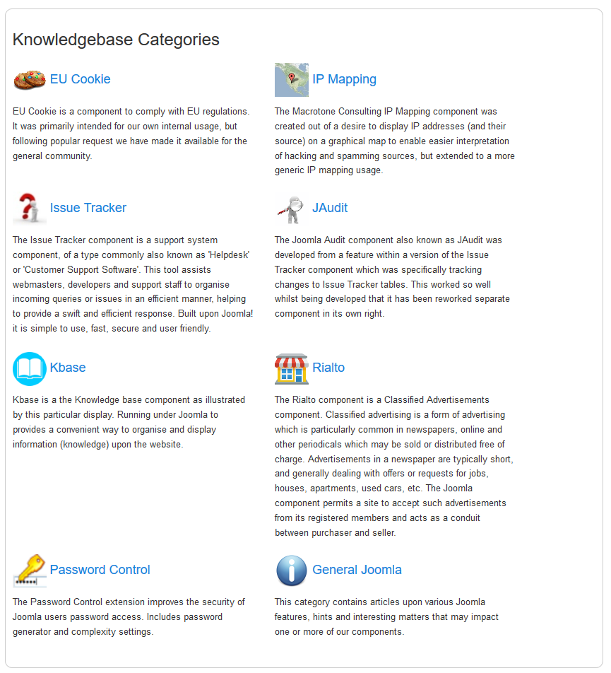
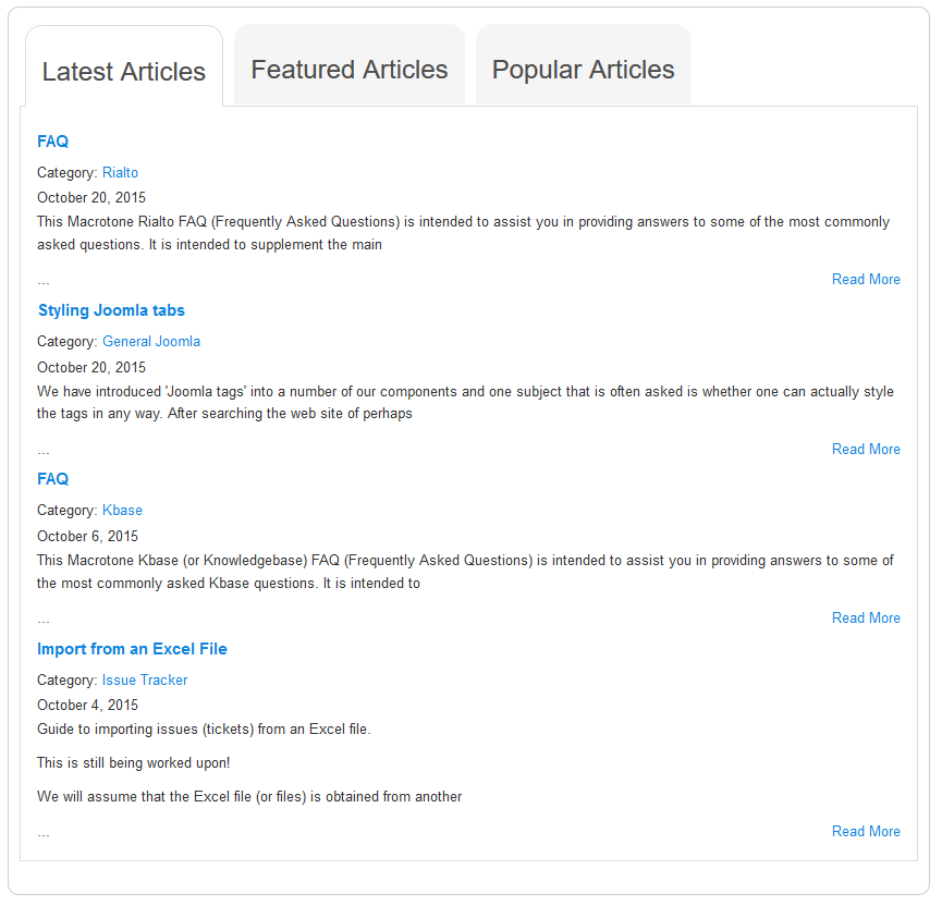
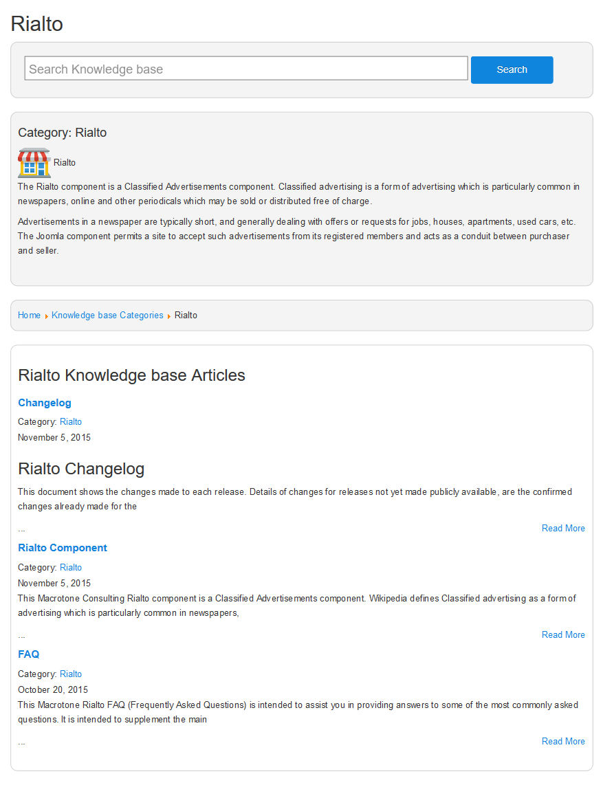
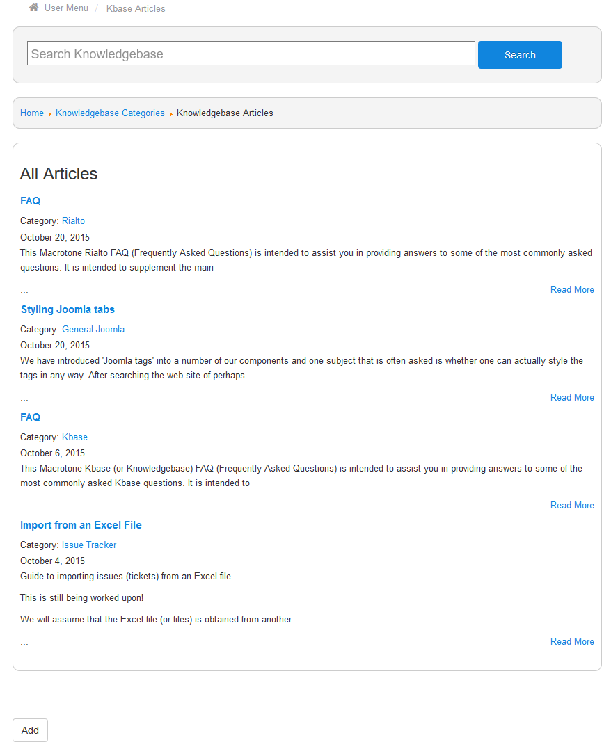
![[Note]](/media/com_docimport/admonition/note.png)